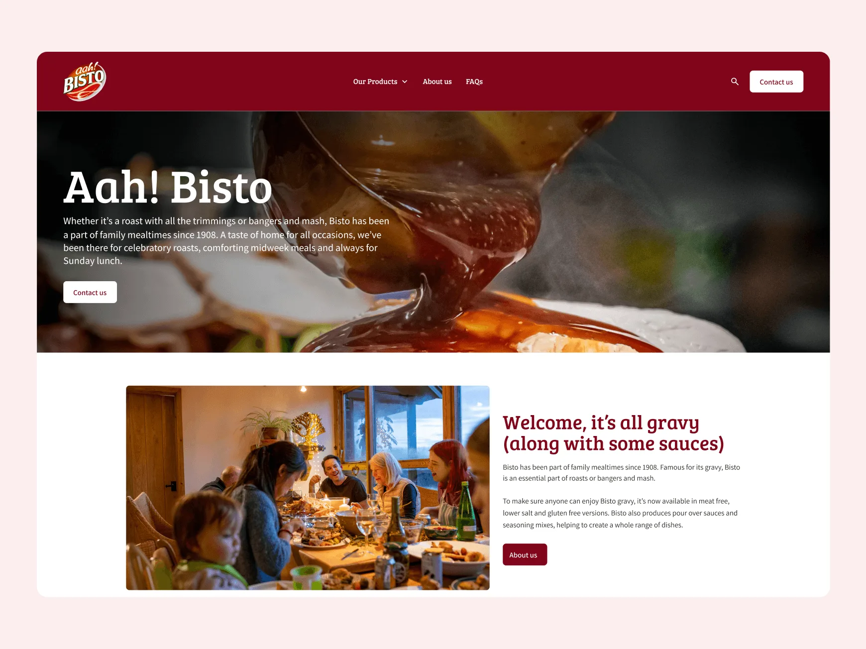

Design system | WordPress parent theme | Modular page building | UX/UI | Accessibility | Module library | CMS training | Support & evolution
Food and drink

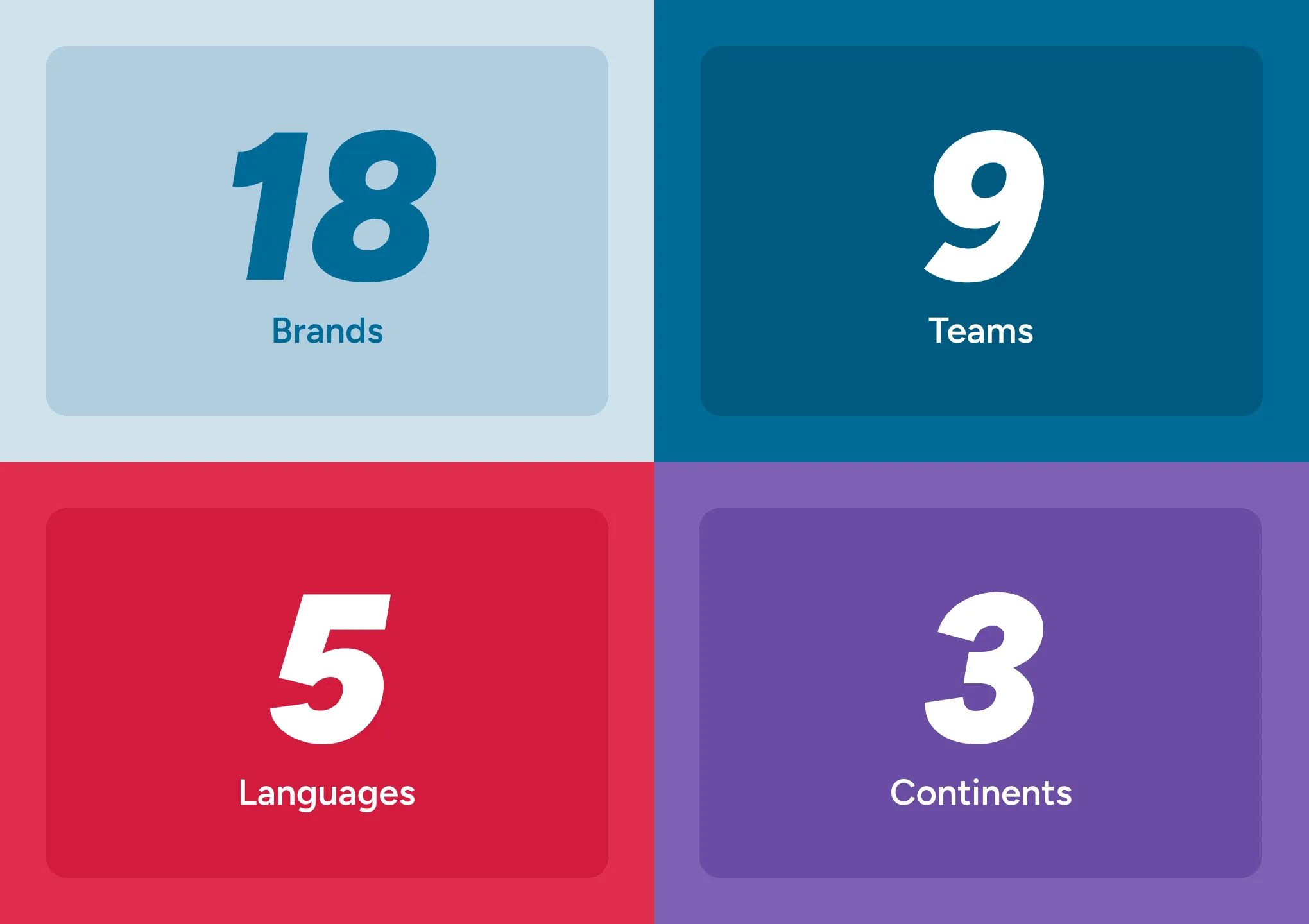
Before the system, the portfolio was split. Some brands had simple one-page sites, others had fuller builds, and different development teams were working in different ways.
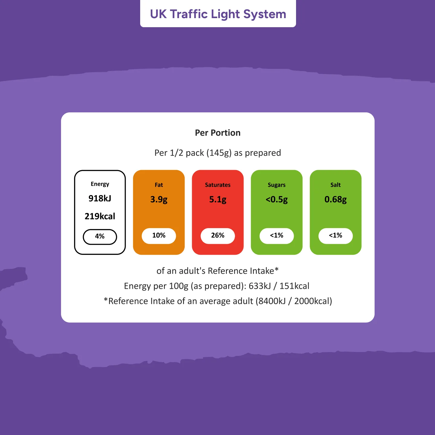
We started with discovery sessions with the central Premier Foods web team and brand stakeholders to understand what each site needed to do, what had to be retained, and where the biggest risks sat. That surfaced the practical issues affecting users and teams. Key product information was missing on some sites. Others were at risk of being out of date, including allergens and UK traffic light nutrition labels, with potential dietary implications. Many sites were also visually and technically dated, with accessibility gaps and unreliable behaviour across tablet and mobile.
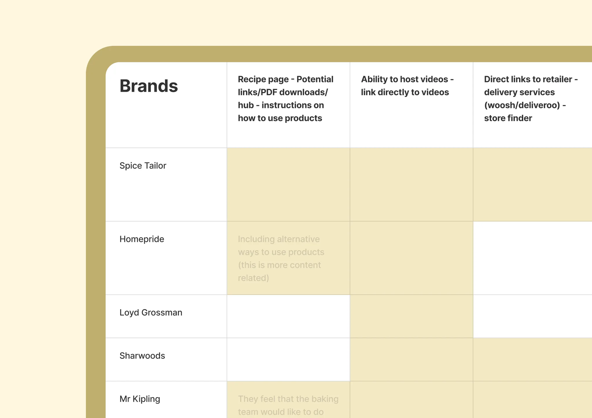
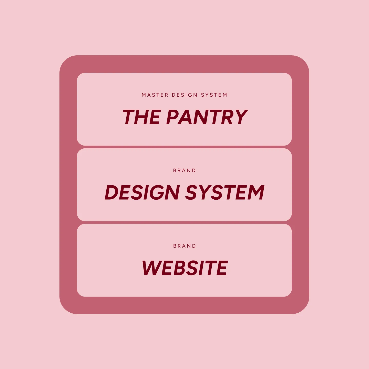
The goal was consistency and uniformity, but with enough variability to allow each brand to express itself individually. As some of the UKs best-loved brands, many of them under the Premier Foods name have a long heritage and brand equity, as well as their own audience, strong branding, and class of products. The system had to respect that, while still giving the web teams a single, reliable way to build and maintain sites.
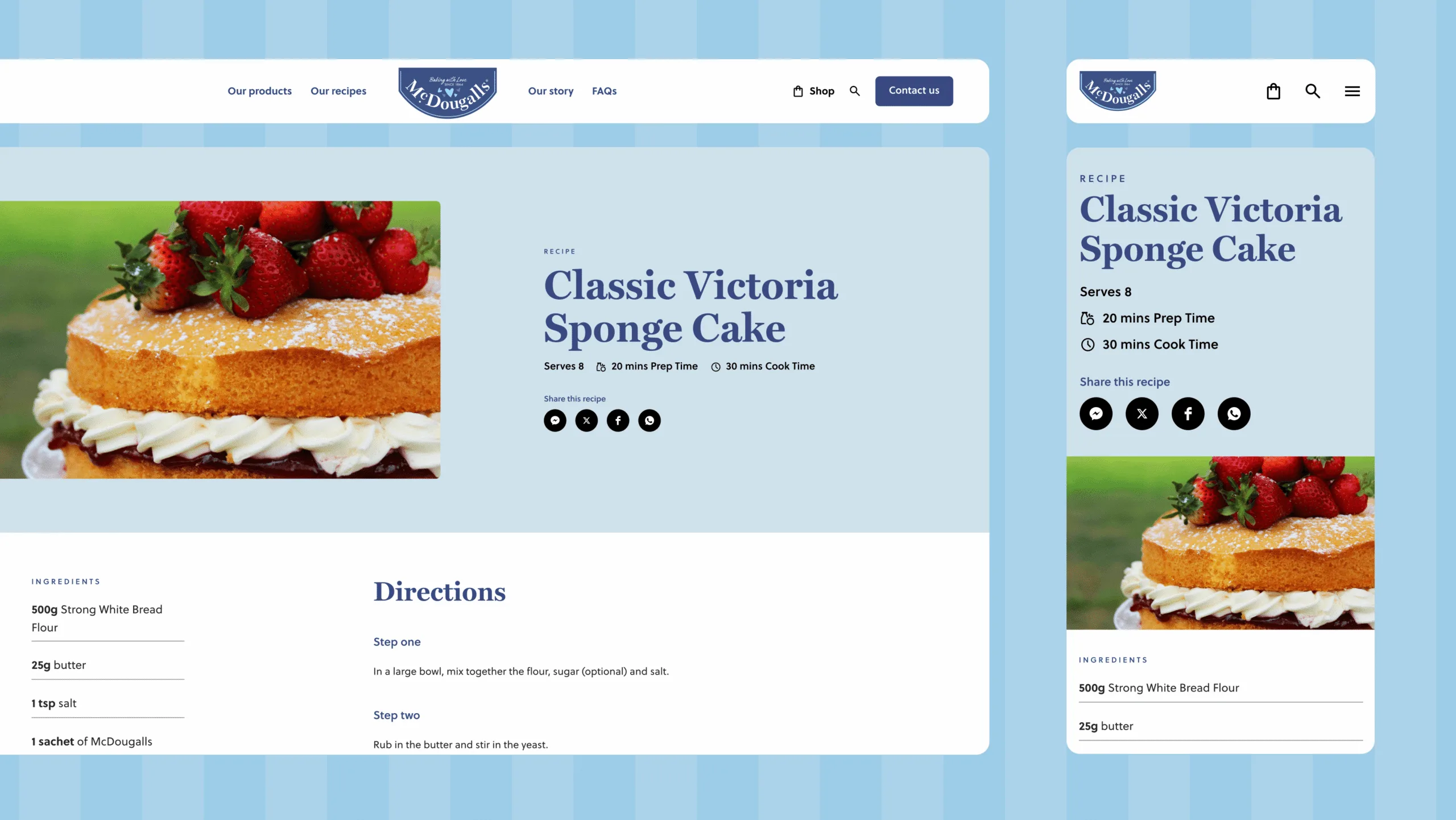
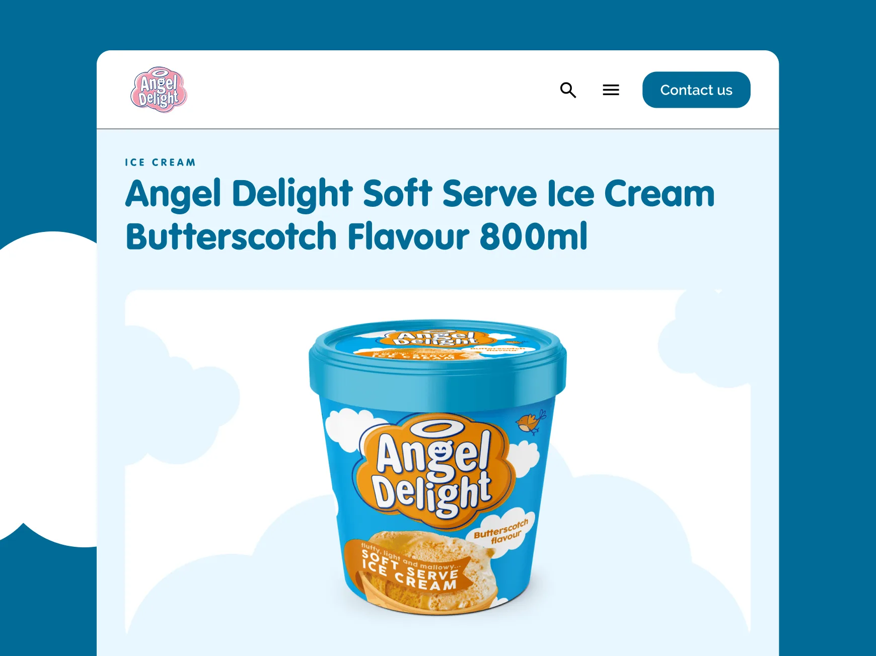
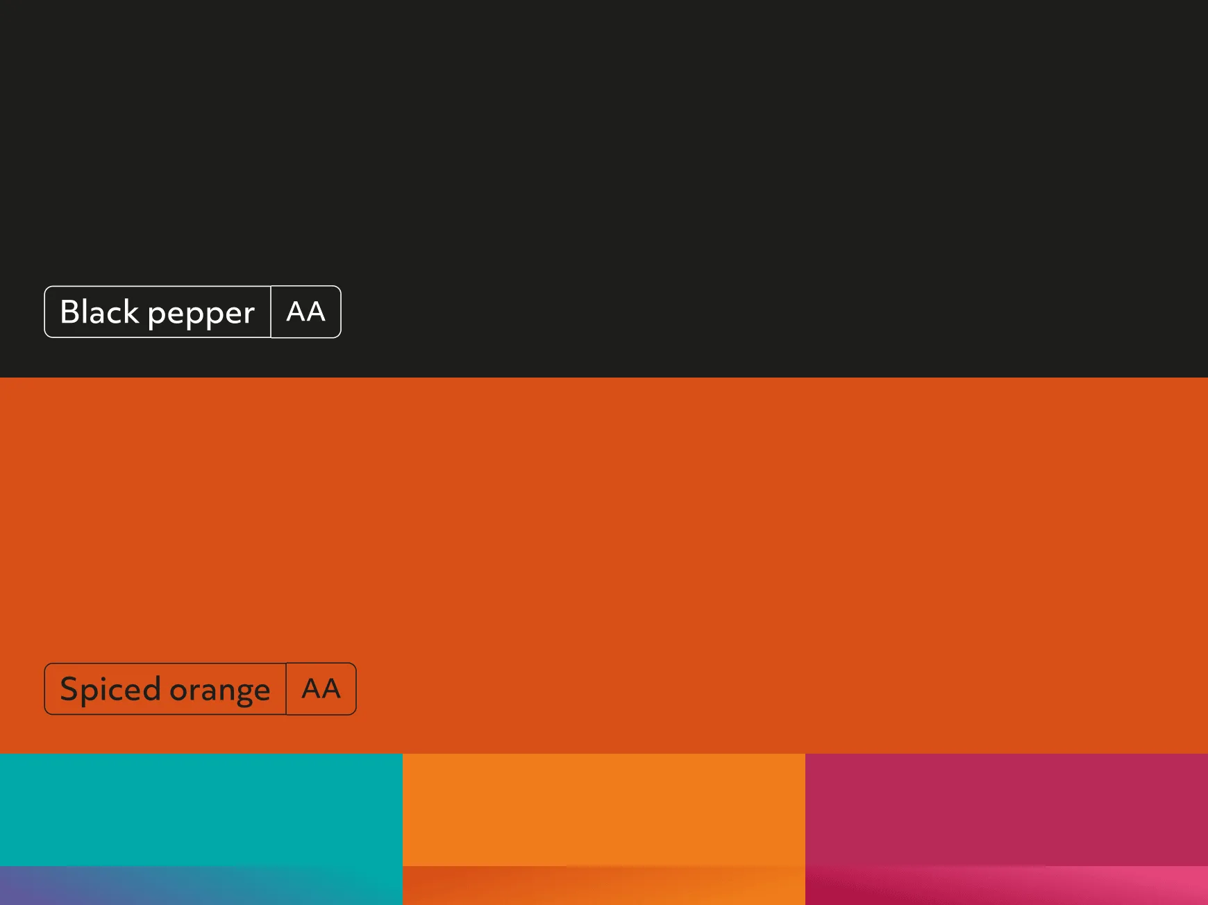
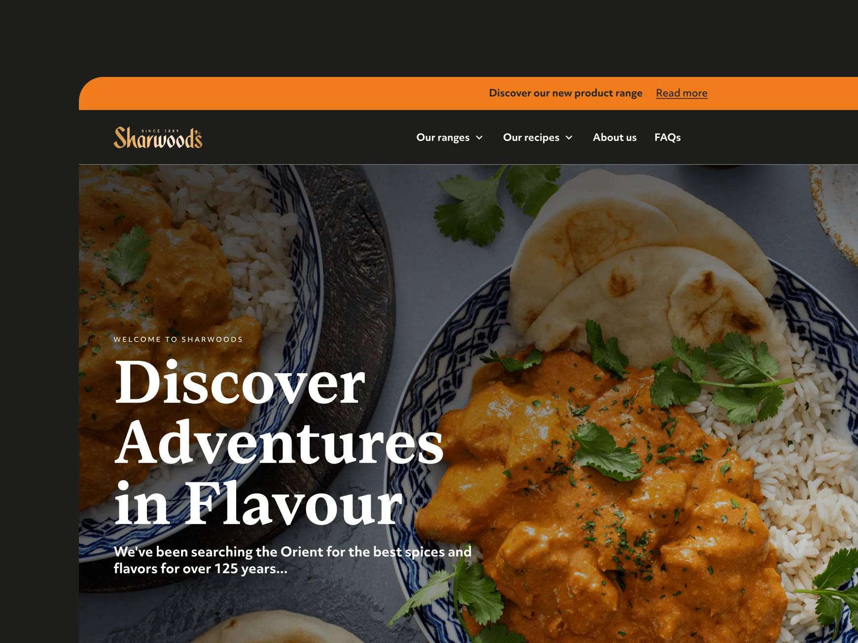
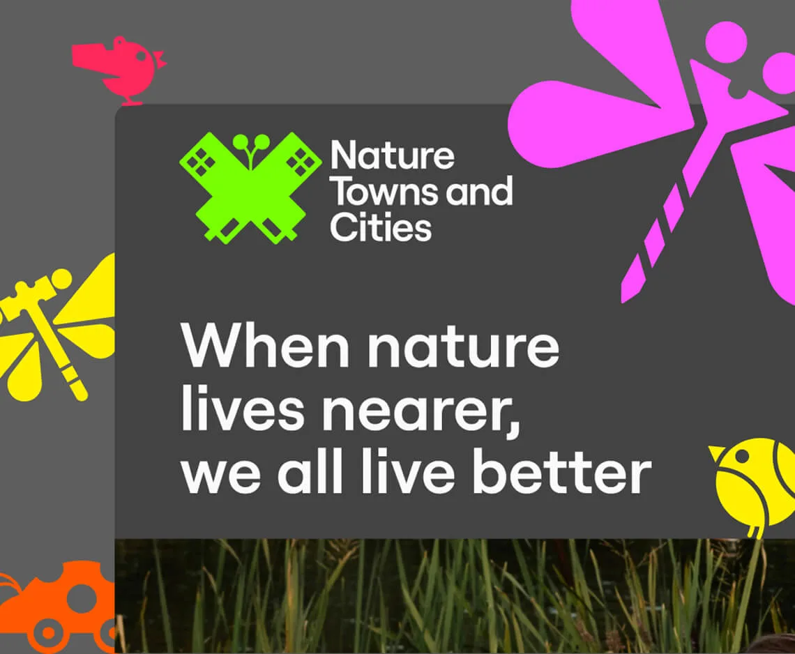
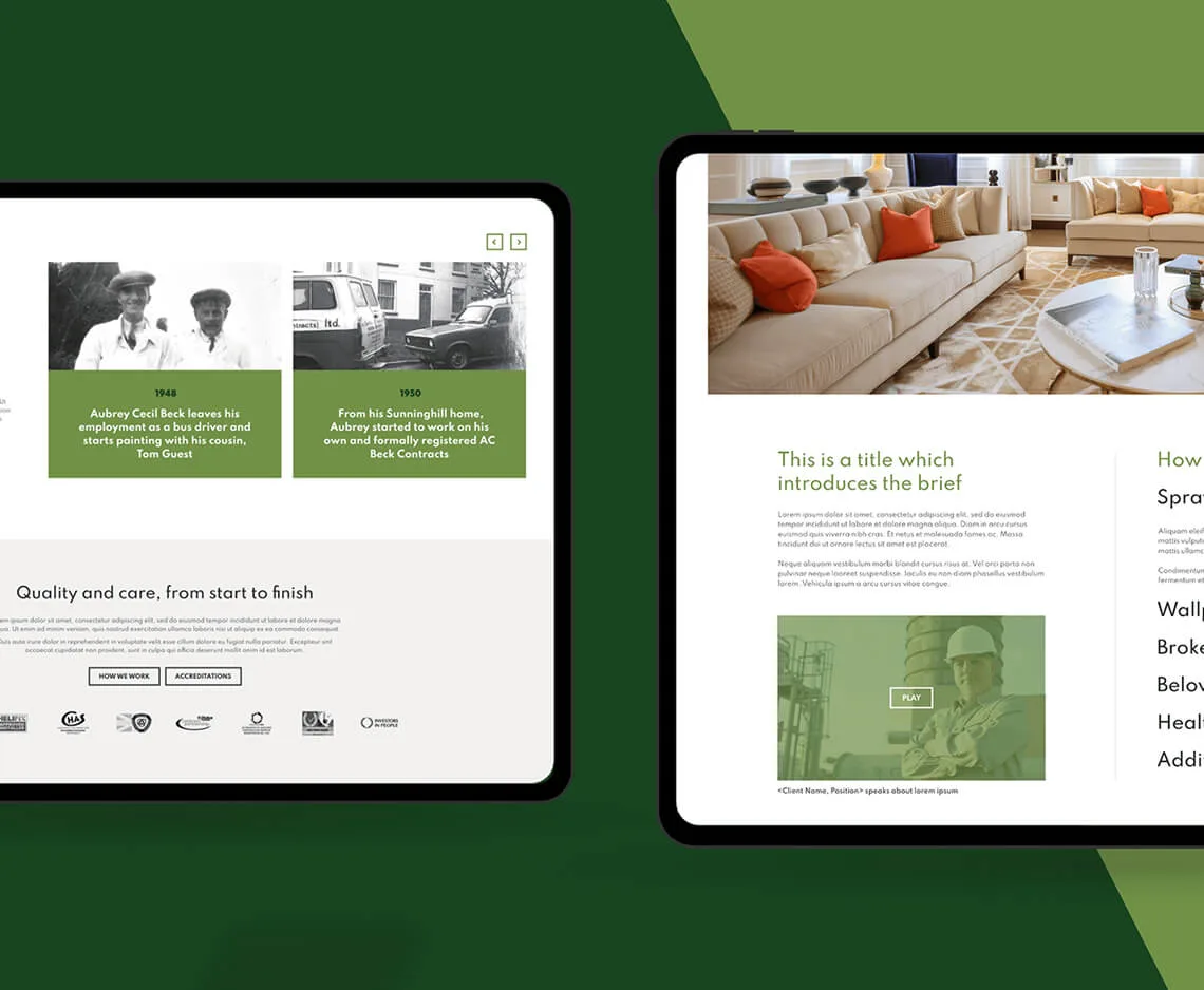
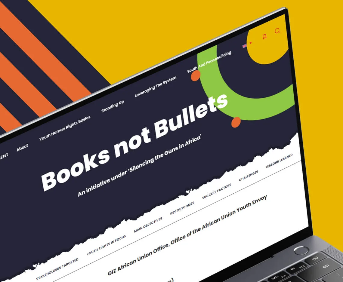
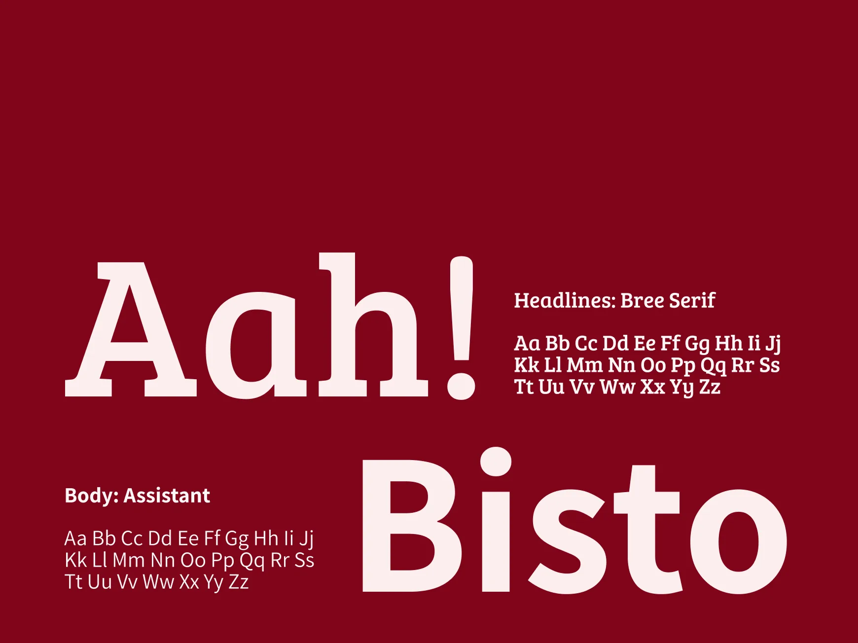
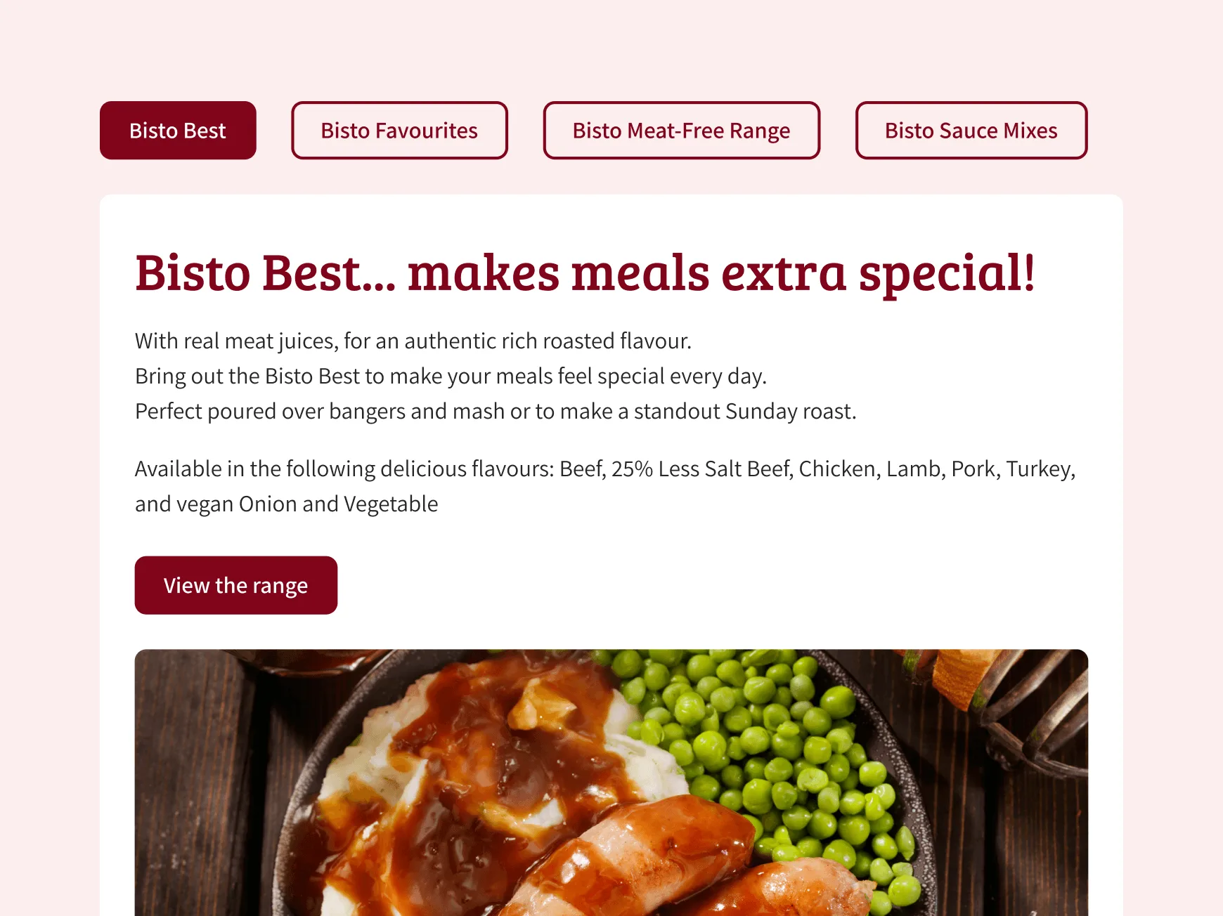
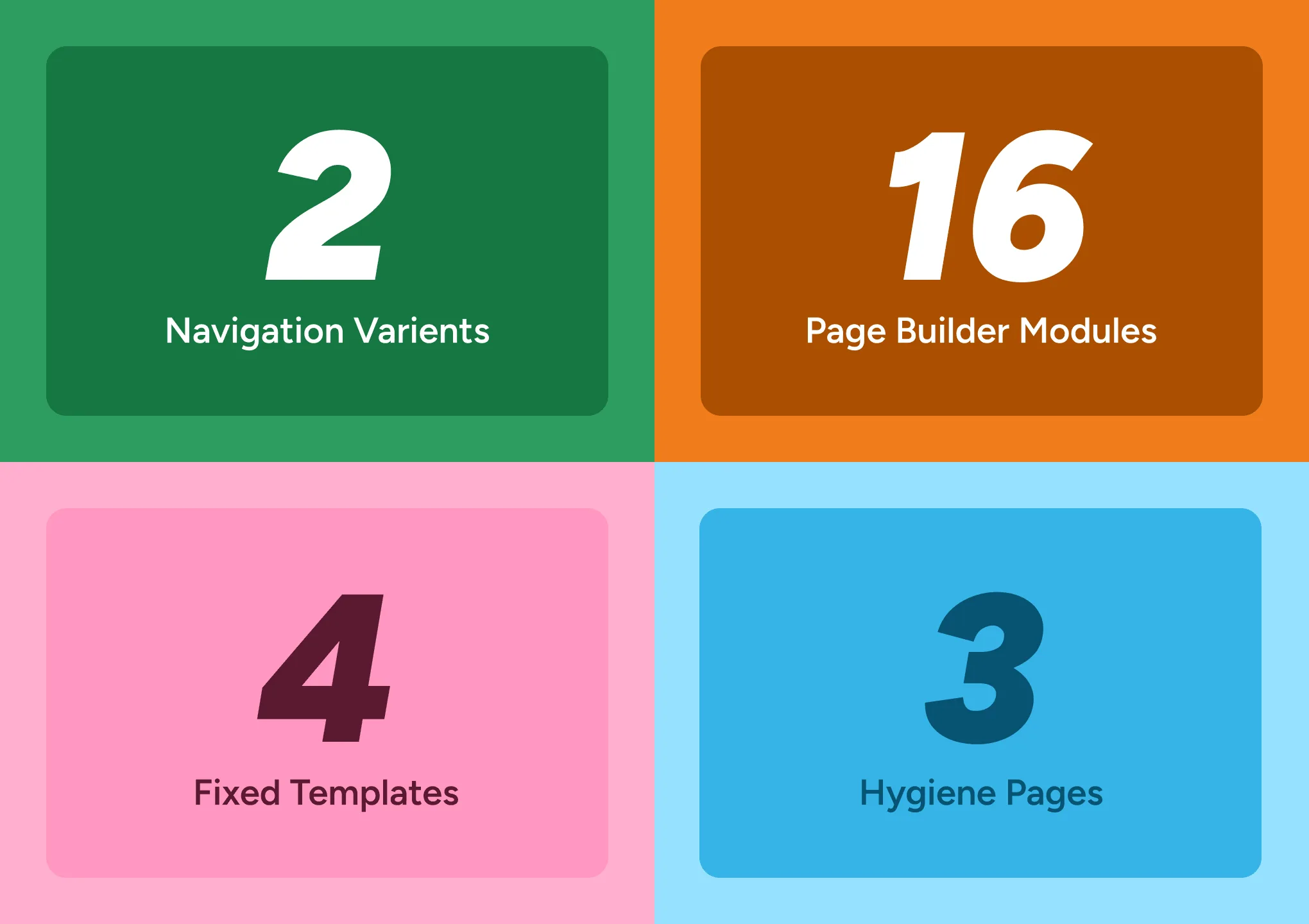
Rouge created a single-source library of content modules, all within a global set of rules with consistent structure, behaviours and levels of flexibility. Each brand has access to the same library of modules with their own colours and typefaces applied. Through the built-in flexibility, brands have the ability within the WordPress Content Management System (CMS) to curate chosen content modules to form custom website pages.
The result is a shared foundation that makes managing the portfolio of sites easier for the web teams, without sacrificing each brand’s unique personality

This was not just a set of marketing page blocks. The system needed to handle the content users actually look for, and the pages teams need to keep accurate over time. That meant building a system that could support full WordPress websites, not just campaign landing pages.
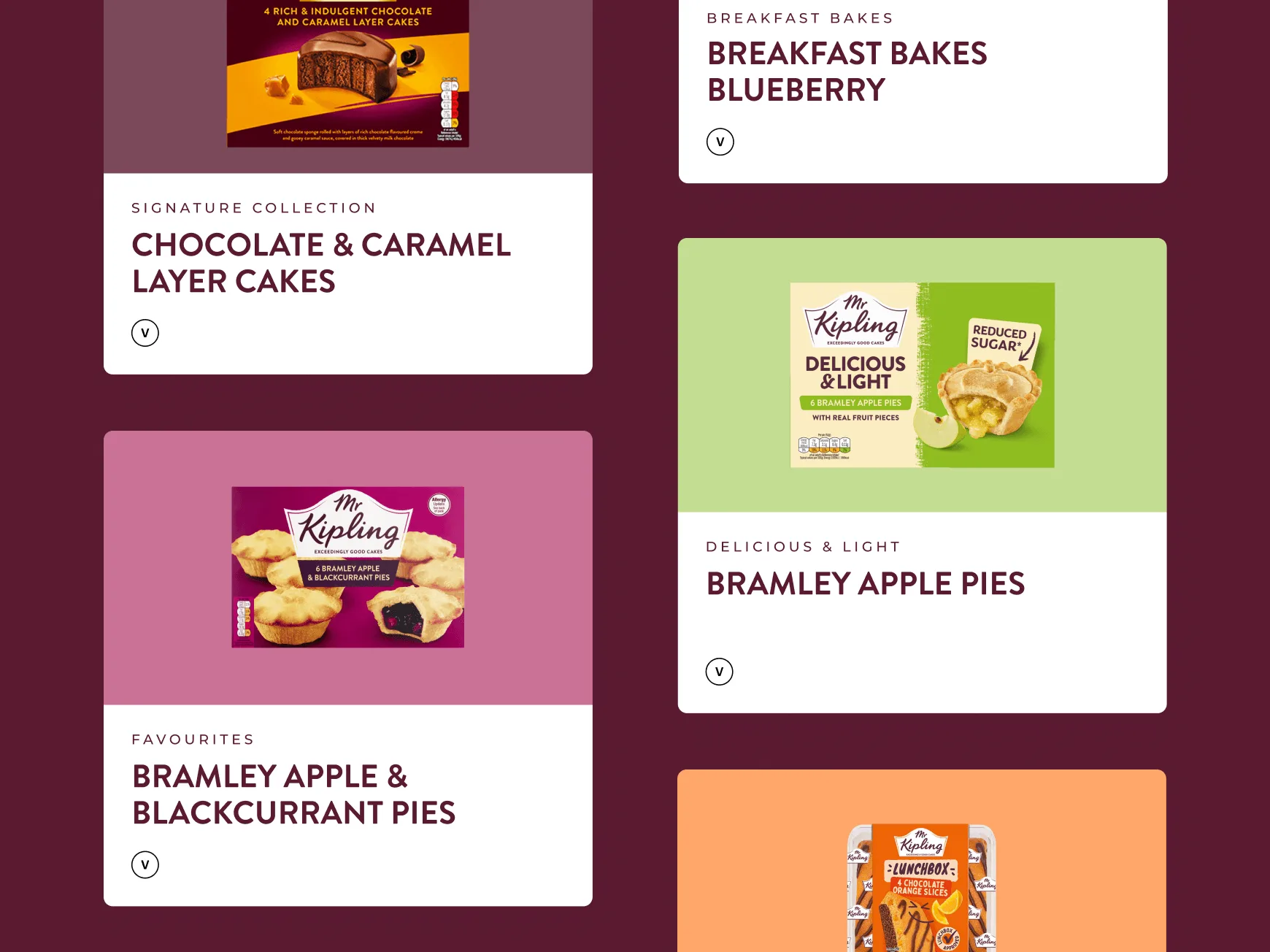
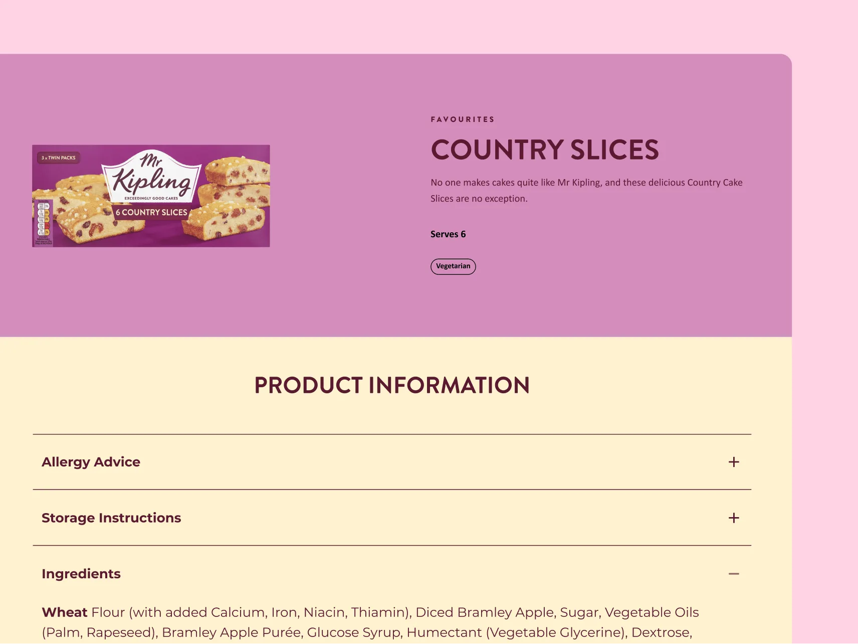
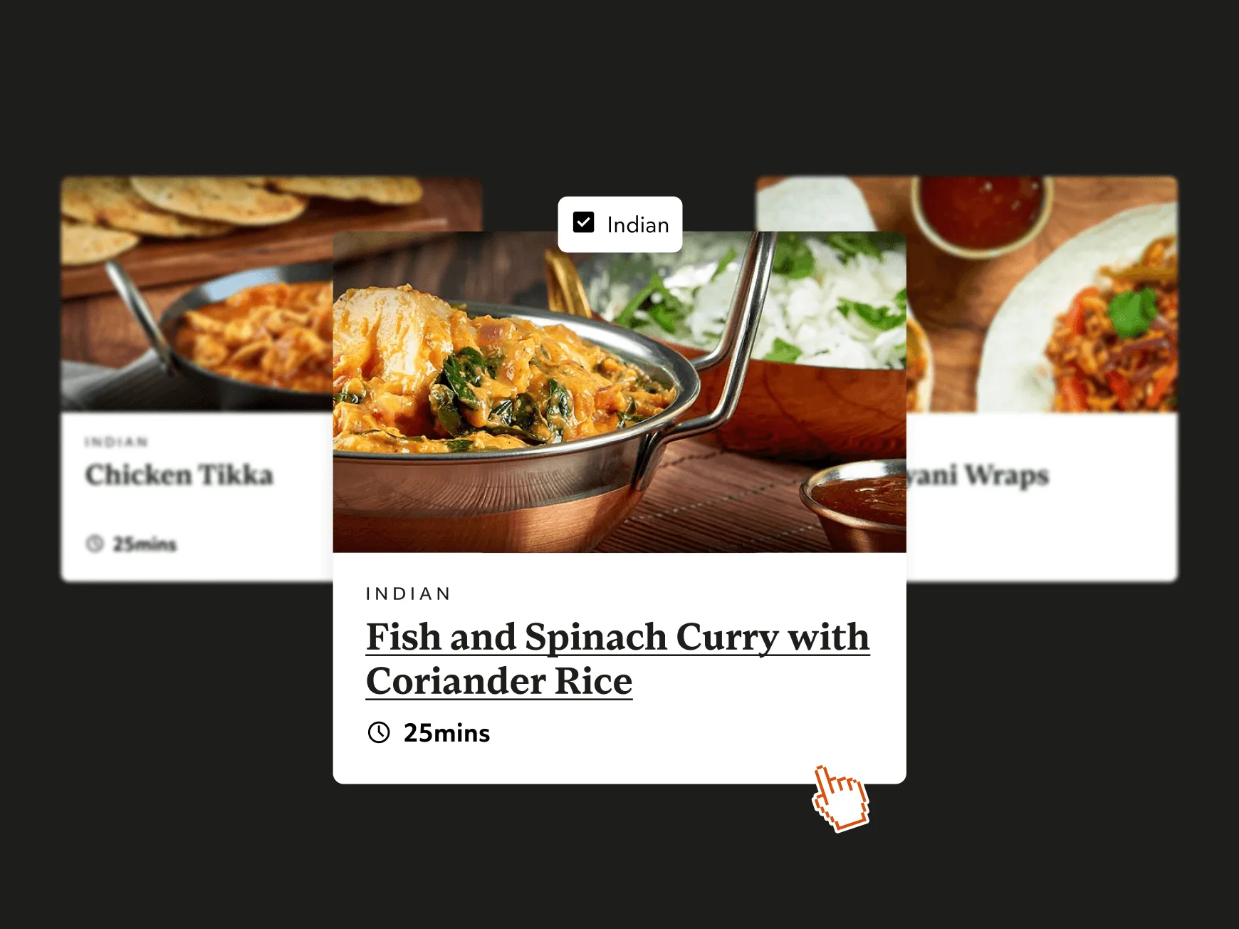
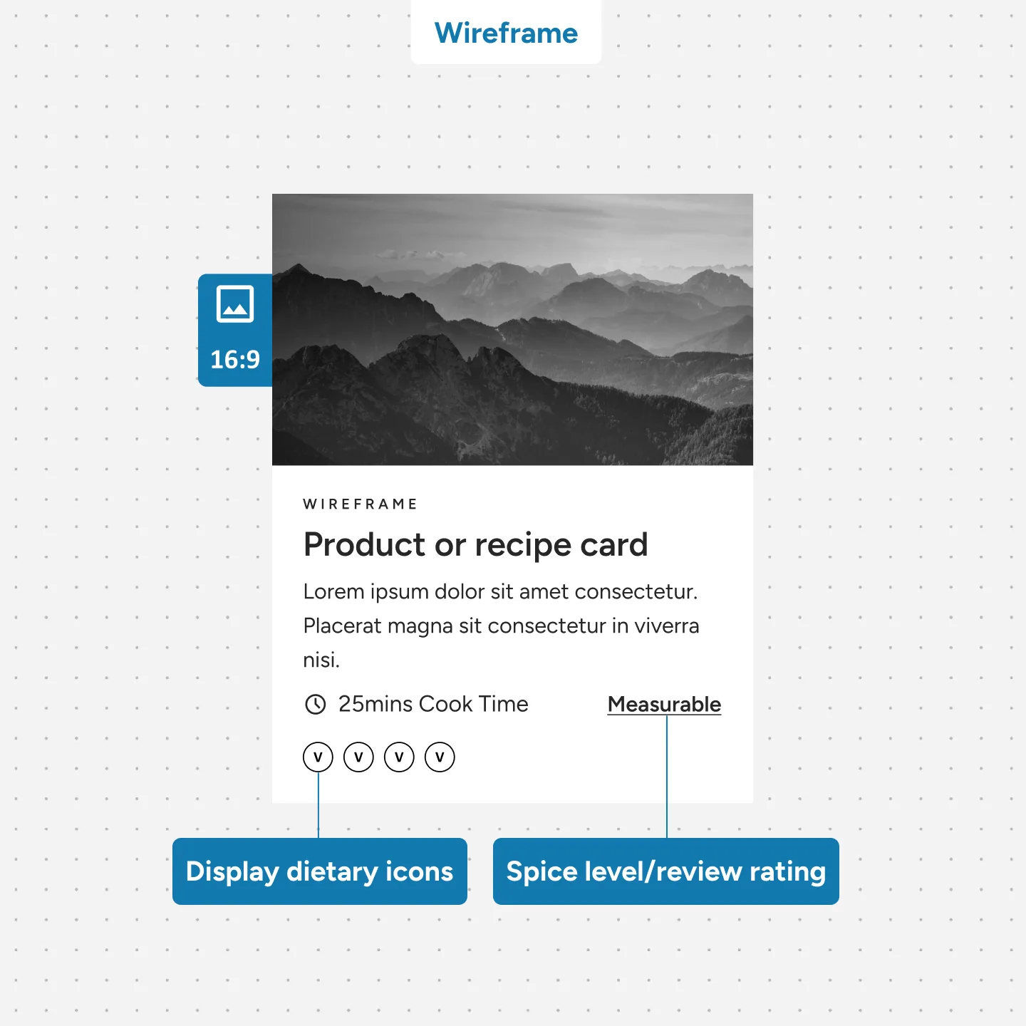
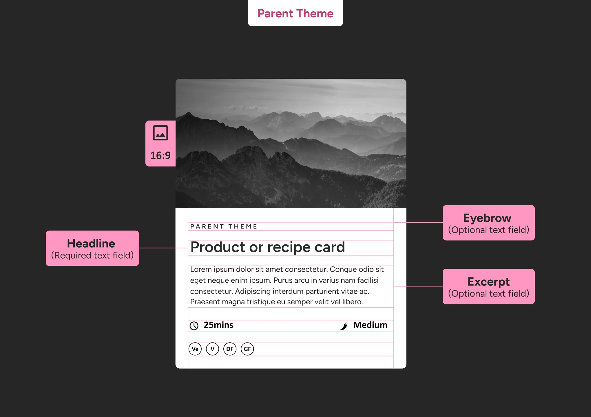
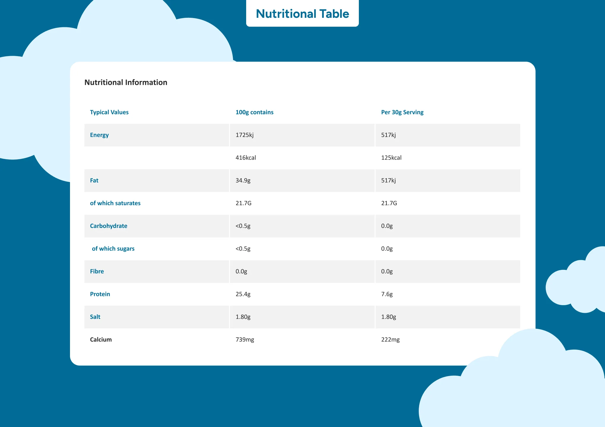
To accommodate those requirements, Rouge designed a set of flexible modules alongside fixed templates, including archives (library of posts), post pages and content cards (products and recipes). Crucially, the system supported the detail-heavy information that matters most in food and drink. Where accuracy is not optional and information is driven by regulatory requirements. Allergens, ingredients, nutrition, UK traffic light labels, cooking instructions, and dietary requirements all had a consistent place, so users could find them quickly and teams could maintain them with confidence.
We also built a clearer approach to Frequently Asked Questions (FAQs). Teams could use consistent FAQ patterns, including accordions and structured layouts, to make common questions easier to scan and answer. It improved the experience for users and reduced the support burden on internal teams.
Many sites were not meeting AA accessibility standards, and breakpoint issues were common across tablet and mobile.
Accessibility and responsive behaviour were treated as core system requirements, not fixes added at the end. Colour and type choices were updated for contrast and clarity, and modules were designed to behave predictably across breakpoints.
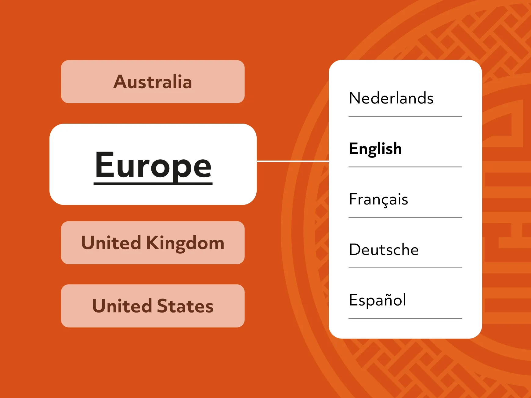
The portfolio needed to support multiple languages and regional requirements, without splitting into separate solutions that drift over time.
The system accounted for UK requirements such as traffic light labelling, and US needs such as store locator functionality. Variation was handled as part of the design system, so the platform stayed coherent as it scaled.
Rouge delivered WordPress CMS training and support for the web team and brand teams, so they could publish confidently without waiting on developers.
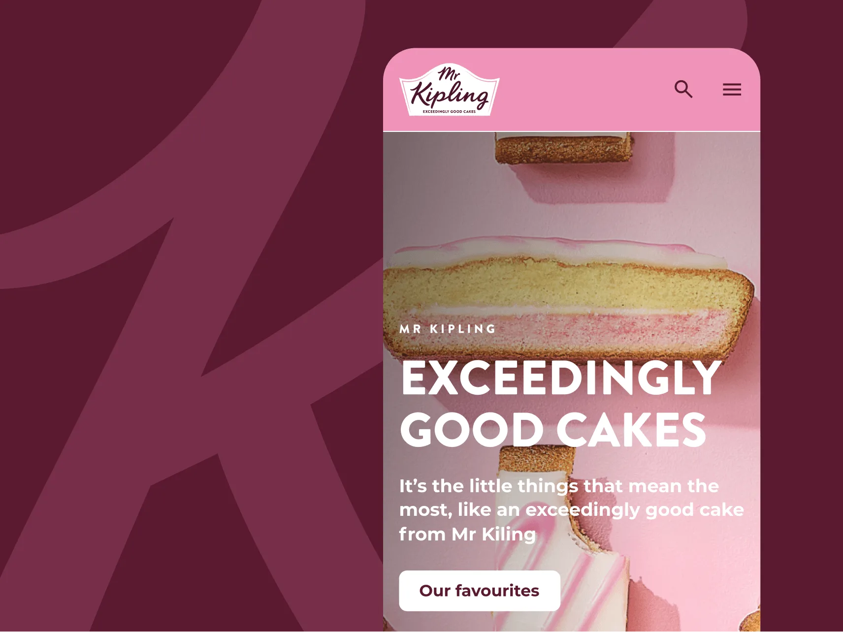
A flagship brand, Mr Kipling, was used to validate the approach early, including a visual kick-off to confirm key brand choices and content expectations. From there, the parent theme could be duplicated and reskinned per brand, with ongoing enhancements added post-launch, including expanded spacing and colour controls within modules.
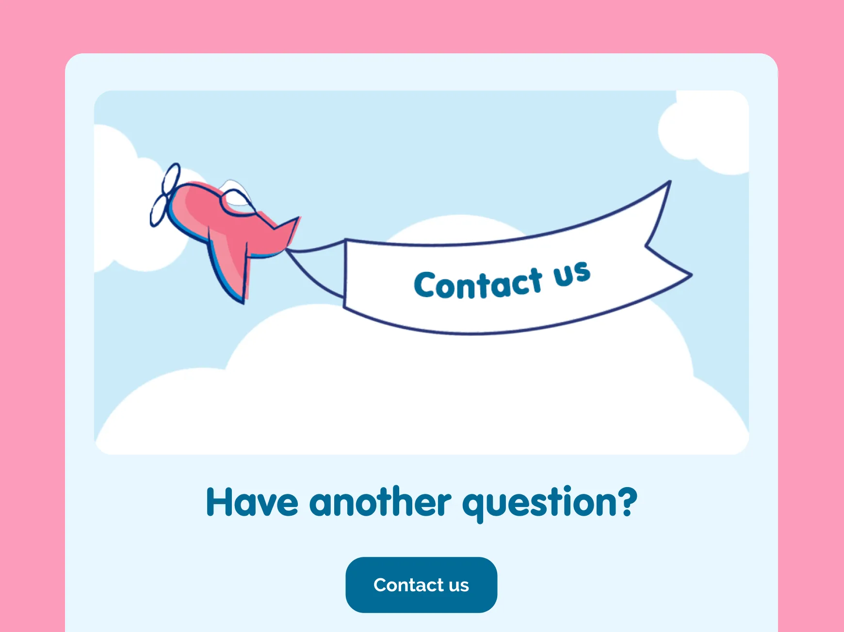
The result is clearer, safer information for consumers with fewer challenges for internal teams. People can quickly find key product details, including allergens, ingredients, nutrition, traffic light labels, cooking instructions, and dietary requirements. FAQs and help content are easier to use through structured layouts and accordions, and key navigation Call To Actions (CTA, clear prompts that help the user take the next step) like Contact Us are more visible. Across the portfolio, Premier Foods’ brand websites are now more consistent with each other, with stronger accessibility foundations and more reliable performance across devices. All of this while still enabling each brand to confidently express its identity.