Easier discovery of resources, fewer users dropping off. A trusted primary science hub.

One structured digital platform. Helps teachers find what they need, fast. More meaningful engagement. Less time wasted.
Our role
User-Experience Design | WordPress | Logo Design
Industry
Education
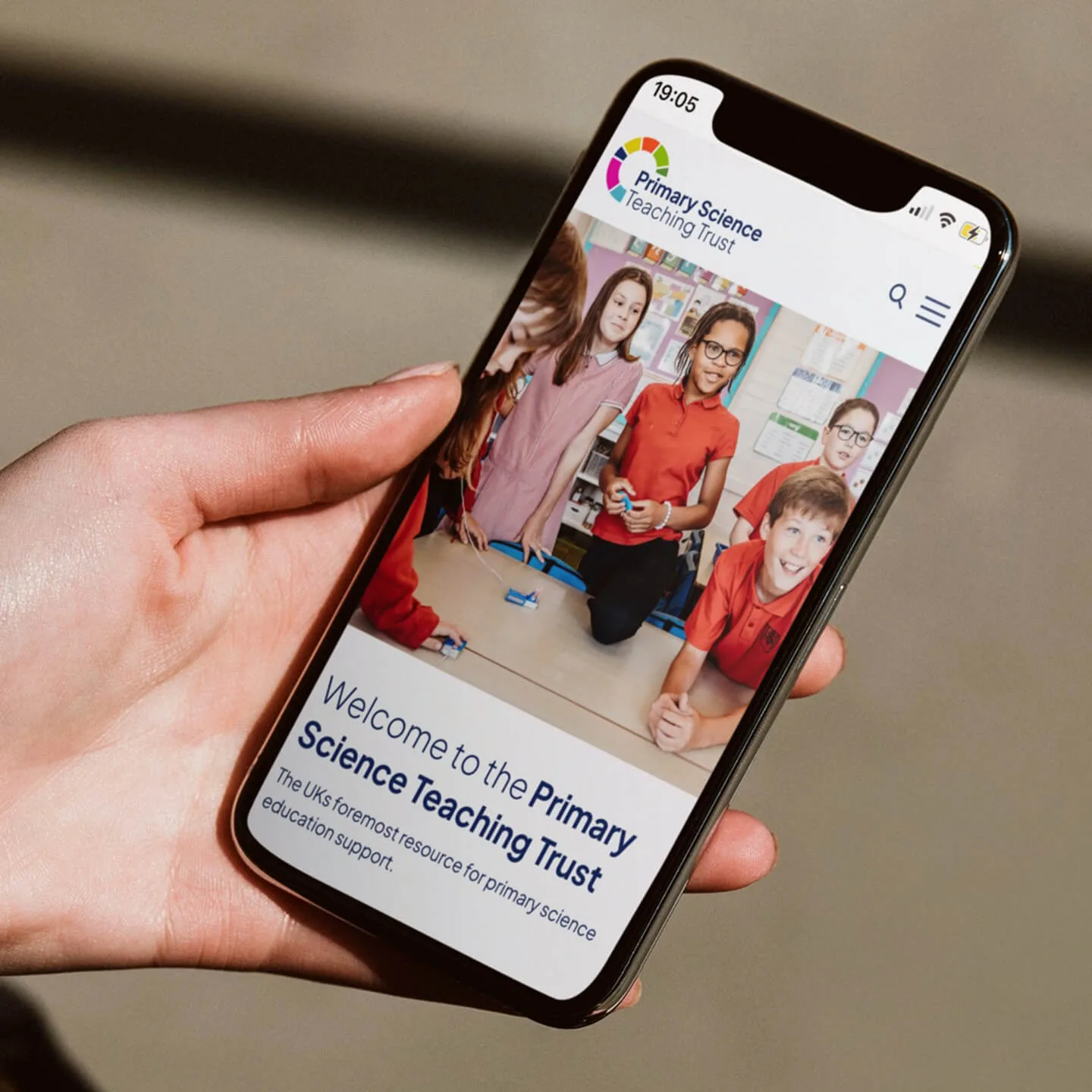
The Primary Science Teaching Trust exists to improve the quality of science teaching in every primary classroom in the UK. It supports teachers through research-backed resources, professional development, mentoring programmes, and national awards. But its digital presence was holding that work back.
The website had grown organically over time. Content was hard to find. Navigation struggled to serve very different audiences with very different needs. The brand no longer reflected the authority, clarity, or confidence of the organisation behind it.
PSTT needed a platform that could support complexity without feeling complex. One that worked equally well for classroom teachers, fellows, partners, funders, and policymakers. And one that would stand up to scrutiny as the Trust entered its next phase of growth.

Different audiences. Different needs.
PSTT’s ambition was clear. Become the UK’s leading digital destination for primary science support. The obstacles were just as clear.
Teachers needed faster access to trusted resources. Fellows needed structured areas for funding, forms, and collaboration. Partners and funders needed to quickly understand the impact and credibility of the Trust. Internally, the team needed a system that was more manageable, flexible, and future-ready.
The existing site struggled to do any of this well. Navigation buried key content. The resource library lacked clarity. The brand felt dated and inconsistent across digital and print. This was not only a cosmetic problem. It was a structural one.


Insight, not instinct, drives the outcome.
The project began with a deep discovery phase. Not just around content, but around audience behaviour, priorities, and pressure points.
Workshops focused on understanding the realities of primary teachers’ time constraints, the expectations on PSTT’s fellows, and the different ways partners and stakeholders evaluate credibility.
This work surfaced a critical insight. PSTT’s value was never in question. Its accessibility was. That shaped every decision that followed.

A strategy built around use, not noise.
Our user journey strategy focuses on one thing; making PSTT’s expertise easier to access, easier to trust, and easier to use.
Different audiences come to the site with very practical needs. Teachers want to find classroom-ready resources quickly. Fellows need fast access to funding, forms, and opportunities. Partners and stakeholders want to understand impact, credibility, and where PSTT fits.
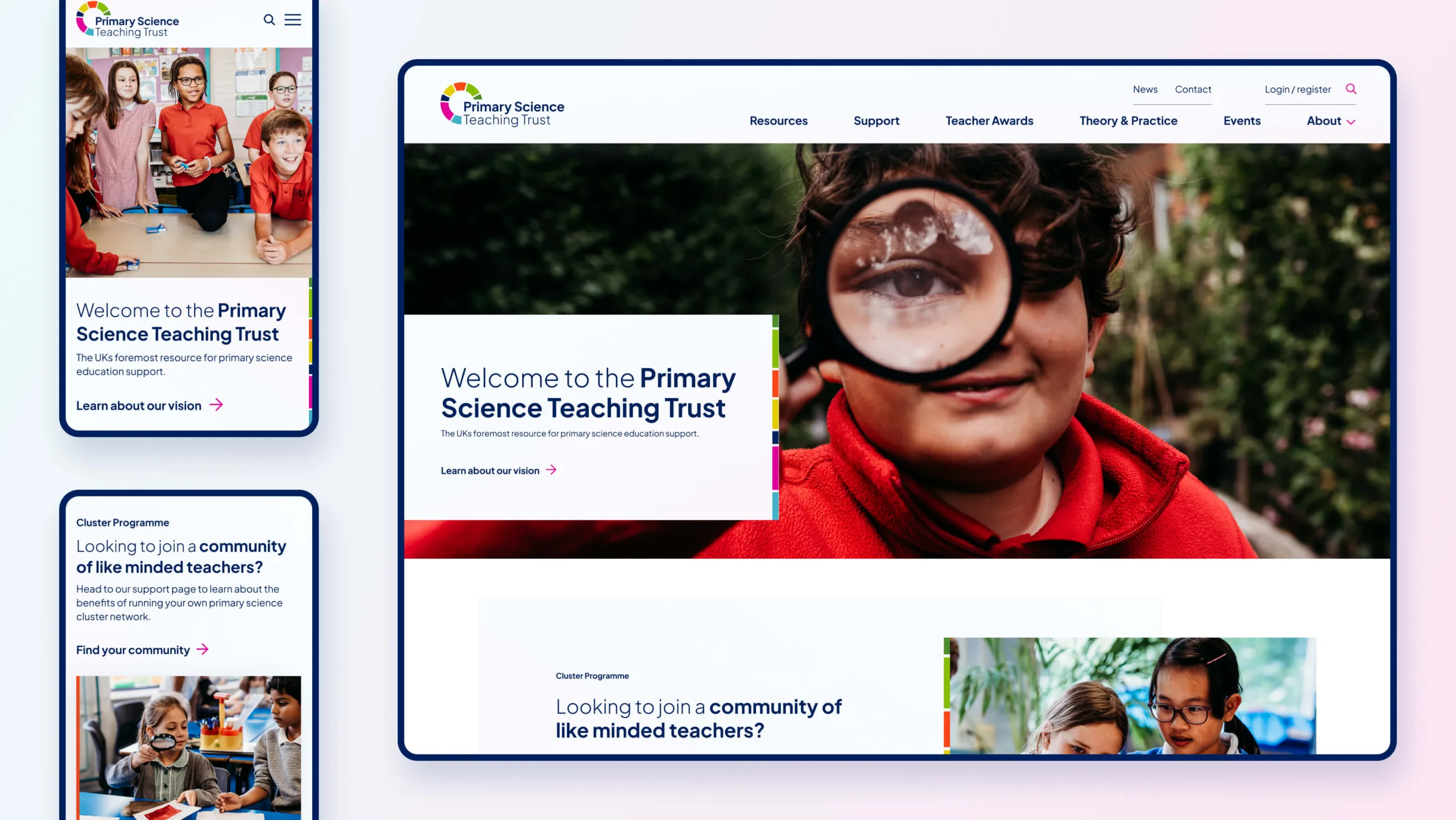
The structure reflects that. Clear pathways for each audience. Fewer choices at the top level. Stronger signposting to core programmes. Content organised around the tasks people arrive to complete.


The same brand. Better equipped.
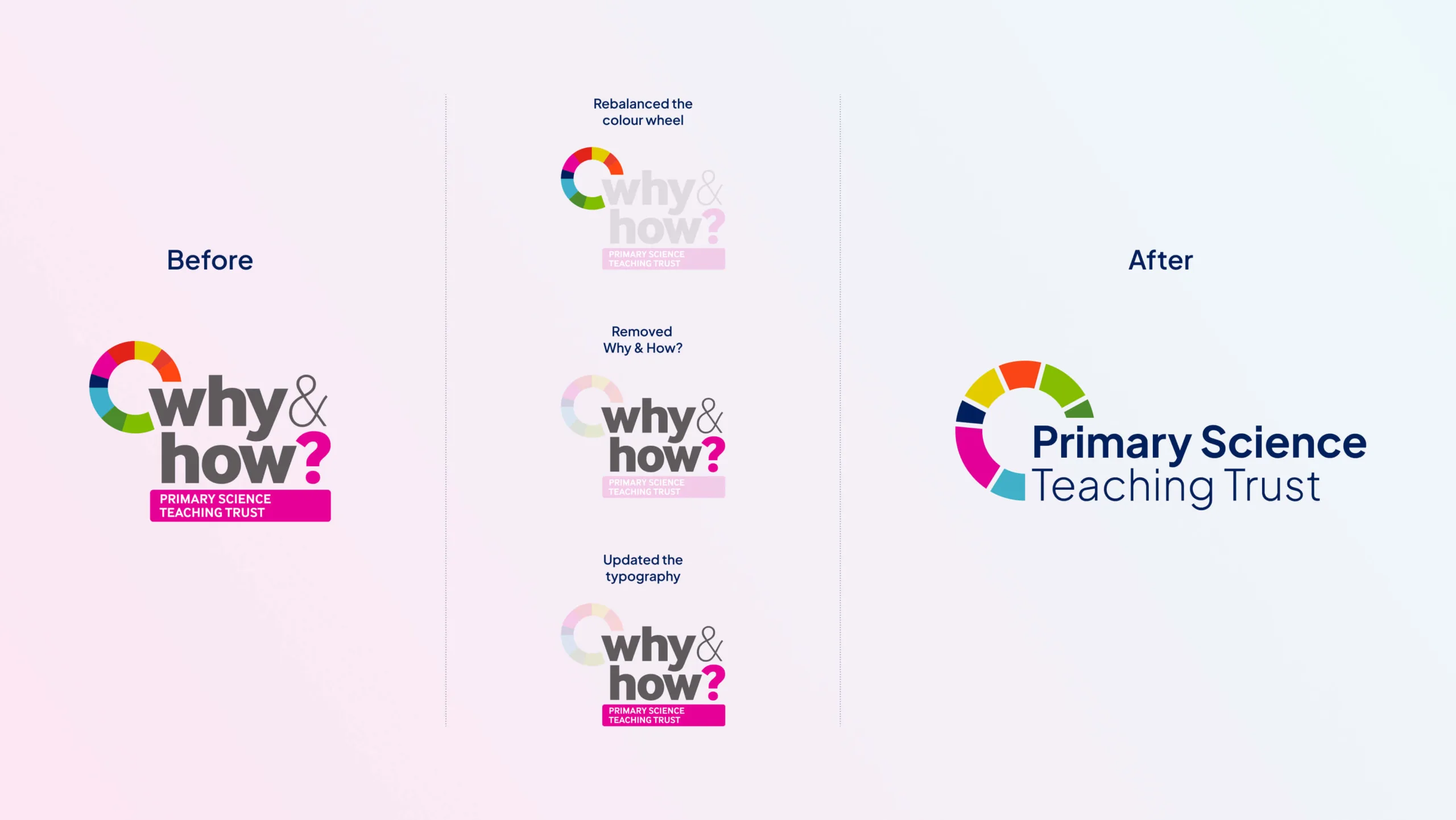
The existing logo carried strong recognition but was not built for modern digital use. Rather than replacing it, the mark was evolved.
The colour palette was retained to preserve familiarity. The structure was refined for clarity, legibility, and consistency across screen and print.
The result is a logo that feels like PSTT. Just more confident. More usable. And future-ready.


Clear routes. No guesswork.
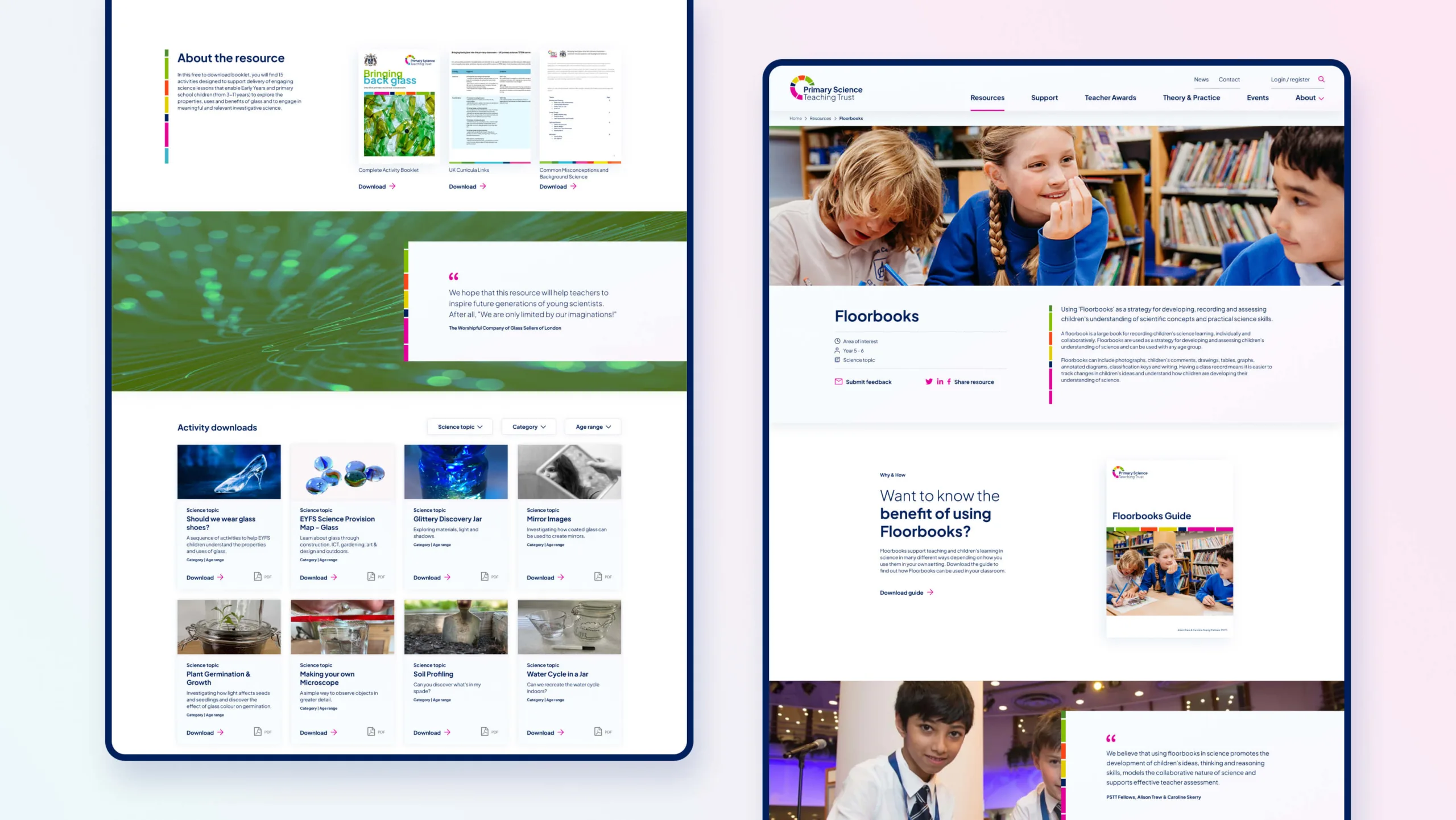
We started by understanding what each audience needed to do on the site. Then we built the structure around those tasks. Finding teaching resources, accessing forms, and understanding programmes all became quicker and more obvious.
Navigation was simplified so people did not have to dig, repeat steps, or second-guess where to go next. Content was grouped logically, with fewer dead ends and less duplication.
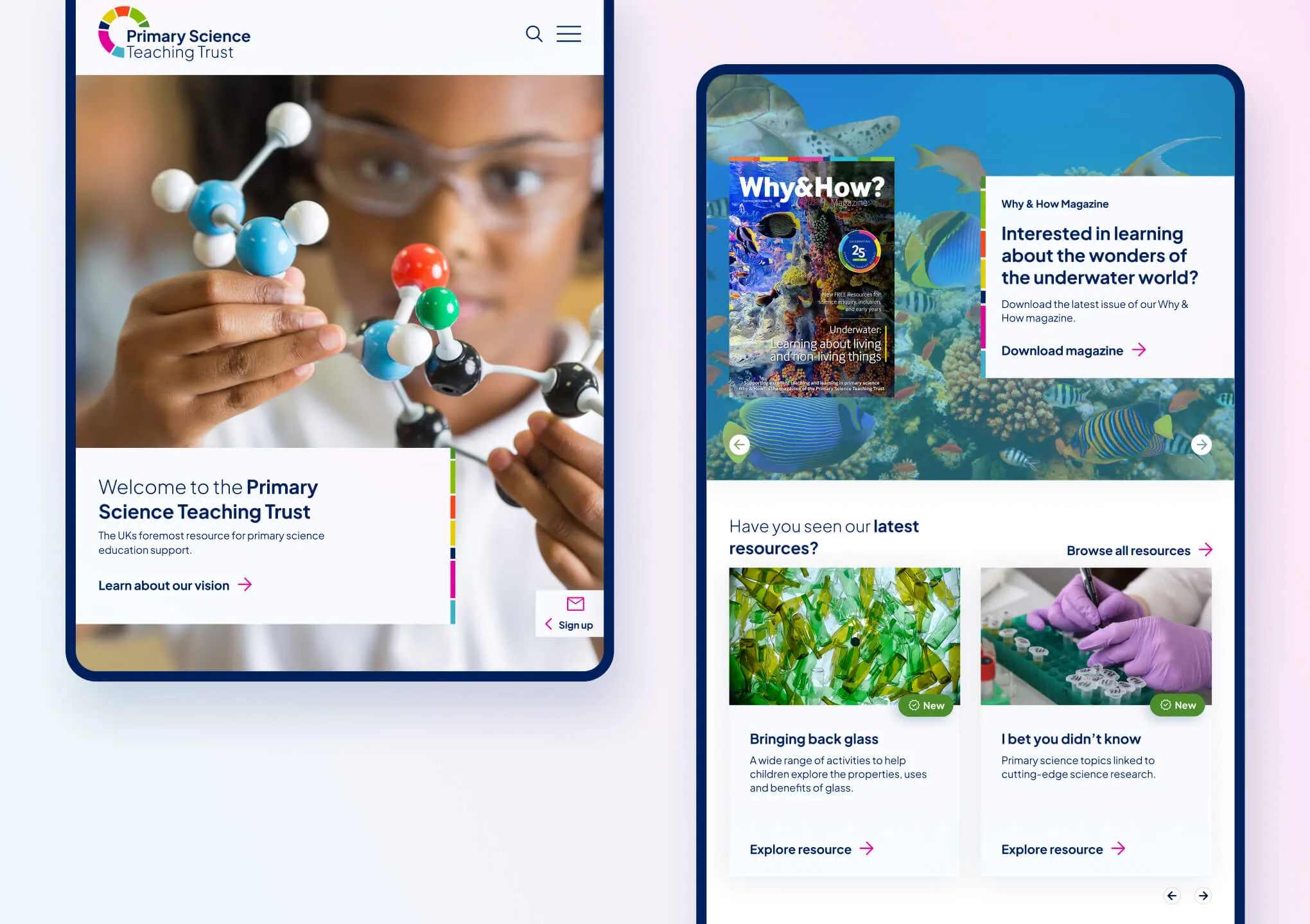
The new WordPress website stopped expecting users to work things out for themselves. It guided them instead.

Calm, clear, and built for focus.
The design balances authority with warmth. It feels professional without becoming institutional, and accessible without feeling simplistic.
Typography, colour, and photography are used to create clarity and calm. White space is intentional, giving content room to breathe.
Most importantly, it supports the resources, not competes with them.


A platform designed to grow with demand.
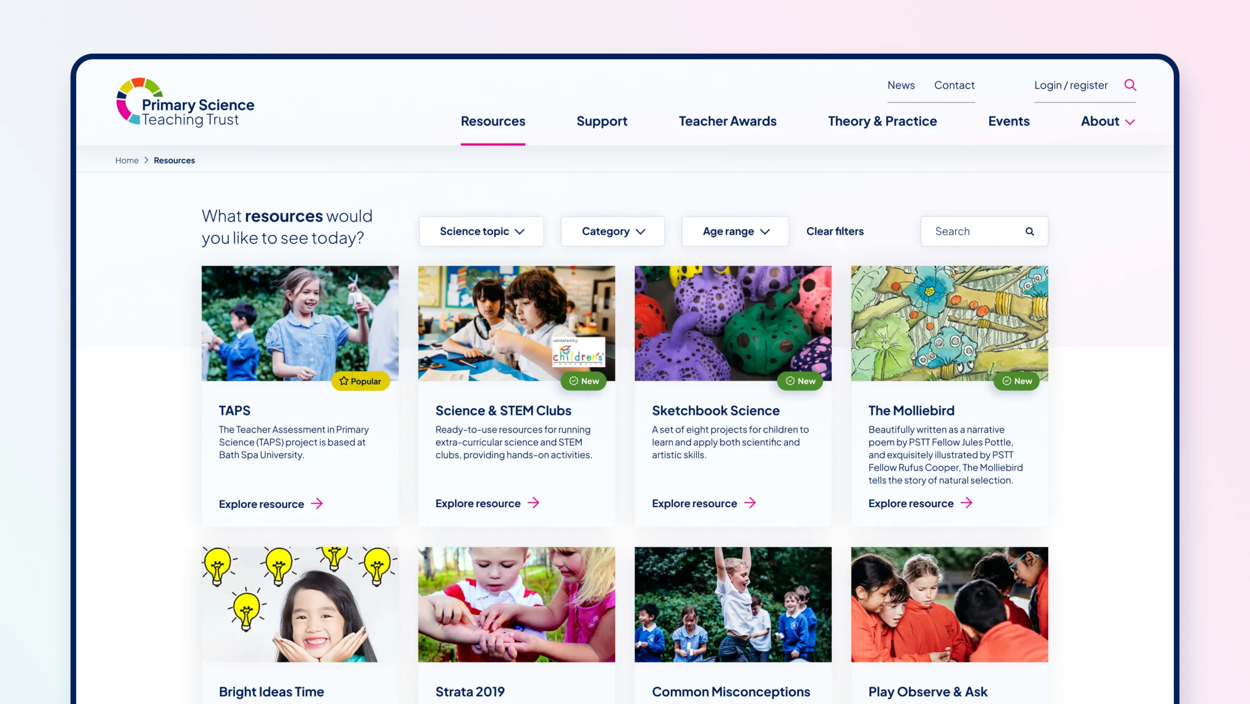
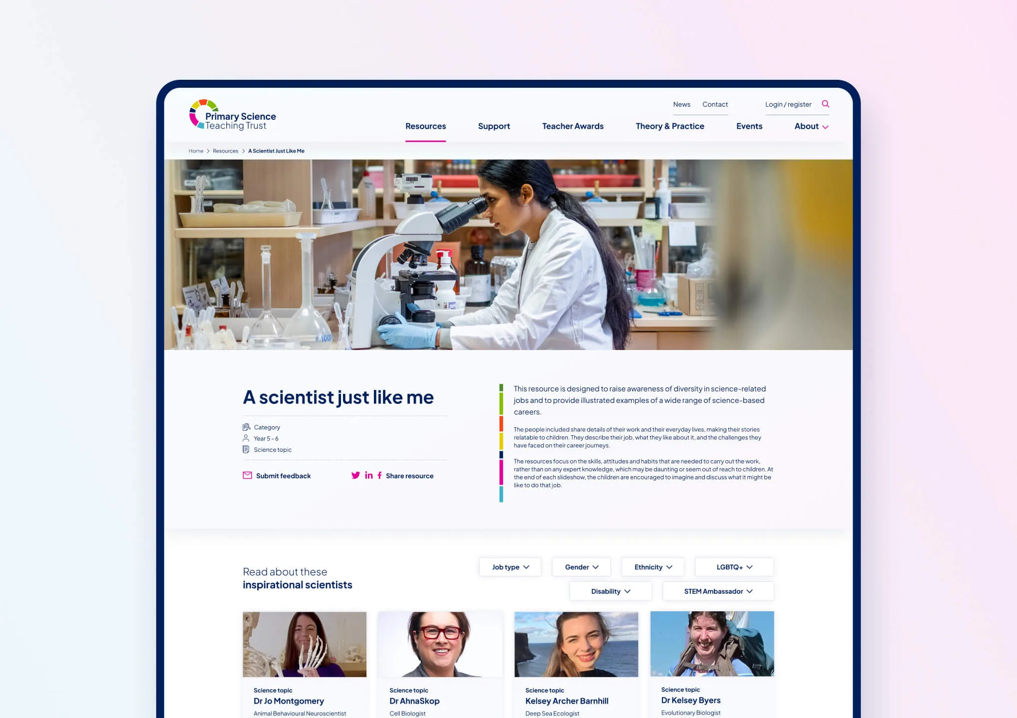
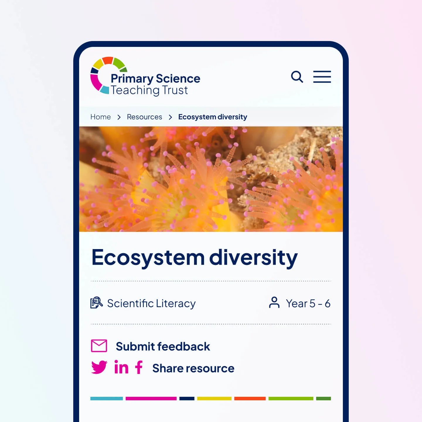
A robust resource library allows for powerful filtering and search. Forms are structured to support everything from award nominations to funding applications. Welsh language support is built in. External integrations are handled cleanly.
Under the hood, the platform is designed to scale. New resources, new programmes, and new user groups can be added without structural rework.


“Rouge took the time to understand the realities of our audiences and the complexity of our work. The result is a website that feels calm, clear, and genuinely useful.”


Digital confidence, inside and out.
The new website gives PSTT something tangible. A clearer story. A platform that matched its authority. A structure that respected users’ time. And a system that could support growth without friction.
Internally, the team gained confidence in the site as a tool, not a liability. Externally, PSTT now presents itself with the clarity and credibility its work deserves.