From two established accreditation organisations to one unified global brand.
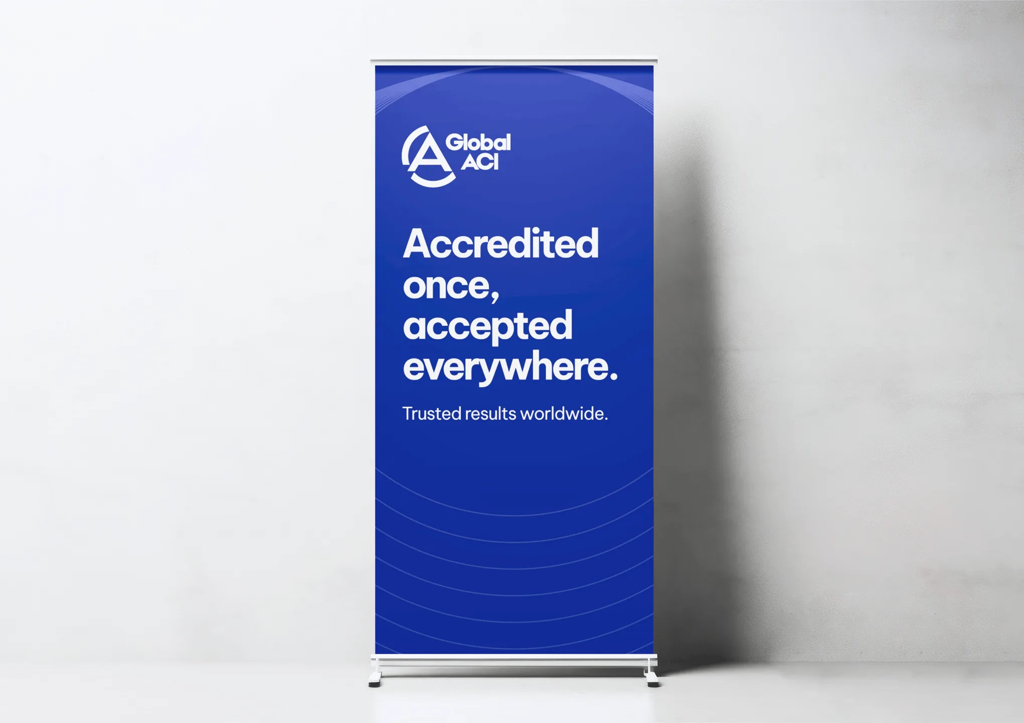
Naming, identity and brand guidance for a new international accreditation body.
Our Role
Naming support | Logo design | Brand identity | Brand guidelines | Asset production
Industry
Global Accreditation
When two established accreditation organisations come together to form Global ACI, the new brand needs to do more than look unified. It needs to signal continuity, create something distinct, and give global teams a system they can use with confidence.
Global ACI was created through the merger of IAF and ILAC. The brand had to balance heritage and change, while giving the new organisation a clear identity it could launch with and grow into.

Naming has to work in practice, not just on paper.
The naming phase focused on viable options, availability, and practical checks around use, translation and domains. The goal was not simply to find something new, but to help the organisation choose a name that could work globally.
By addressing those issues early, Rouge reduced risk and gave the project a stronger foundation before the visual identity moved forward.
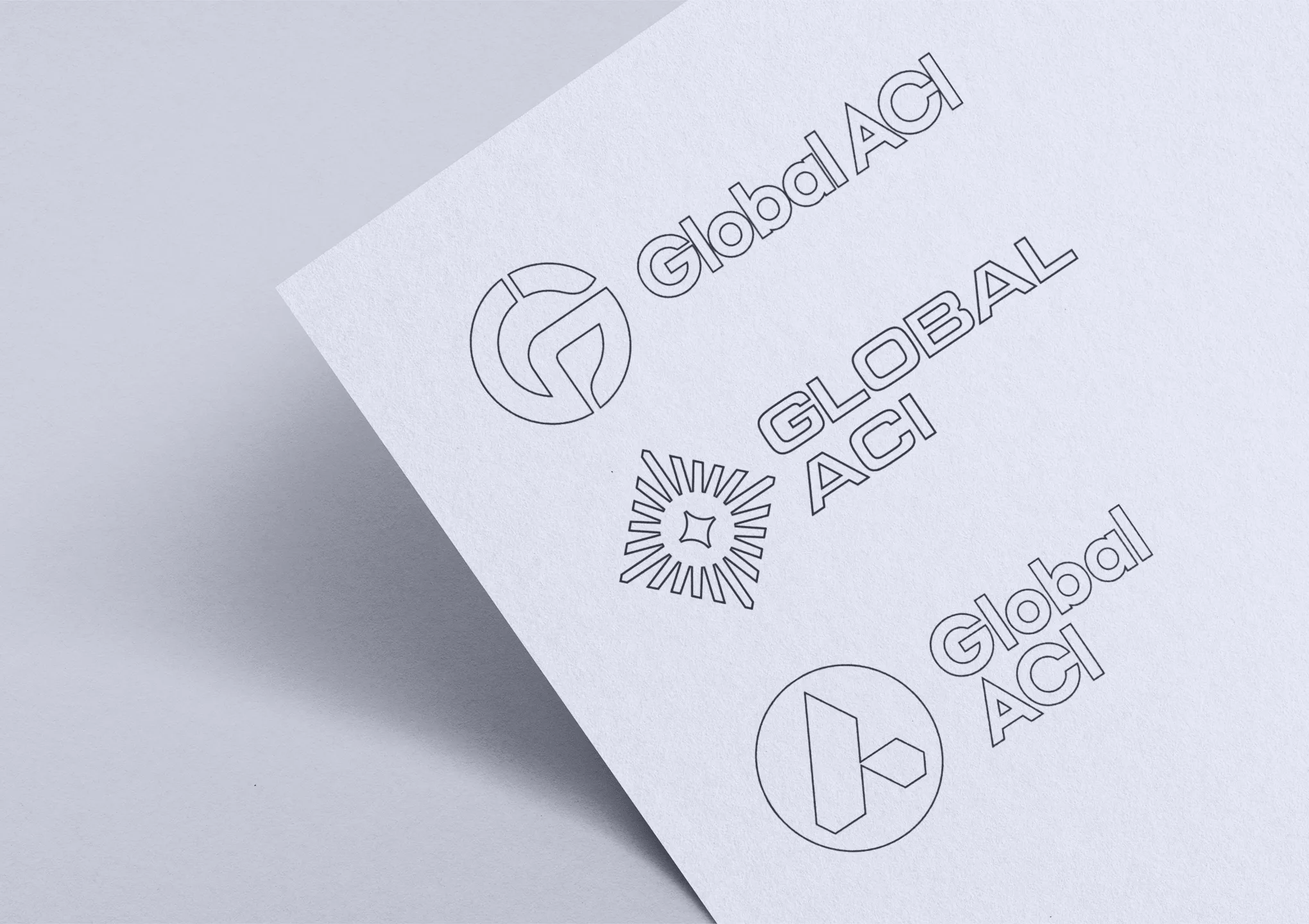

Workshops created shared direction across time zones and teams.
Global teams do not need more opinions. They need a clear process. Rouge ran logo workshops covering the questions that shape a useful brief, from wording and layout to colour, visual elements and existing materials.
That helped turn broad views into practical direction, narrow the brief, and reduce wasted rounds later. For teams working across time zones and towards a fixed launch, that clarity made decisions easier.
A merger this significant needs more than a new logo.
This was not about combining two existing identities. It was about helping a new organisation define its name, clarify what it stood for, and present itself as one global body from day one.
For any marketing or communications lead handling a merger, that matters. If the identity is unclear, alignment slips. If the story is weak, trust takes longer to build. Rouge’s role was to make the brand clear and strong.
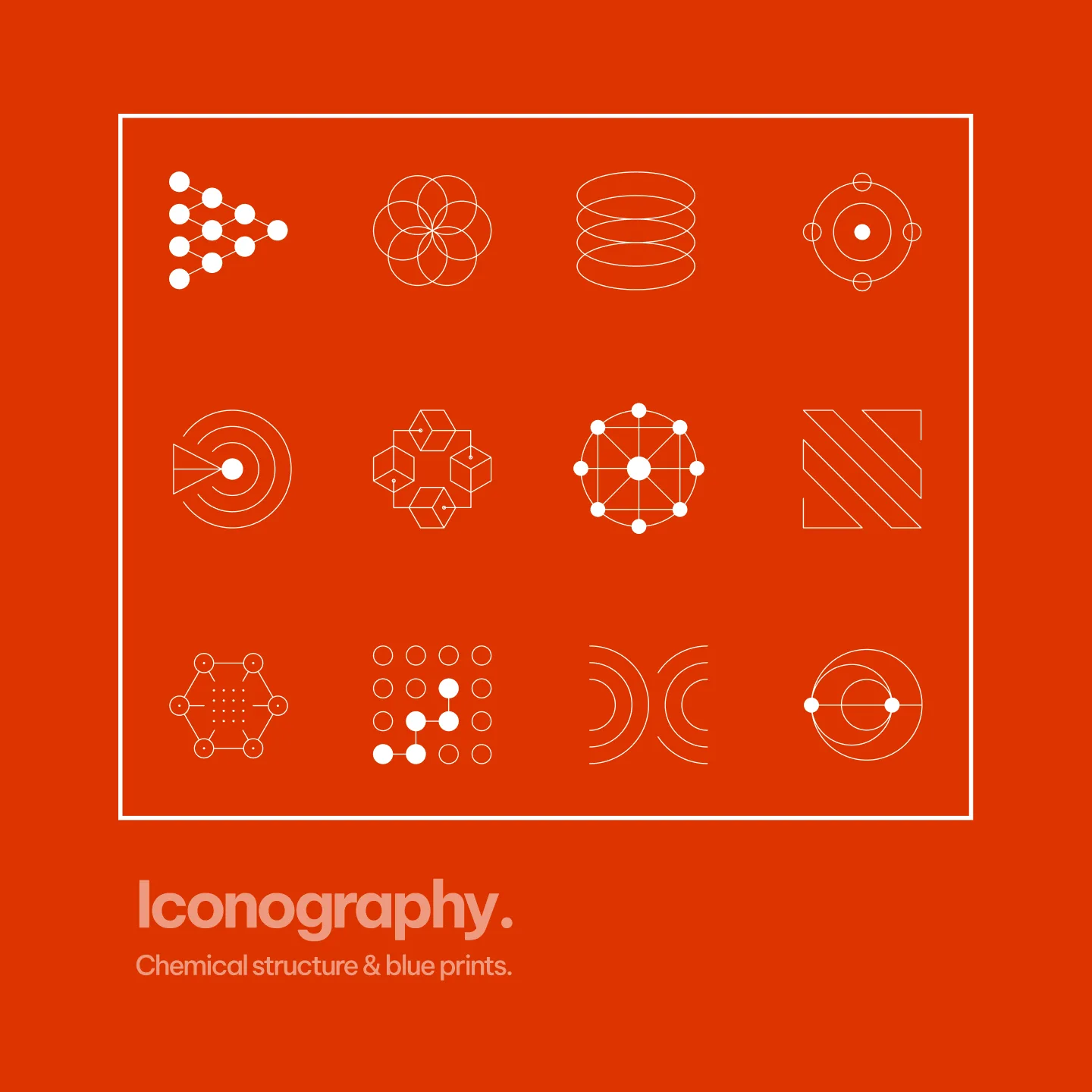
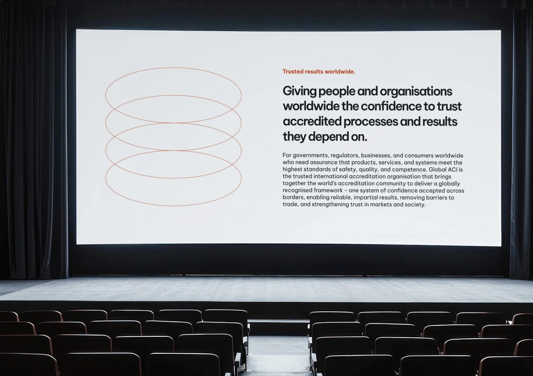
The identity needs global reach without the usual clichés.
Global ACI needed to feel international without relying on a generic globe, cultural stereotypes or narrow industry visuals. Early mood boards and stylescapes helped explore that territory and show the thinking behind the work.
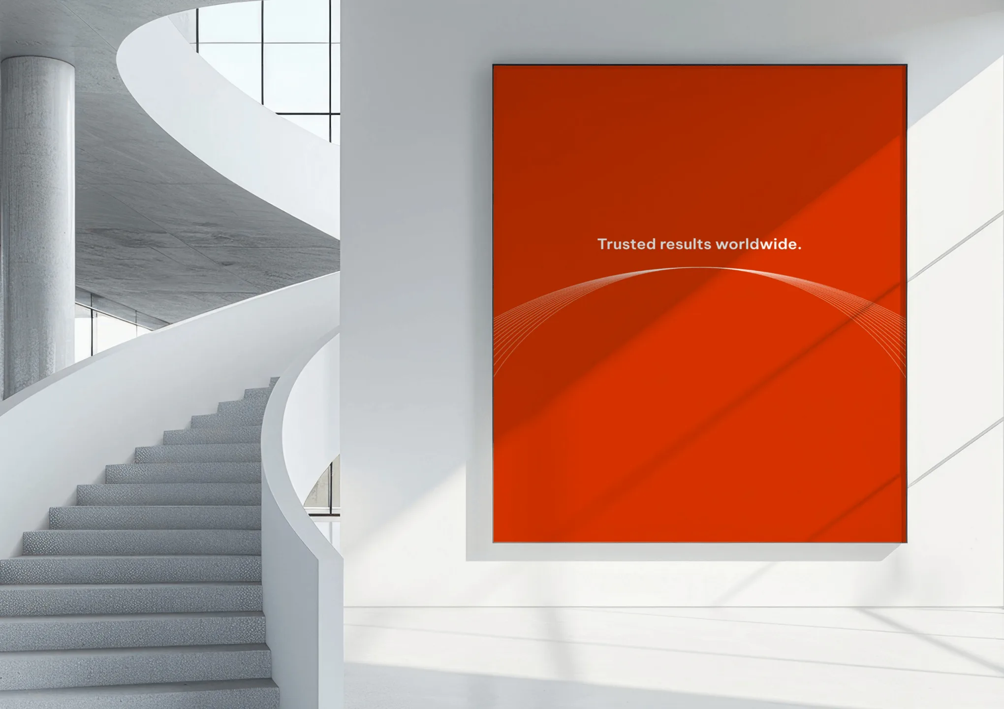
The direction moved towards something clean, open and editorial in style, suited to the organisation’s heavy use of documents, data and structured information. The final visual language drew on star navigation, blueprints and chemical compound structures, giving the brand a sense of global reach and precision without falling into the obvious.


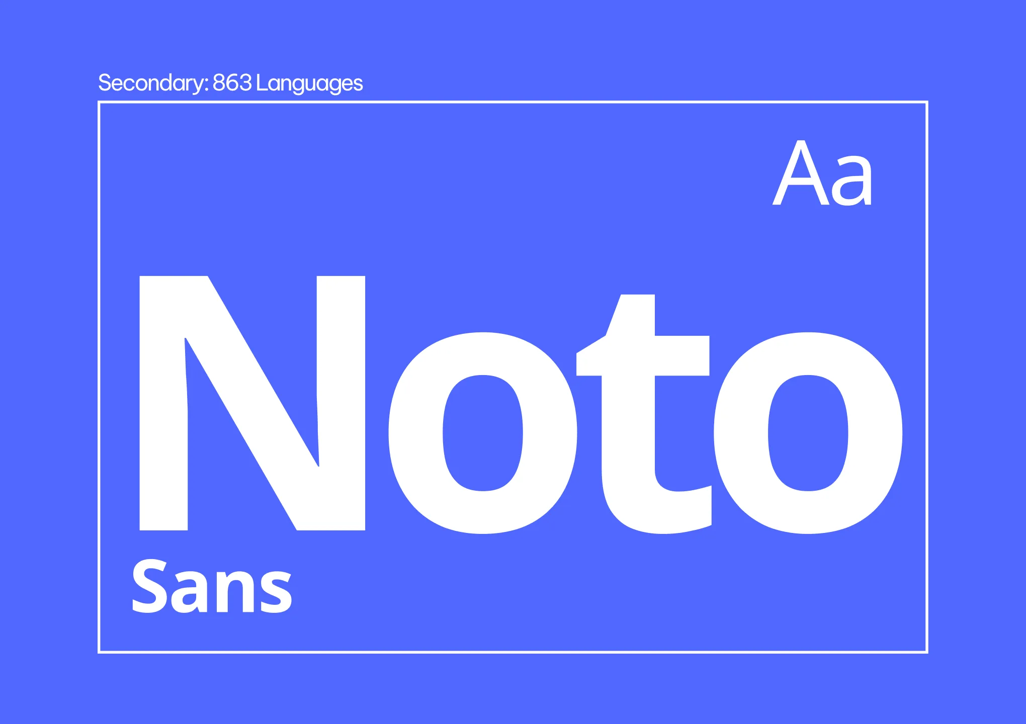
Branding that works beyond one language.
A global brand has to work across languages, scripts and channels. Typography was considered with other scripts in mind, alongside accessible colours, additional shades and neutrals for digital content, charts and documents. Be Vietnam was chosen for languages written in the latin script. Noto is to be used for other writing systems.
That is what makes a brand system practical. Rouge designed for day-to-day use, not just for launch.
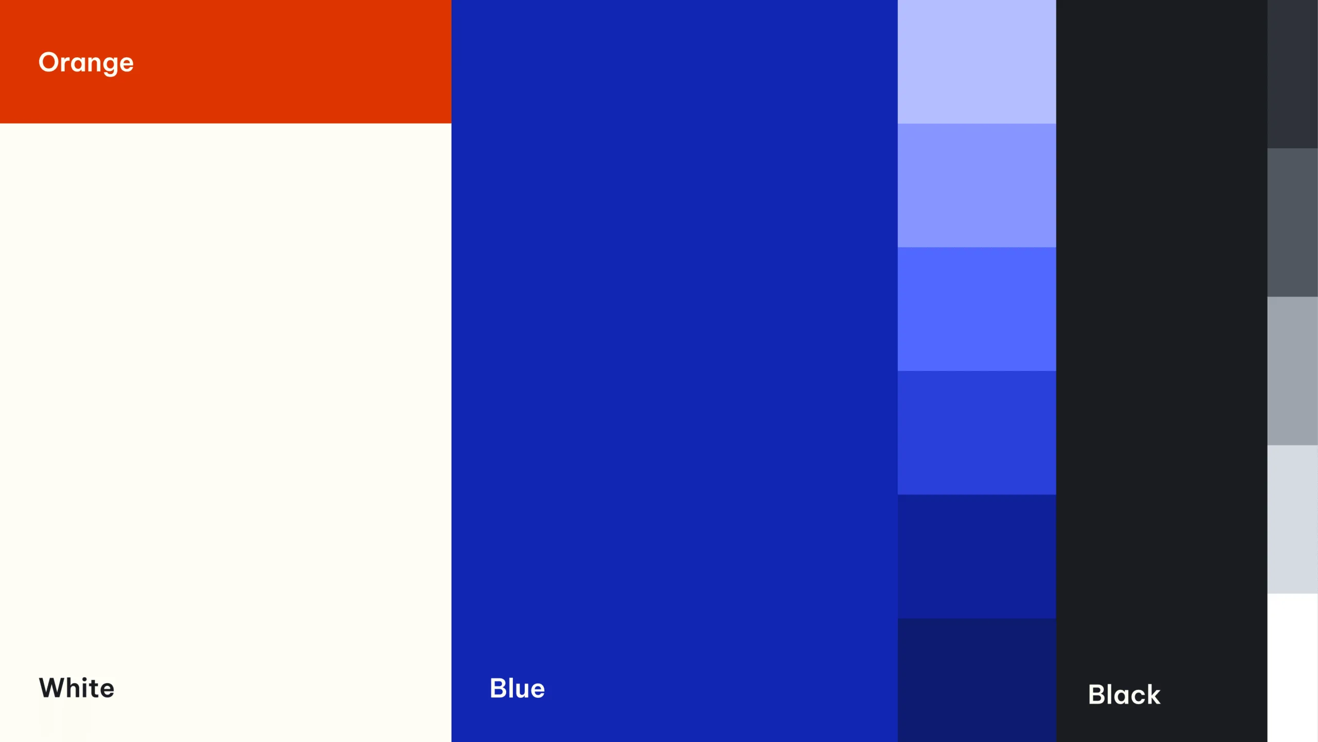

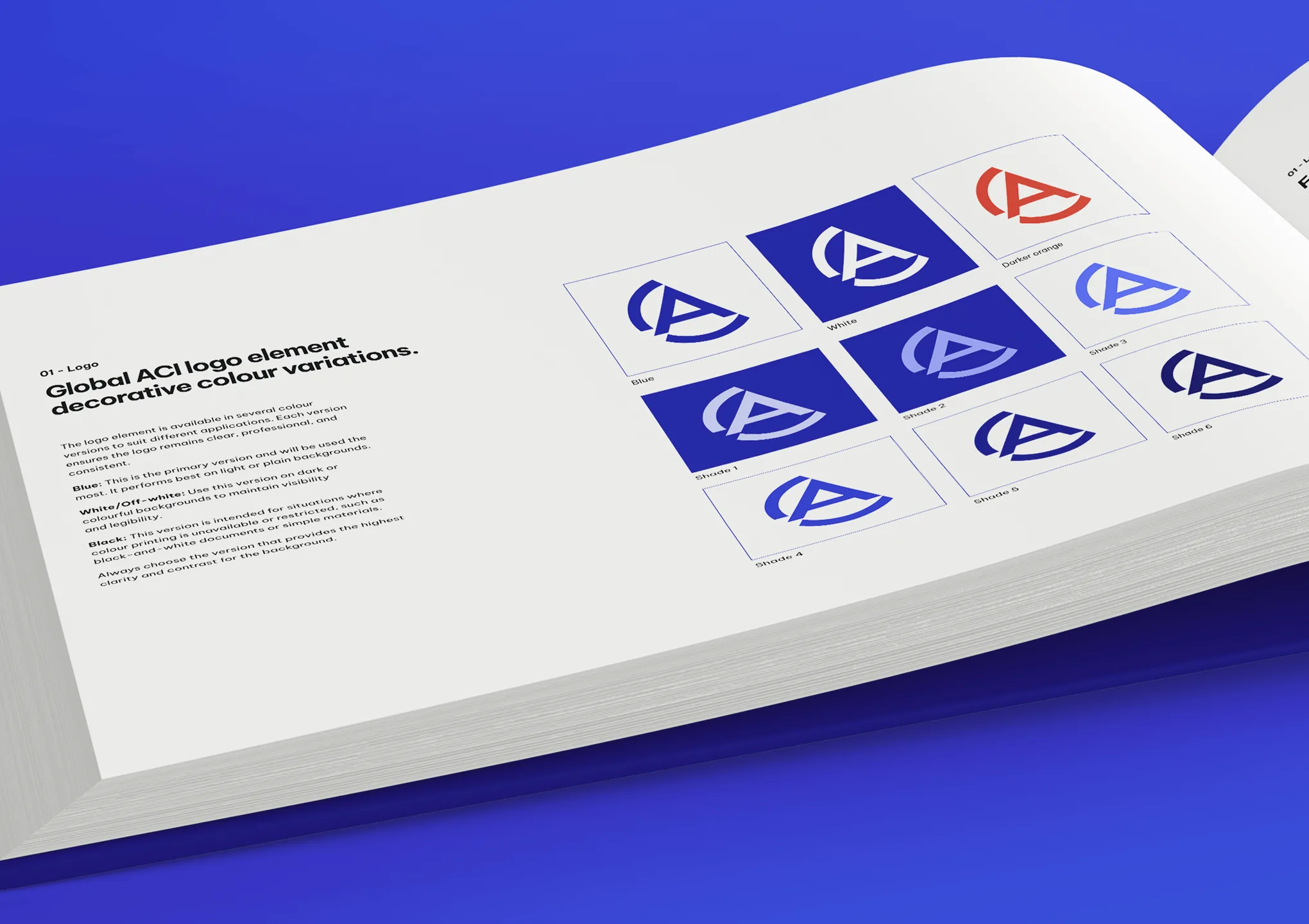
Guidelines and assets gave global teams one agreed way to use the brand.
A brand only becomes useful when people can apply it consistently. Rouge produced detailed guidelines covering logos, icons, typography, colour, charts, graphs and the wider rules needed to keep the identity aligned. Logo packs, icon packs and “Unisphere” packs supported rollout.
For a global organisation, that guidance is what prevents fragmentation. It gave Global ACI one practical identity that is consistent across teams, regions and formats.
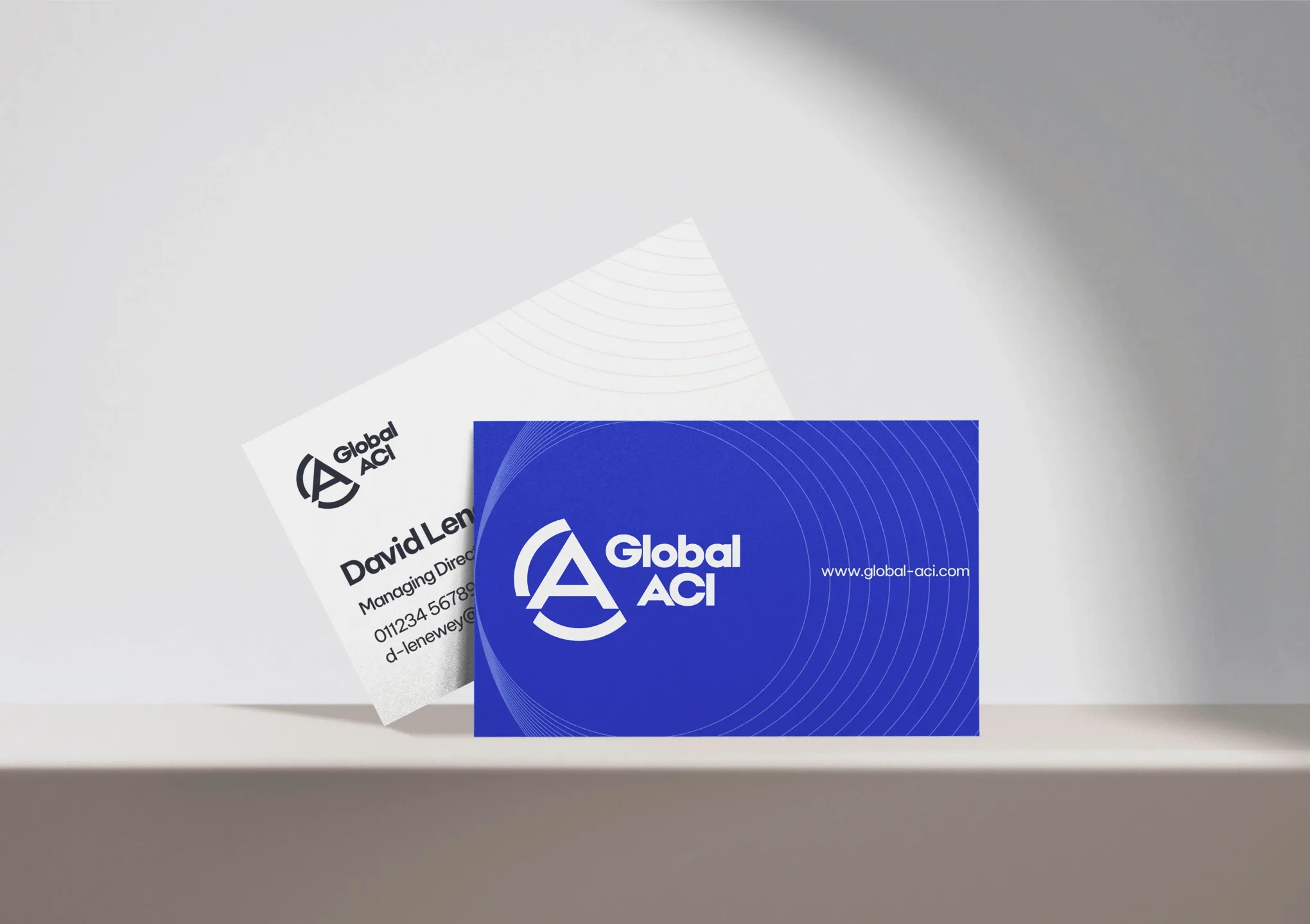
Results that support launch, clarity and consistency.
Global ACI came out of the project with a new name, a distinct logo, a full visual identity, practical guidelines and a usable set of assets. The merged organisation then became operational as the single international authority formed from IAF and ILAC, with a clear brand platform for launch and communication.
The value was straightforward: a merged organisation now has one agreed identity instead of two competing legacies. Global teams have clearer rules for using the brand across documents and communications. The visual system reflects global reach without relying on tired stereotypes. Accessible colours, flexible assets and script-aware typography make the brand more usable in practice – and the organisation has a stronger foundation for consistency as it grows.