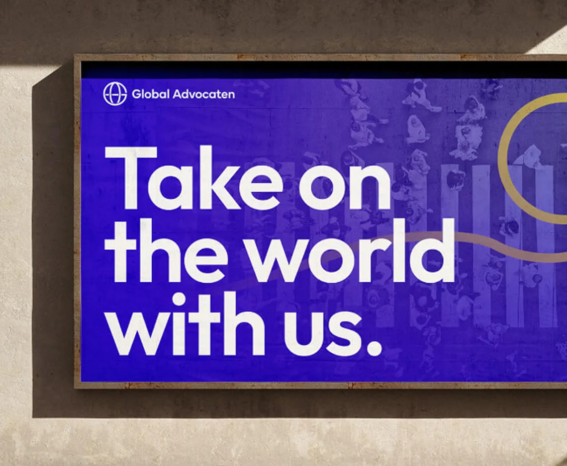
A modern brand that feels human. Built on clear strategy and a fresh visual identity.

A sharper story and clearer visuals, bringing everything together as one cohesive brand.
Our role
Brand Strategy | Visual Language | Logo Design | Brand Activation
Industry
Legal
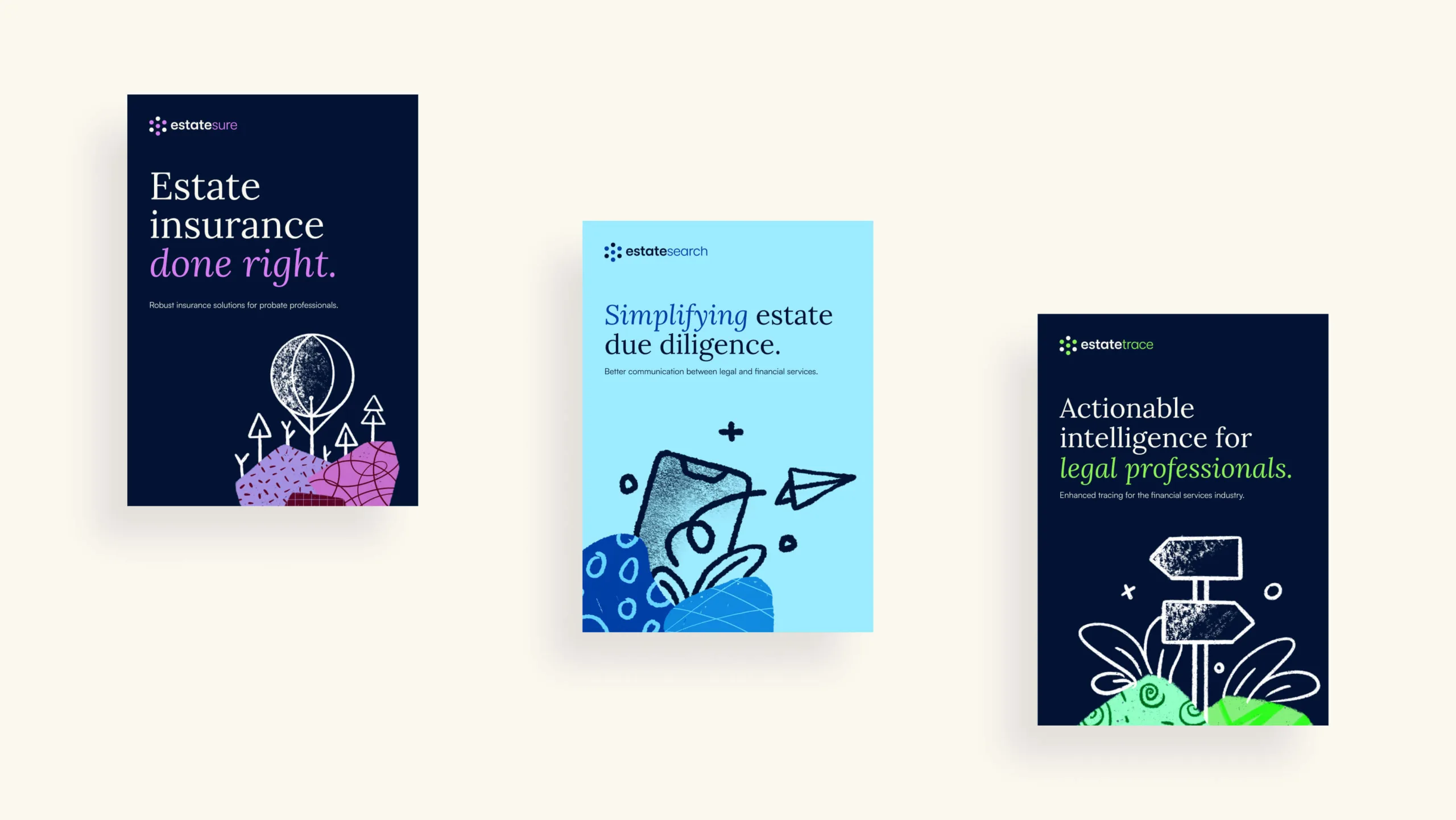
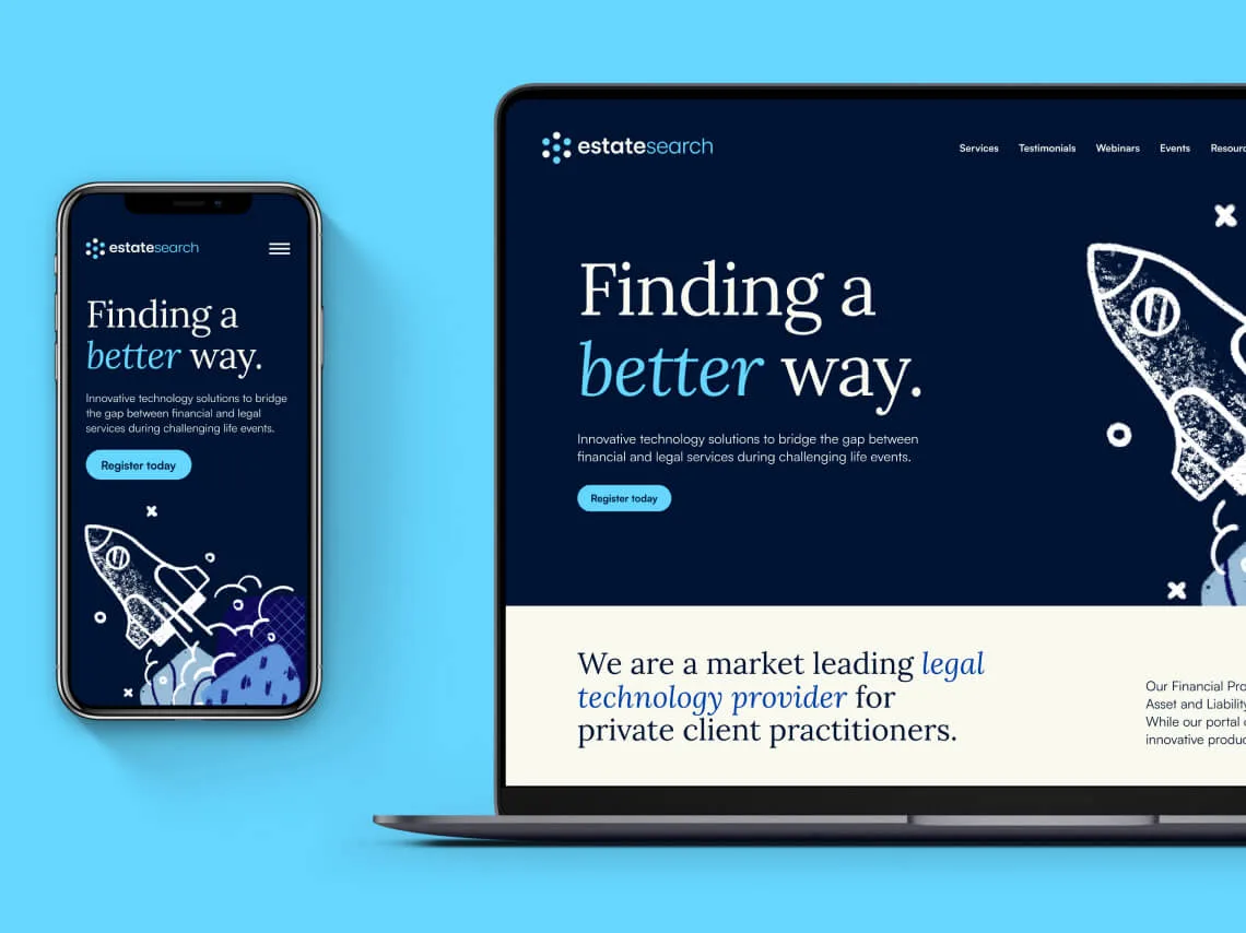
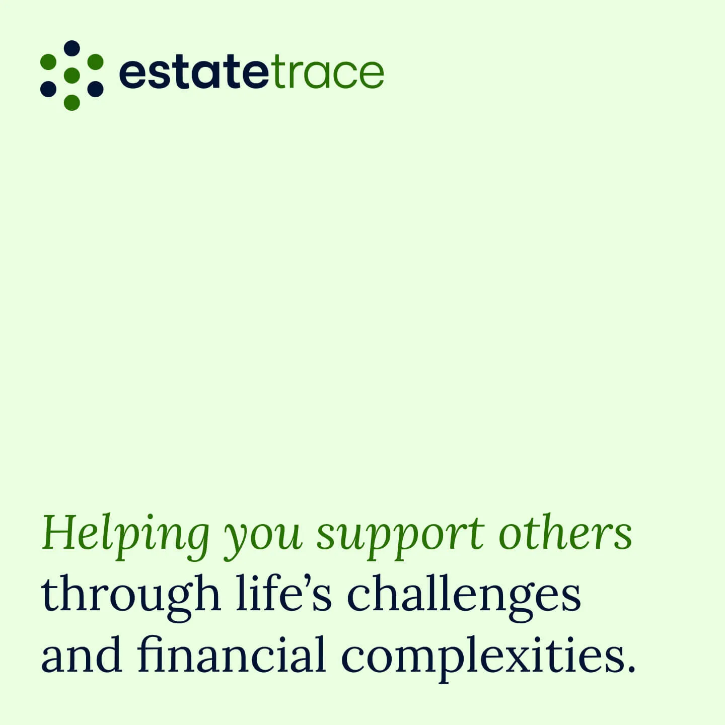
We teamed up with Estatesearch to turn a solid business into a brand people feel. Starting with strategy, we shaped a clear position and a story that fits the team. Then we translated it into a visual identity for the master brand and the two sub-brands, Estatesure and Estatetrace.
The result is a single, confident experience that makes life easier for solicitors, reassures beneficiaries and signals credibility to financial services.
The result is a single, confident experience that makes life easier for solicitors, reassures beneficiaries and signals credibility to financial services.


We started with people and purpose.
Stakeholder Interviews, workshops and a thorough brand audit gave us the insight we needed. From there we shaped a clear brand strategy to guide every decision.
Positioning, messaging and architecture were defined, with practical principles to keep teams aligned. Strong foundations first, so design and rollout could move fast and stay consistent.
The result is a brand strategy people can actually use. It puts a clear belief at the centre, with positioning and values that make decisions easier. Benefits are mapped to real audience needs, so messages land. Differentiators are sharpened, so the offer stands out.

Built for rollout and ready for growth.
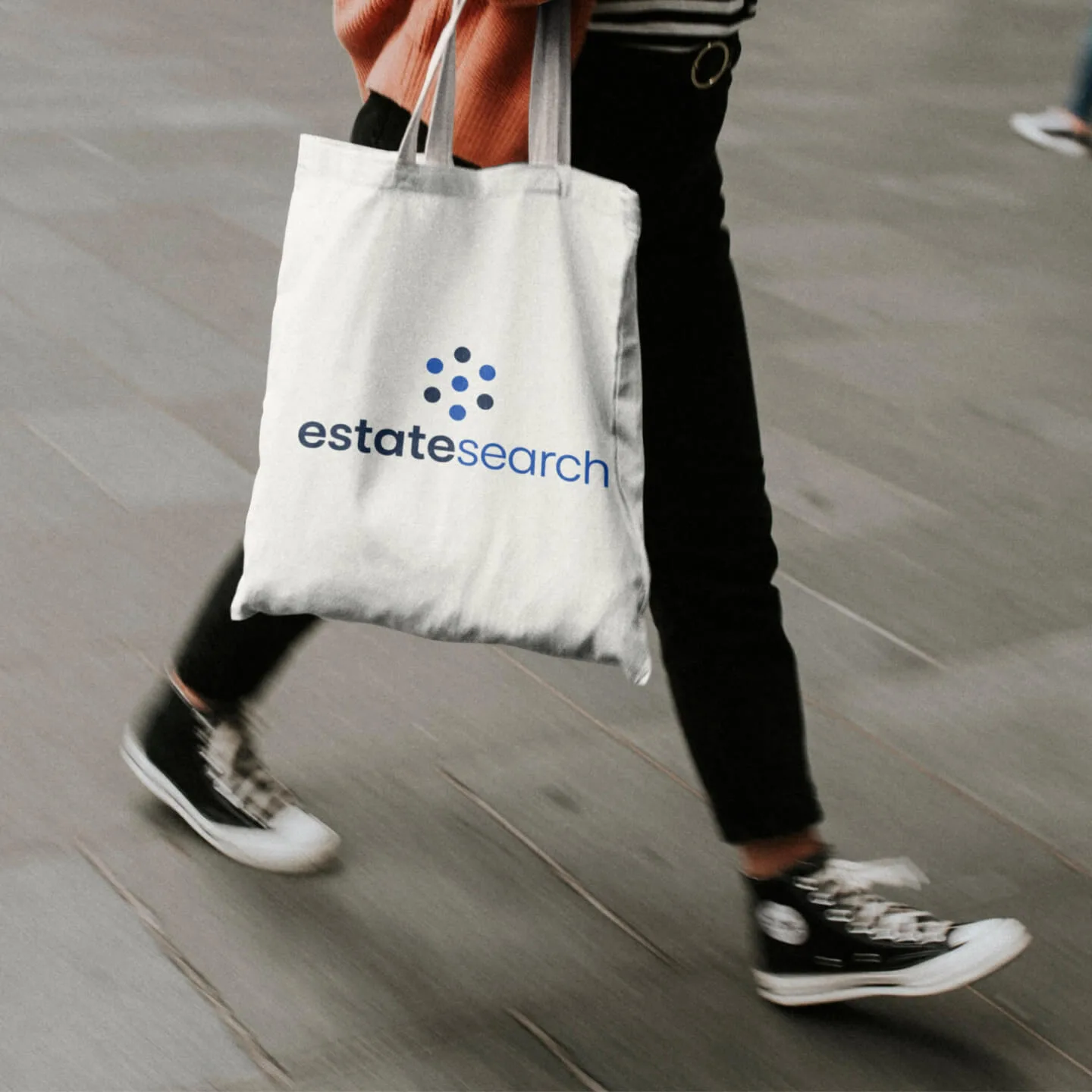
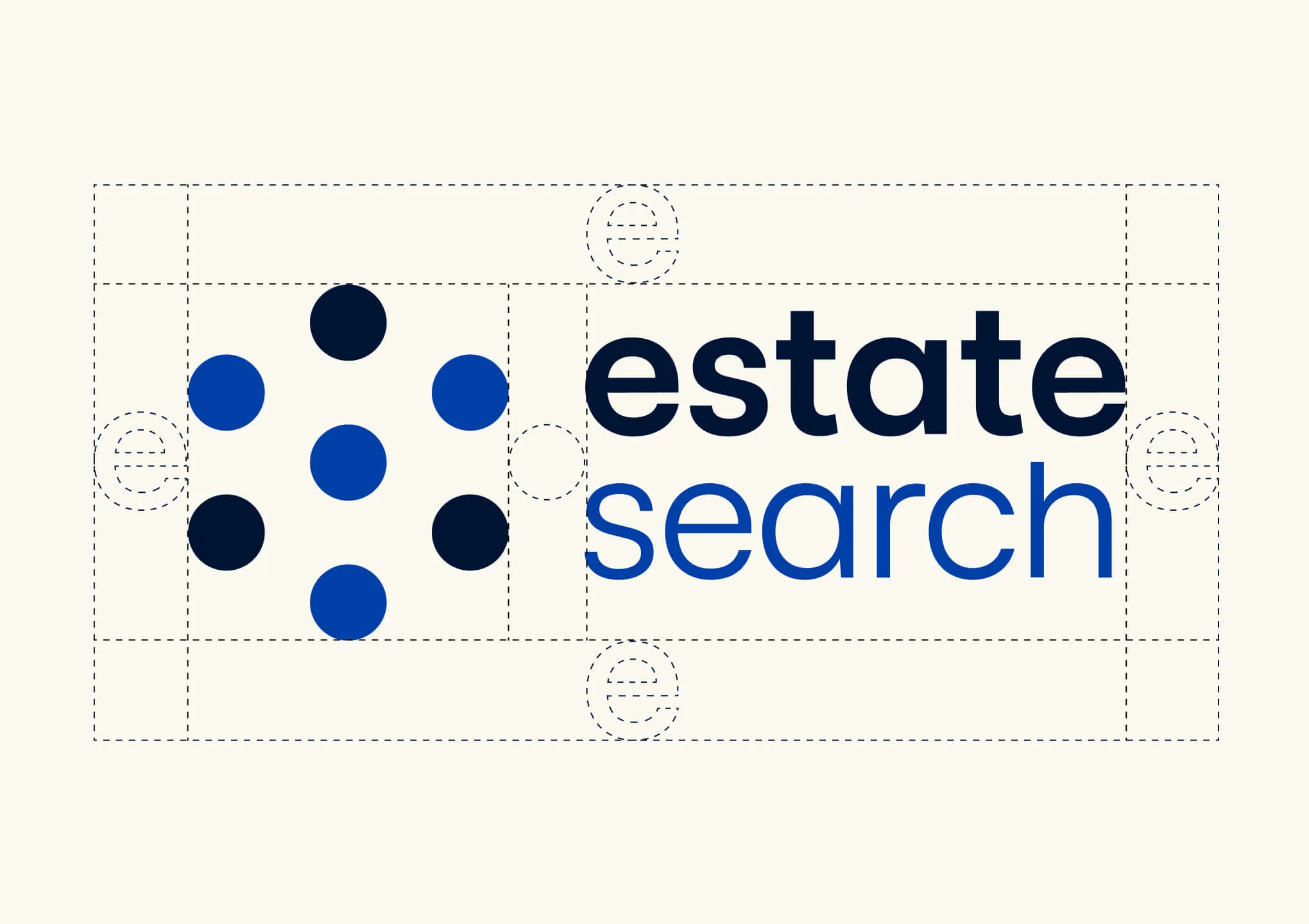
First we refined the Estatesearch mark and built a system around it. The new logo suite is consistent, flexible and ready for growth. Master brand, sub-brands and future additions all follow the same simple rules.
Shapes, spacing and type align with the visual language, so everything feels related and recognisable. It scales cleanly from favicon to event stand and gives the team a dependable foundation to build on.

Professional, warm and human.
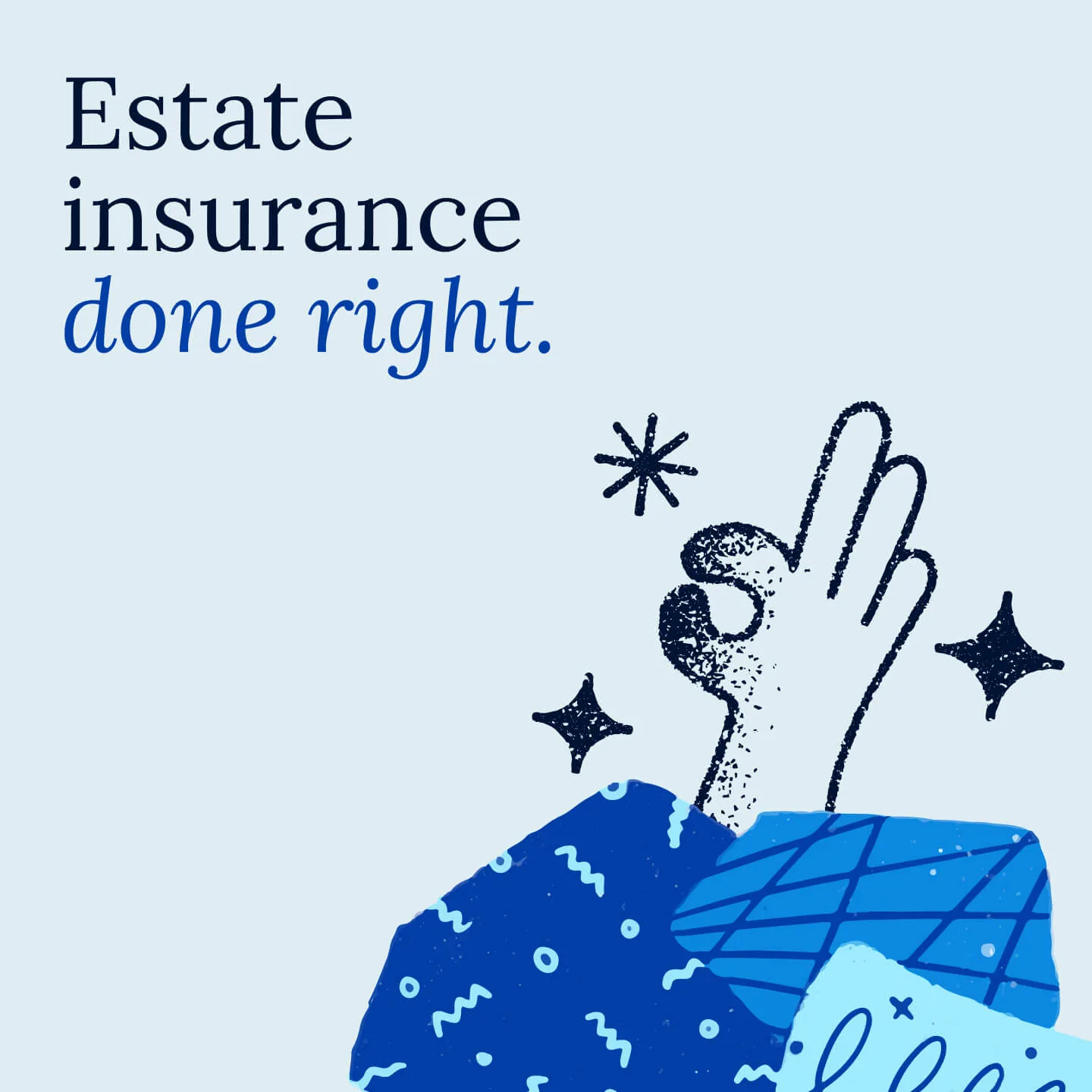
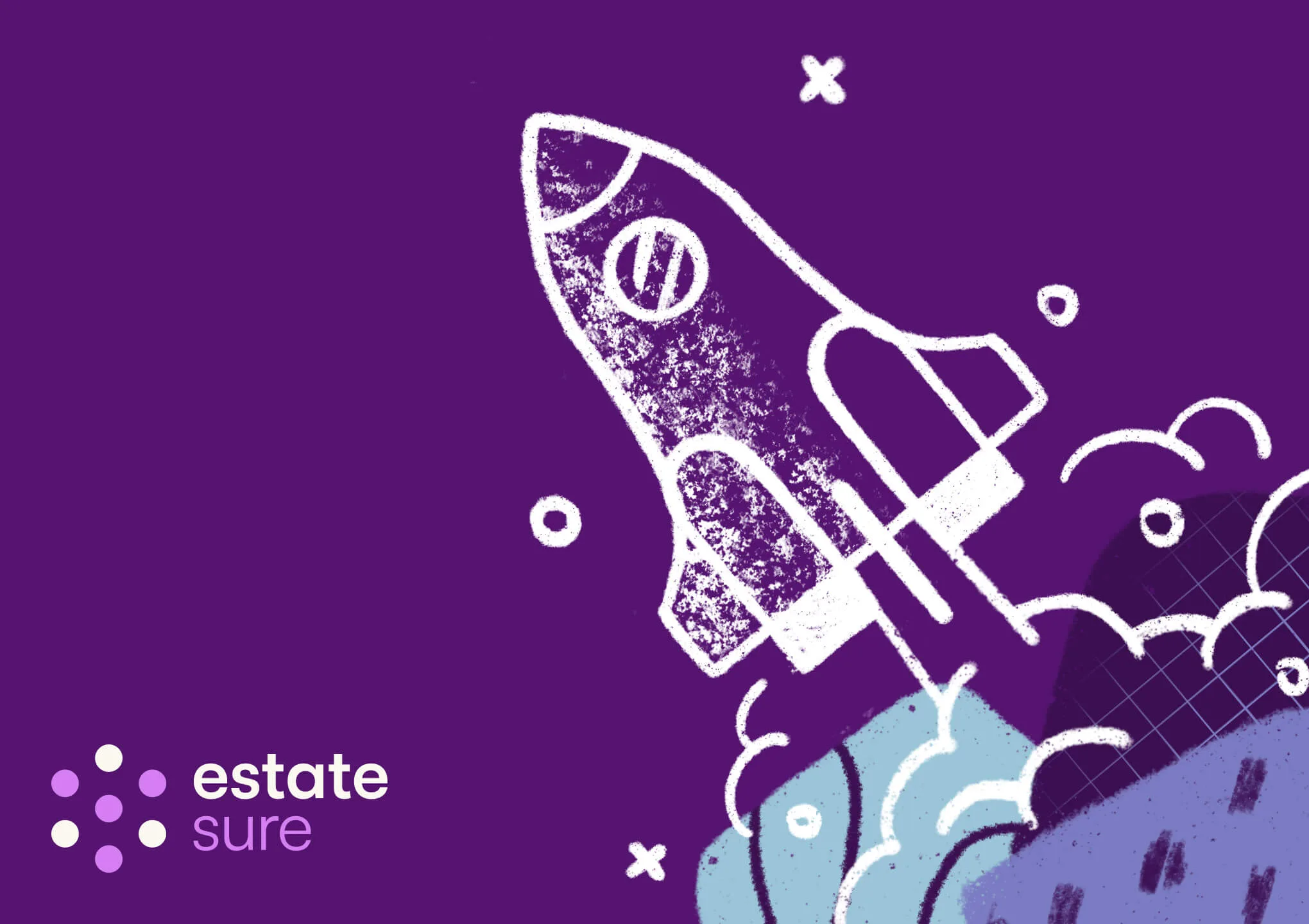
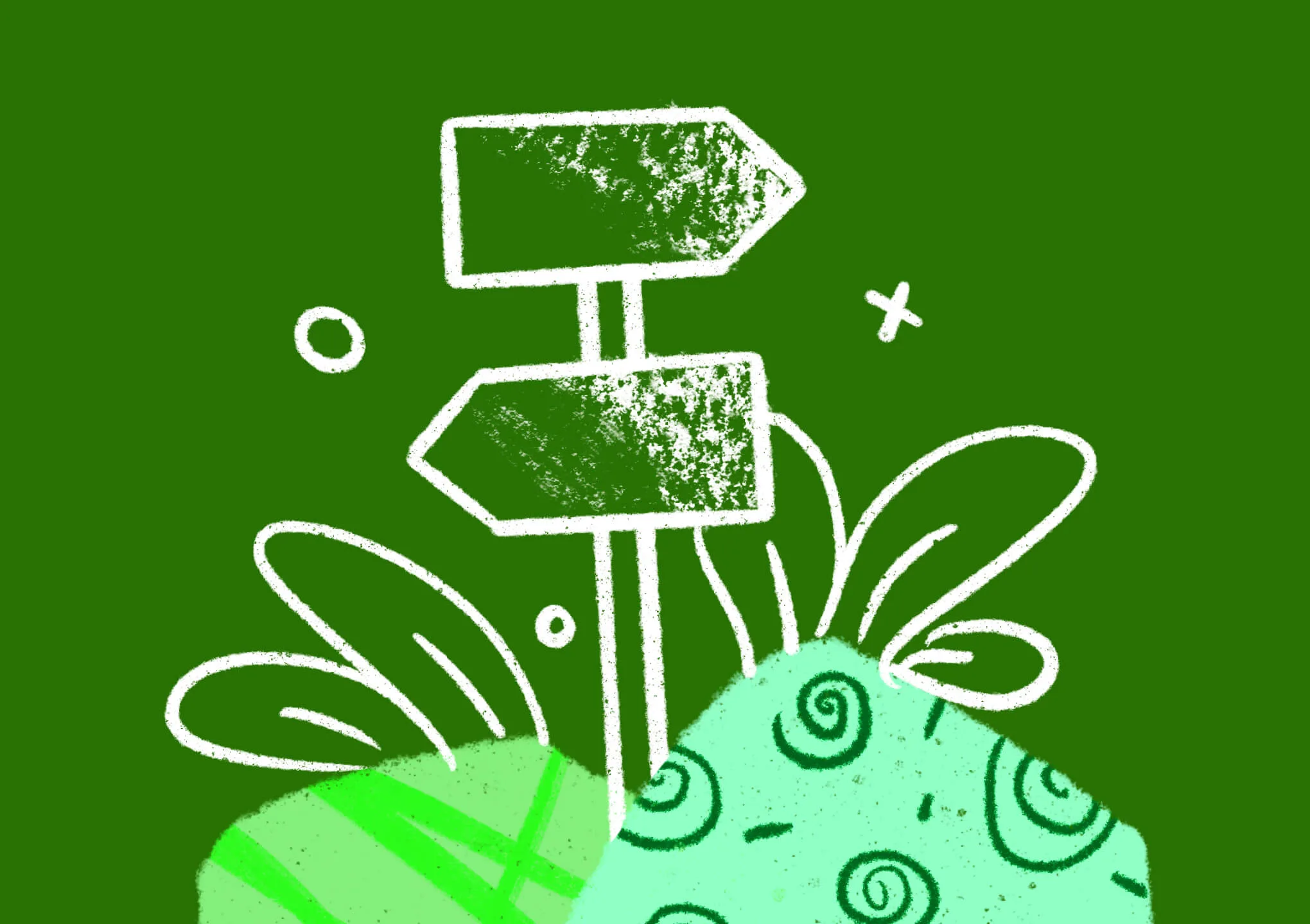
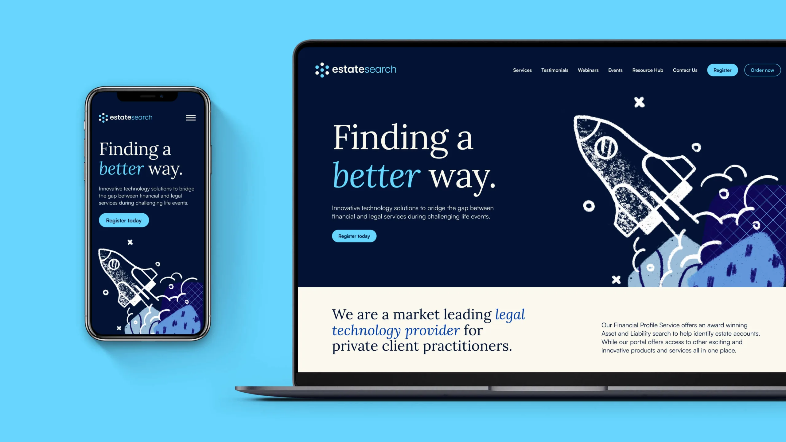
We created a visual language that is simple, distinctive and warm. We paired a friendly serif with a crisp sans to balance personality and clarity. Hand-drawn illustration adds a human note, with lines that feel made by people, not machines.
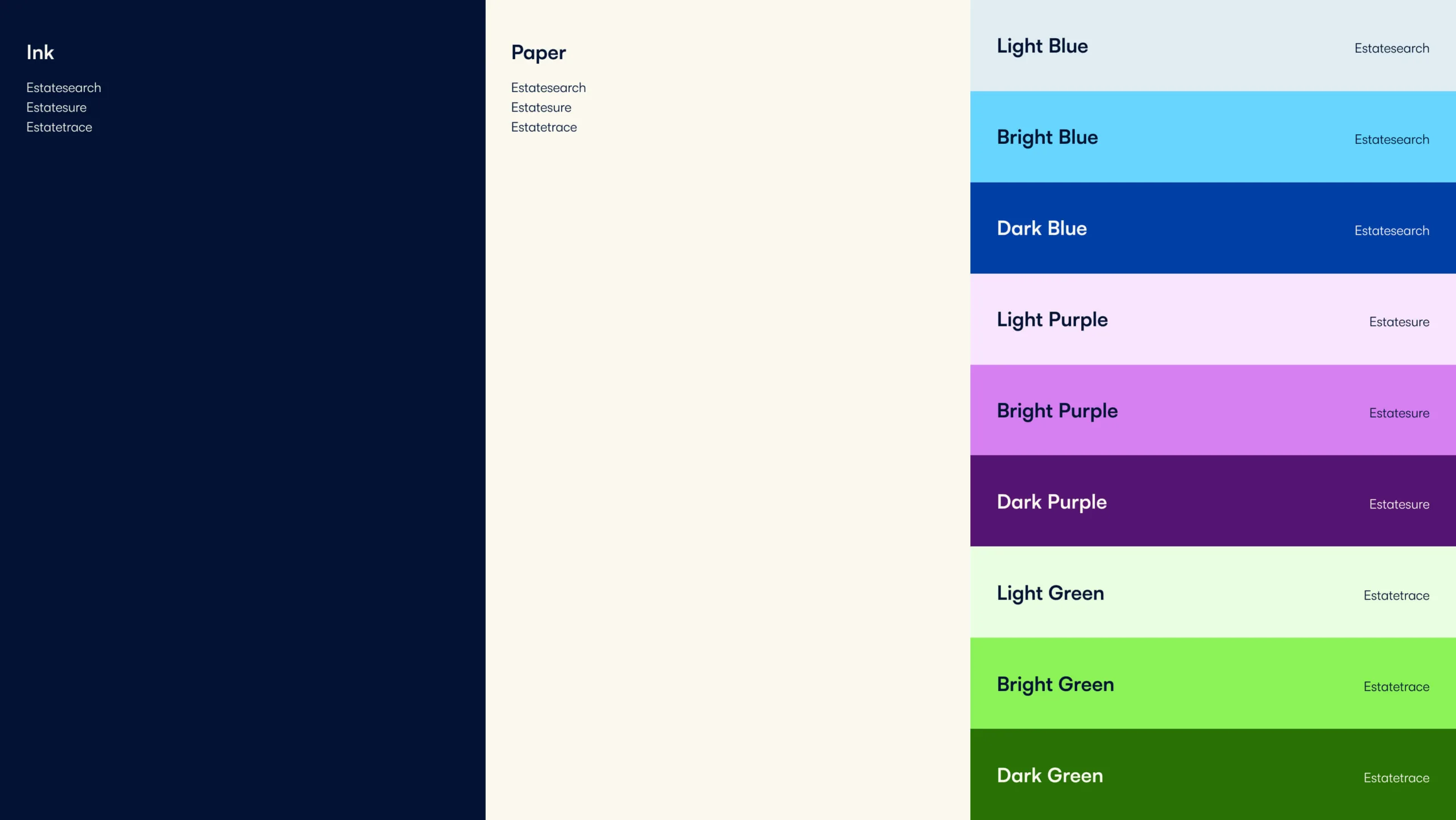
The colour palette evolves what was already familiar, then sharpens it. Core brand colours carry the master brand. Supporting tones give each sub-brand its own space without losing the family feel.
The result is a friendly, human and progressive identity that looks confident everywhere and feels true to the team behind it.


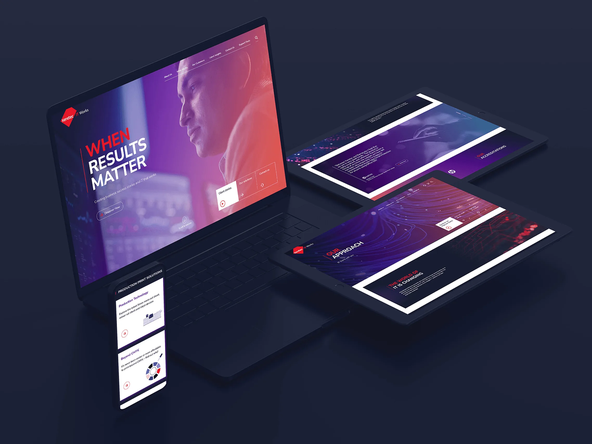
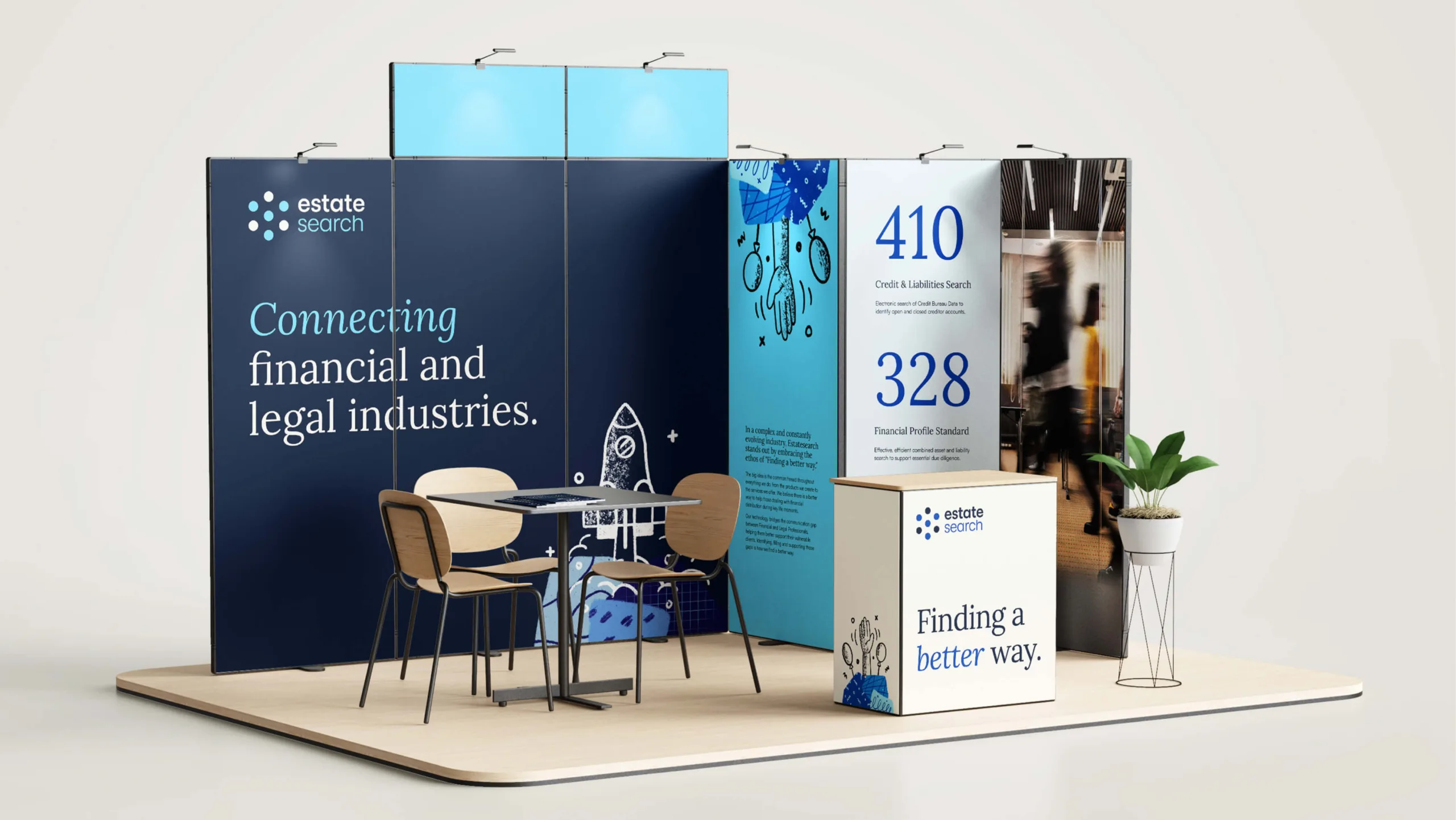
A joined up brand experience in every page.
As part of the rollout, we brought the new identity to life on the marketing site. The refreshed design, copy and components tie every page back to the brand strategy, so the story feels consistent from first click to contact.
We delivered it on WordPress for speed and control. Content is easy to update. Pages are simple to extend. The result is a site that looks the part, works hard for marketing and stays aligned with the brand.
“Rouge helped us articulate who we are, then turned that into an identity we can use every day”

A single story across three brands.
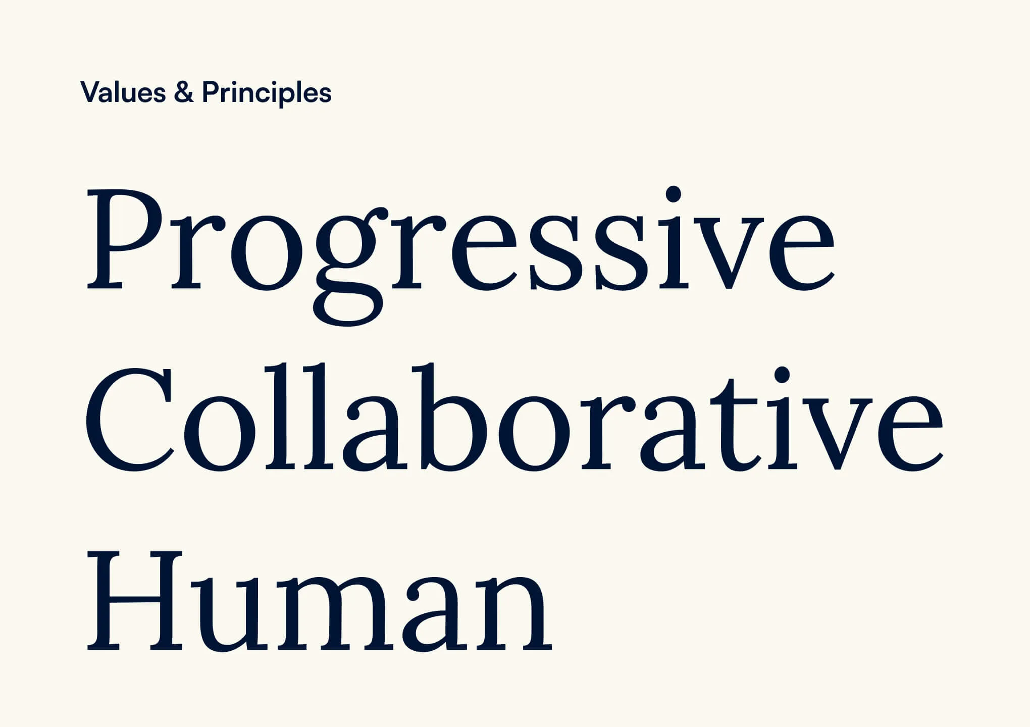
Estatesearch now goes to market with a cohesive brand strategy and identity that holds together in every channel. Internally, teams have a practical toolkit and templates that make good work quicker. Externally, audiences see a business that looks and sounds like the people behind it: collaborative, human and progressive.