Premium brand, clear differentiation. A digital store built to sell and scale.
A WordPress website, making exceptional virtual instruments easier to find and buy.
Our Role
Visual Refresh | Logo Design | User-Experience Design | WordPress
Industry
Retail
e-instruments creates premium virtual instruments for musicians and producers.
The products were premium. The website experience was not.
The site navigation was unclear and search across the product range was poor. Mobile users faced too much friction when trying to purchase new products. We designed a new brand and e-commerce website that makes every product easier to find, understand and buy.
The site navigation was unclear and search across the product range was poor. Mobile users faced too much friction when trying to purchase new products. We designed a new brand and e-commerce website that makes every product easier to find, understand and buy.


Discovery brought the business, creative and technical requirements together.
We worked with e-instruments to understand the product range, how customers browse and purchase, what the team needed to manage with the content management system (CMS), and where the business wanted to grow.4
That gave every decision a clear test. Does it make instruments easier to find, improve the path to purchase and deliver a seamless experience across all devices.
Delivering an outcome that worked for the customer and the business.
Rebuilding the sitemap around the customer purchase journey.
Clearer categories helped users explore the full range. Improved navigation and search made it easier to move between instruments. Related products encouraged discovery without getting in the way.
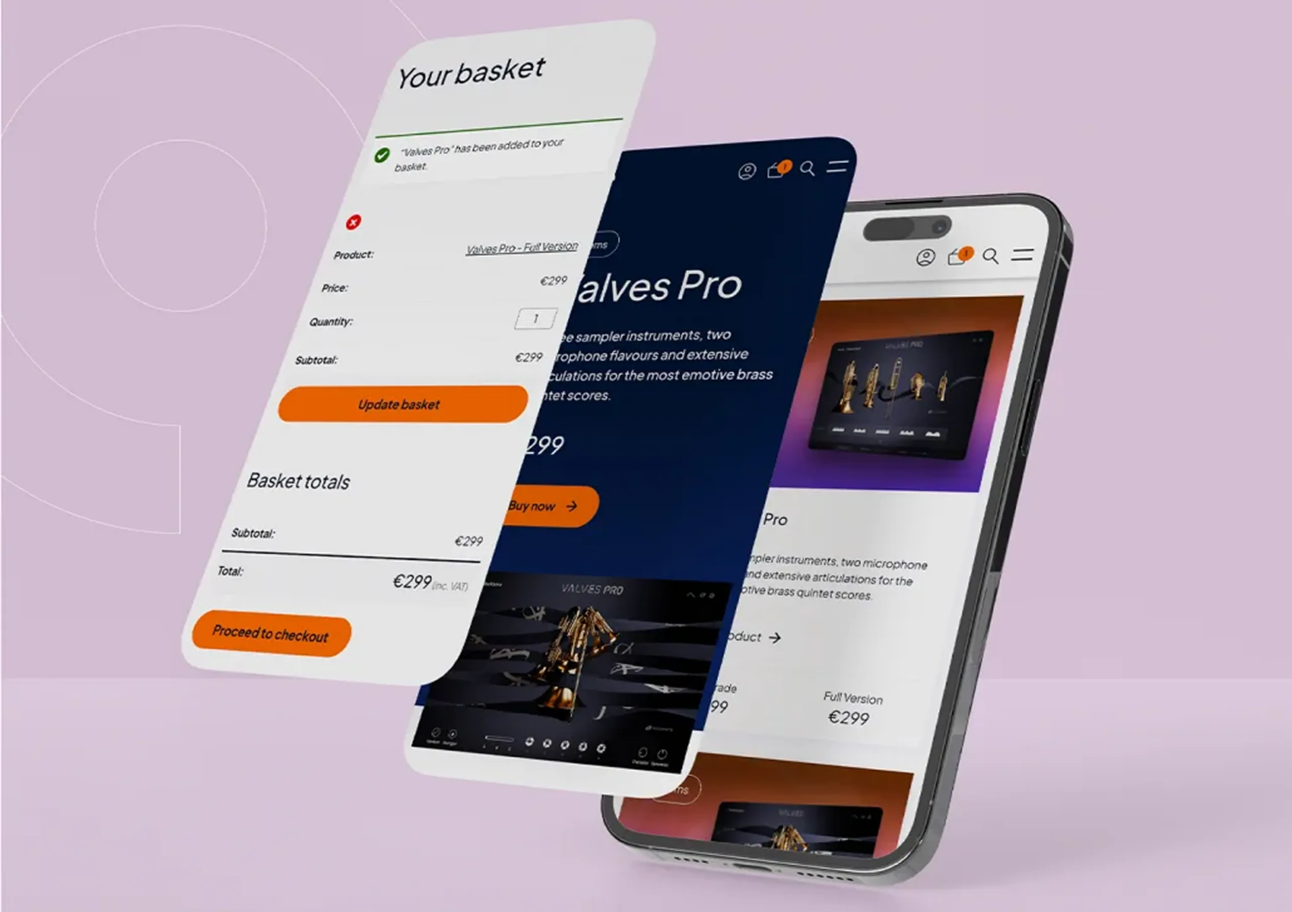
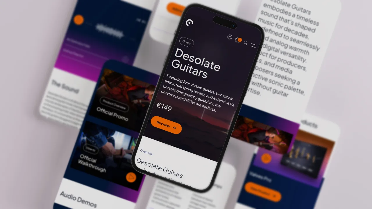
We re-designed the product pages around the questions customers ask before buying. What does it sound like, how does it work or is it right for me? Whilst bringing pricing to the forefront so customers could make a decision without searching.


Premium does not need to shout.
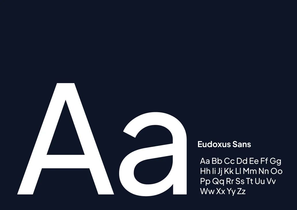
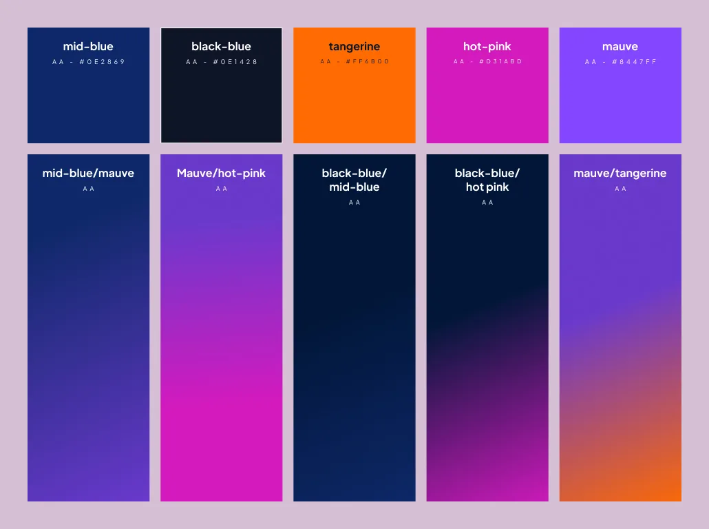
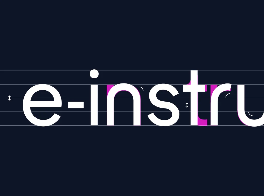
The identity needed to reflect the quality of the products without overpowering them. We refined the logo and created a cleaner visual system around it.
Strong typography, striking colours and bold product imagery gave each instrument space to stand out. Allowing the products to do the talking.


Mobile is part of the experience.
During discovery, it was identified a large share of the audience was already visiting on mobile. From the beginning navigation, product content and e-commerce interactions were designed for smaller screens.
Resulting in a consistent journey across devices, from discovery to purchase.

E-commerce shaped around the customer.
The buying experience needed to feel like one journey.
We designed and developed a WordPress WooCommerce platform around e-instruments’ products and chosen payment provider. Allowing account management, checkout and payments to work together more clearly.
Behind the scenes, reusable templates and a flexible WordPress Content Management System makes it easier for the team to add products, update pages and grow the site across new product launches.
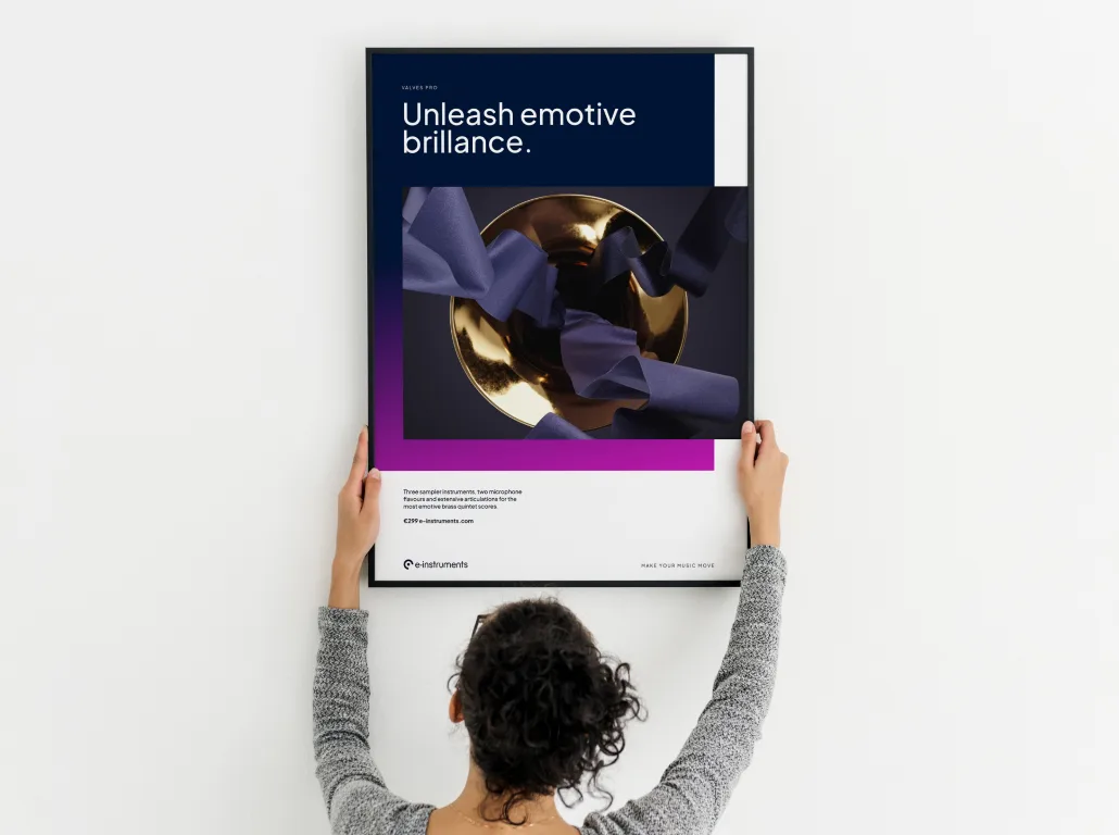

Compared to what we had before, the brand is stronger, the look and feel of the website is vastly improved.