29th January 2018
Thoughts on user interface design in 2018.

Over the past years website design has in some people’s view, become a little staid, no one wanting to break the mould. For many this means all sites seem to have either full-screen images / videos, so called hamburger menus, with many using a flat design and responsive menus…
This has led a few creative designers to ask so ‘What could be the next step’.
So what risks are these designers willing to take? This is an important question when you consider that the changes they make have to be woven into a UI design that will work…
The ideal after all is to produce a web site that is a unique, whilst at the same time not breaking the rules of UI design to such an extent that people can’t use it, or at least can’t be bothered to learn something new. In short, failing to follow the rules could just end up confusing users and that is the last thing that any one wants.
Before we go on to see some of the new ideas that are about, we should first be sure to remember just how important the user interface is. Perhaps the best (and certainly most important) example is that the of recent false missile alarm in Hawaii. This it seems was caused in part, by a poorly designed interface.
Here the interface had two very similar options. One was labelled “test missile alert”, which tests that the notification system is working, whilst another is labelled “missile alert”. You can see that there is little difference here, even though there was a ‘confirmation’ to click through in the latter case.
However, in the incident in question, the user simply clicked the confirmation message, probably without even thinking (I expect you have done this once or twice yourself, except that you did not have as much impact as that poor individual in Hawaii).
This just goes to show how important the UI really is…
But why is creating a new design so important?
All designers try to improve on old patterns whilst also trying to create a new trend. But they also have to understand that, really innovative design change, also changes the way users engage with any given product. Thus changes need to be carefully thought through…
What all designers have to do is to work innovatively, while at the same time ensuring that the user experience they create is a good one.
The UI of wearable technology.
The amount of wearable technology about is growing pretty fast these days, most often being worn on the wrist. Fitness trackers and smartwatches are the most common examples, and as their numbers grow, web designers and application developers are thinking ‘how they can be used to access the websites and applications they have created?’
They are thinking this way as they know that the big brands will want their sites to be accessible via these products in the not too distant future…
However, wearable technology has many limitations, not the least the fact that their screens are small, thus the UI has be as simple and functional as possible
First impressions count.
There is probably no better example of the importance of the ‘first impression’ than that of websites and Apps. Designers have to remember that users will, more likely than not, form an opinion of their creation in the blink of an eye. Thus they have to ensure that their layouts are simple and clear.
In all cases users must be able to immediately understand what their next step is. You have to ensure that the goal of the site or App is easy to spot and that the user’s attention is placed firmly on it.
Basically, the message is to keep your pages simple and clutter free.
Speak your viewers language.
It is always essential to balance the goal of creating a unique type of design, with that of the need to remain traditional, as otherwise you may simply ‘lose’ your users.
The most important message, is as ever, to make any ‘call to action buttons’ easily identifiable.
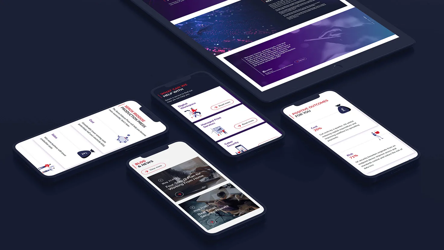
The importance of responsive design.
The advent and ever increasing use of smartphones and tablets have literally ‘made’ designers create sites and Apps that can be used on smaller screens, these having to adapt to the large variation of sizes automatically.
However, designing a responsive website means more than just shrinking it to fit as this can mean that no one can see the content without zooming in, a process that makes it hard to understand what the whole page and thus what the site is ‘all about.
All designers therefore not just to create a responsive site, but rather one that will maintain the aesthetics of the brand in question.
Easy navigation is another key.
Another key factor that must be taken to heart by an UI designer is to ensure that users can easily move about the site, without getting lost or confused.
Give users the ability to scan the content.
Today’s users often find themselves short of time (and patience?) so it is essential that you give them the ‘big picture’ when they first view the site. This allows them to drill down quickly to the data that they want, without the need to wade through a complex set of steps.
Let users scan your content first.
So, break information up into small related areas, creating headings and subheadings so that a user can easily see what is on each page. This includes placing the most important copy near the top of the page, under a great headline of course. Doing things this way will ensure that the users attention can be grabbed quickly, this making them all the more likely to read on.
Remember, most users only switch from scanning to actually reading content once they are convinced that they are in the right place.
So make all your headings and sub headings crystal clear as it will allow the user to easily choose what they would like to read in depth. They will thank you for it and be all the more likely to come back.
Learn more about the services talked about in this post.