29th June 2022
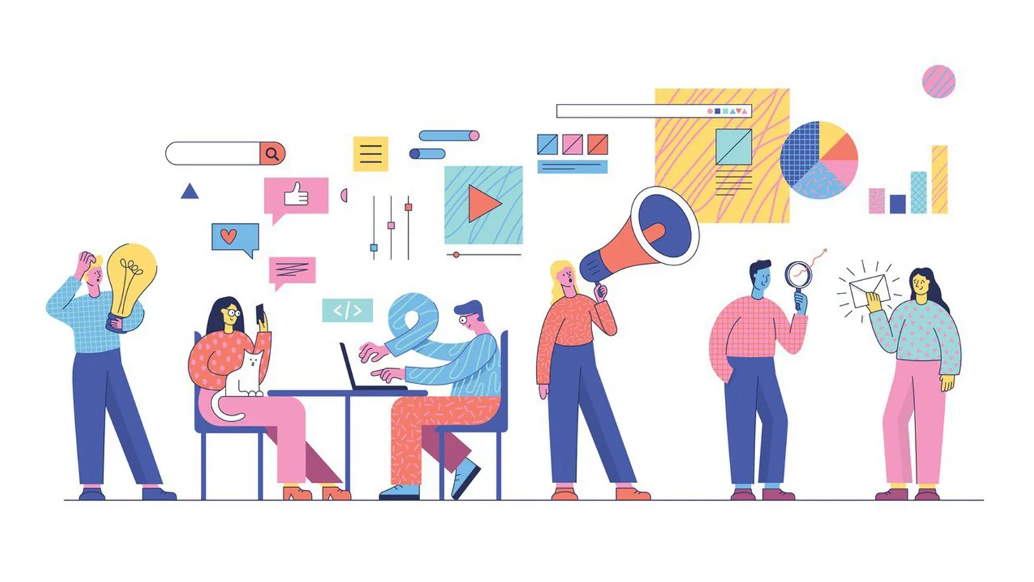
Dark patterns. Clever or unethical website design?

We first need to understand User Interface (UI) design to understand dark patterns.
A user interface is how someone interacts with a website, application, software, or device. The design and placement of the buttons, layouts, words, navigation, and framework facilitate the User’s actions. A good UI design helps the Users. And the design itself is essentially invisible – the User doesn’t even have to think about what or where to click next. It is simply natural and intuitive. The best interface designs give the User a sense of control and are created solely towards the User’s interest.
Dark Patterns are the evil twin of good User Interface design. They take everything wholesome about UI and make it work in the interests of the website or app owner. They are deceptive techniques that trick you into doing something you didn’t want to do. At worst, they are criminal.
Dark patterns are everywhere. Book a hotel room online, and you’ll see a counter that tells you x-many people are also looking at that room, which is the last one available for your dates. Sign-up for a trial offer for an app in one easy click. Then decide you don’t want it. Only to discover you have to leap through dozens of flaming hoops to turn it off. Visit a car-hire website, and see a “hire this car for £X per day” message. Then try and book. It’s double that cost at the check-out.
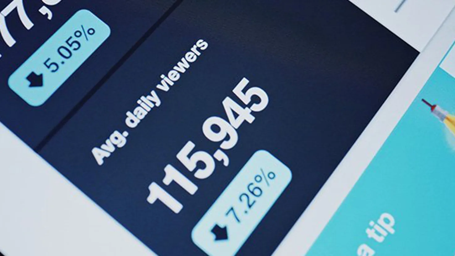
A friend of mine works for an airline. I was talking to him about this subject recently. He told me that when booking a flight for his family, the website displayed only a limited number of seats left – even though the flight was six months away. However, through his job, he has access to the back-office system and could see a mostly empty aeroplane. That’s a dark pattern.
What this company is doing isn’t technically illegal because they release their seats in blocks. The website told my friend that the number of seats in the current release was running out. Despite not technically unlawful, this is still a dark pattern because it paints a false reality on the availability of the seats on the whole aeroplane. The website uses this interface technique to create fear-of-missing-out (FOMO) and encourage Users to buy today.
Persuasive marketing is as old as the hills. What’s new and different with dark patterns?
The job of every marketeer, in a nutshell, is to sell more stuff. Its basic form can be as simple as making your audience aware of what you are selling. High-performance marketing is where it gets fascinating, though. Human psychology comes into play.
Marketing and advertising are persuasion arts. Buy this, click that, sign here, etc. Marketers will use every trick in the book to ‘encourage’ you to click the button and buy more.
Take an eCommerce website. It has two main jobs: to get you to spend money when you visit. And then to come back and buy again. And again. The aim is to move consumers from passive visitors into brand-loving devotees. The holy grail of marketing for any business is to create a cycle of repeat buying loyal customers.
What big eCommerce sites have today is big data and the rapidity of change. The website of a business like Amazon is constantly changing. These changes are not by design alone; they are led by customer behaviour. With a global audience, companies can treat their websites as giant marketing laboratories. They throw marketing tricks, ideas and innovations into the mix, evaluate the performance, tweak the design, and try it again. Rinse and repeat.
Clever psychological design manipulation on eCommerce websites has rocketed in recent years. Gone are the days of creating interface designs based on how we think Users behave. Today consumers experience weapons-grade tools of mass selling.
These websites are quite literally connected to our brains. They are now so good at selling that we can’t help ourselves from buying more.
Where have dark patterns come from?
The concept behind dark patterns and using misdirection to sell something is nothing new. I can remember buying a carpet for my first house way back in the 90s. The carpet wholesaler had a big sign outside saying “50% off all carpets” Underneath this was another sign saying “another 20% off today only”. There are two persuasion techniques here. The first is the words’ today only’ – using FOMO to push me into the commitment of buying that day.
However, there is a more sinister dark pattern lying in wait.
While the sales advisor was drawing up the quote for my carpets, and I was being evasive about buying that day, they told me I would miss out on the 70% off deal. That’s a devilish dark pattern right there.
It’s not 70% off – because the 20% is taken from the 50% sum, not the original value. It’s nearer to 60% off. While this is still a good saving, it is not the truth. This pricing trick is misleading, whether online or in a mid-1990s carpet warehouse.
How dark patterns work.
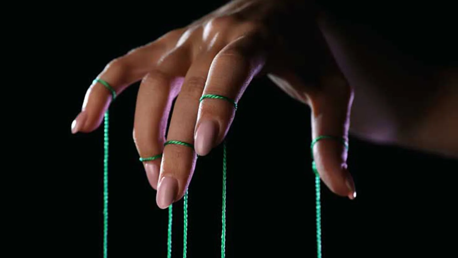
We are not always in charge of our decisions. We like to think we are free-thinking beings, but we are frighteningly easy to manipulate because of how our brains work.
Three key components manage the unconscious functioning of our brain: the basal ganglia, the limbic system and the neo-cortex. The basal ganglia are the oldest part of our brain. It responds to sensory disruption. It looks out for anything that could harm or reward us. The second part above this is the limbic system. This part is most commonly associated with social identity and relationships. The third part of the brain is the most complex, our neo-cortex. This part is where we process concepts, metaphors and meaning.
A great example of a website using our brains against us is the hyper-fast-fashion website, Shein. When you first visit the homepage, as a new User, your screen is flooded with special offers, coupons, and money-off vouchers. There are more special offers than clothes on display at this point.
Shein’s USP is the ridiculously low cost of products alongside the latest trends. That’s what brings people to the site. Most consumers will already know this, so the website’s job at this exact point is to convince them to make their first purchase. Or at least take a step towards doing so.
By bombarding the screen with offers, they are creating cognitive dissonance. This disruption technique knocks the User off-guard and triggers their brain to look for danger or reward. Doing so makes them look at the offers and coupons. Before they know it, they have clicked an offer without thinking, bringing them one step closer to becoming a paying customer.
Digital marketers use various techniques to create cognitive dissonance on their websites, effectively forcing viewers to engage with content. Shein’s website is a heavy user of many other dark patterns, including:
- Time-limited countdowns
- Exclusive discounts
- Low stock and scarcity tactics
- Hot products
- Confirmshaming
- Disguised ads
- Engagement rewards
The Confirmshaming technique is another one that exploits the way our brains work – specifically, the social identity part of our brain, our limbic system, by making us feel guilty. Confirmshaming is the act of using guilt to get the User to take a specific action. For example, seeing this message when trying to unsubscribe: “Yep, I’m OK with missing out on deals and special offers.”
You can tell someone the benefits and features of a product, but it won’t stick. Engage the consumer’s subconscious, plant a seed of need, and you can create emotional disruption.
These behaviours and biases are hard-wired into our brains.
We have evolved for survival, not shopping.
Dark patterns: clever or unethical design?
Persuasive website design can be a good thing. For example, a genuine stock-level counter means I don’t miss out on that new pair of trainers.
The counter helps me know to buy today and allows the shop owner to sell another pair of shoes.
This part is vital: I was going to buy the shoes anyway. It was an active choice.
It becomes pernicious when that counter is fake. And for me, I feel it edges into evil when the number of persuasive design techniques and dark patterns builds up to levels that trigger behavioural biases and effectively bully the User into buying.
What protects us from dark patterns?
Can we seriously be manipulated into buying something we didn’t mean to?
The simple answer is yes, easily.
Persuasion techniques can become so deceitful that they mislead consumers into buying against their intention. And for me, it is at this point that they become dark patterns.
In the UK, we have trading laws and Government-backed bodies to protect the consumer from this in our shops. However, the protection for the consumer online is vague at best, especially regarding dark patterns.
As you can see in my airline seat booking example – they are not always doing anything illegal. They are simply not showing the User the whole truth. Or if they are, they are making it hard to uncover.
The UK has a long way to go. As far as I know (and I’m not a legal expert), we have the Consumer Protection from Unfair Trading Regulations 2008 – created way back in Windows Explorer 7 days. Until Brexit, we had the even older Electronic Commerce (EC Directive) Regulations 2002. Neither of these directly references dark patterns or the sneaky miss-direction techniques we see on countless websites today.
Change is happening. And legislation is coming. In 2021 California announced a new Privacy Act that banned companies from using dark patterns to confuse or trick Users into opting into selling their information. It’s a start, and it is a behaviour that will spread.
Until then, we UI designers are responsible for ensuring ethical User Interface design on our clients’ websites and apps.
We need to design with respect for what Users want to do.
Learn more about the services talked about in this post.