A vibrant website to launch Nature Towns & Cities, a new initiative from the National Trust.
Applying a lively and energetic new brand to a technical WordPress website, including a self-assessment tool, for Nature Towns & Cities.
Our role
WordPress | Responsive User Interface Design | Motion Graphics | Design System
Industry
Environmental

Discovery.
To uncover the details of the project, we ran several workshops with the NT&C team. Our primary focuses were the purpose of the website, its audiences and its content, exploring the relationship between these three key strategy pillars.
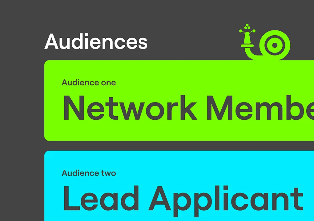
We worked together to understand the purpose, aims and goals of the site, alongside the various target audiences, their motivations, expectations and, therefore, their ideal journeys to and through the website.
We used our time together to understand the nature of the website content, its origins, formats and types – allowing us to make a plan for its visual treatment.

Website content and strategy.
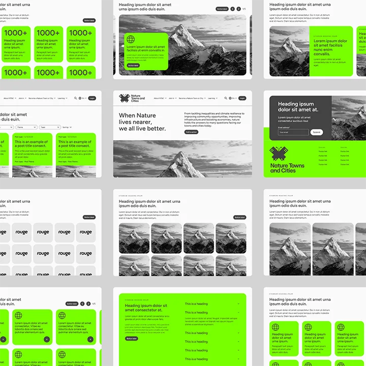
We used our findings from the Discovery process to form the foundation of the website, its framework and its pages. With this, we developed a site map and began to wireframe our pages and content blocks.
As always, we worked to balance the split of content between that which users are looking for and that which we want to steer them towards, always considering their end destination and the way in which we present the content.

Brand application.
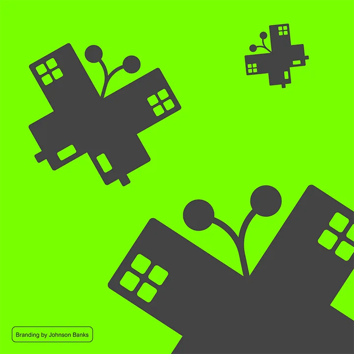
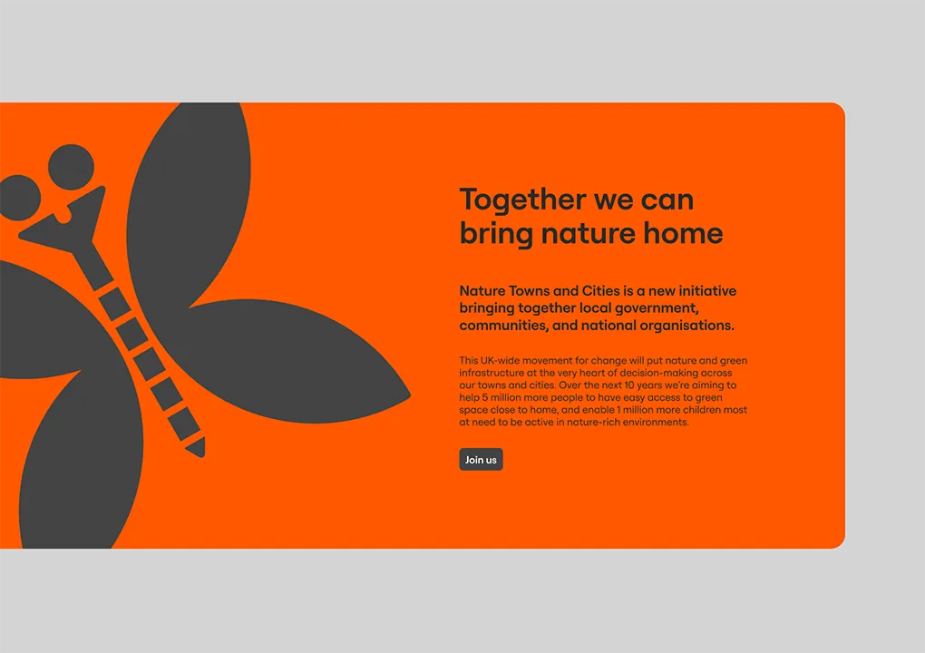
The NT&C brand was commissioned to and created by Johnson Banks.
The identity was delivered by way of a set of brand guidelines and included a clever combination of urban and street furniture used to form familiar creature silhouettes threaded through purpose-shot photography.
The brand is presented through deep greys contrasted with an acidic set of colours and a clear but distinct typeface.
We took the principles and elements of the brand, interpreting it onto our wireframes to develop a visually impactful, technically perfect, functional website design.
The brand offers the potential for motion and animation as we begin to develop the website now and into the future.
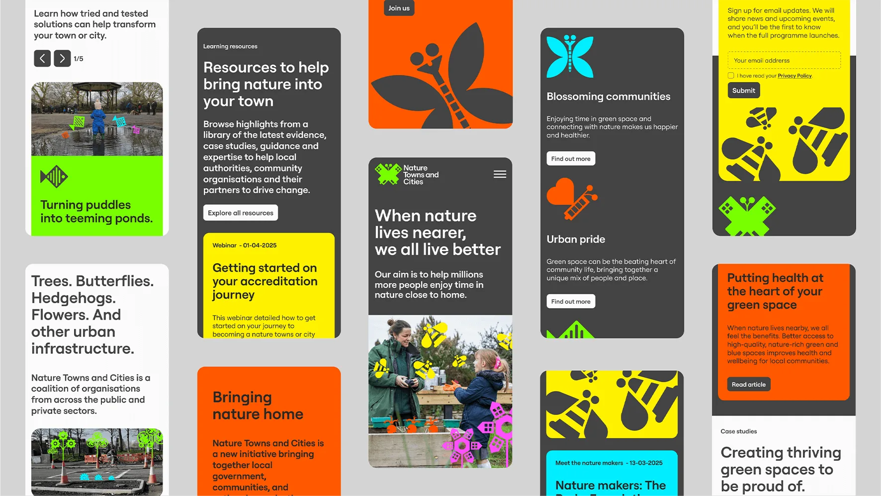
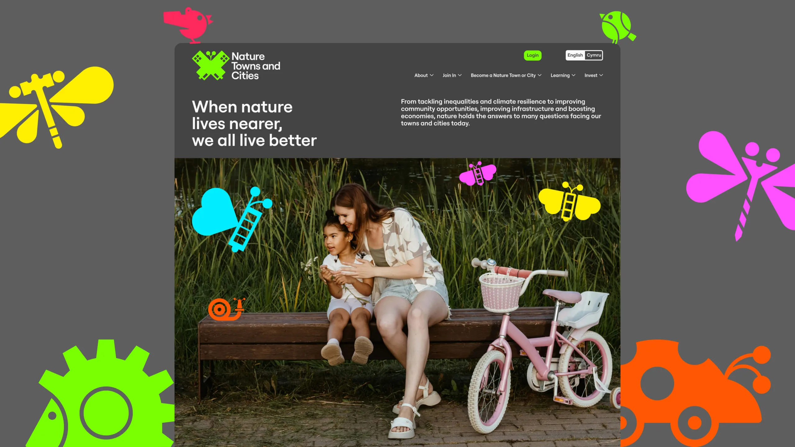
A clear and accessible UI, designed to last.
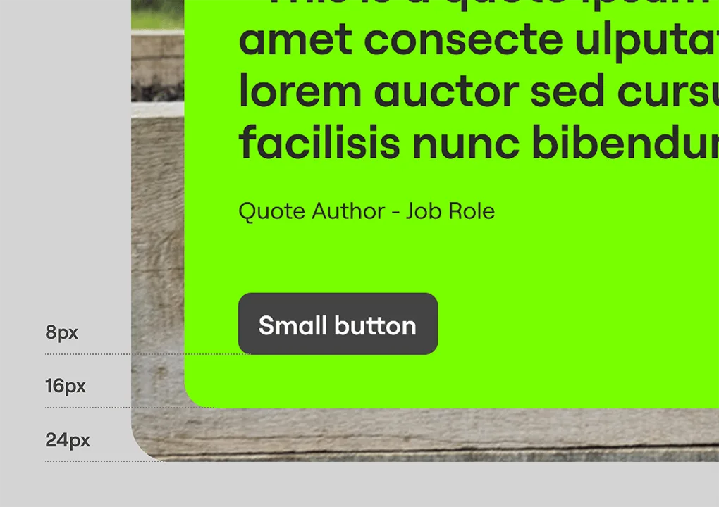
As with all Rouge websites, we developed a design system for that, among other things, including spacing, type and grid rules and scales.
Our design systems ensure seamless consistency, allowing accurate representation of a brand and websites that feel joined up, where users feel reassured by repeat behaviours and visual systems that aid navigation and improve the overall experience.
Visual accessibility is a key feature in this design, using stark contrast to ensure readability, avoiding text-over-image and making calls-to-action clear and meaningful while respecting the brand and its visual balances.


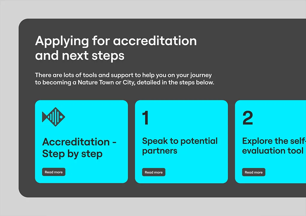
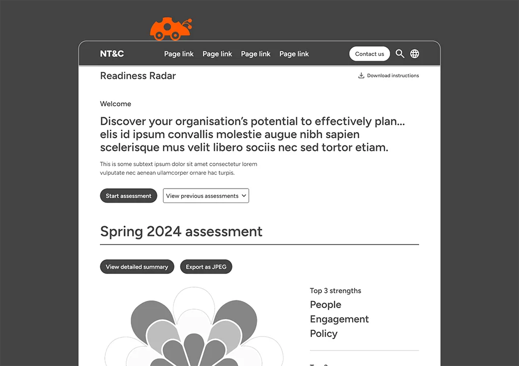
Self-assessment as a key feature.
The self-assessment tool needed to enable end-users to assess their readiness to complete their accreditation application.
We were provided with a visual prototype produced by another agency as a starting point for the experience NT&C were trying to achieve.
An analysis of the visual prototype and the existing offline self-assessment was completed to establish the definitive list of features.

Seamless integration for an app-like feel.
It was clear from the outset that NT&C needed an engaging, interactive, app-like experience for their self-assessment tool, whilst ensuring its seamless integration into their website.
We selected the React JavaScript framework for the front-end due to the need to effectively manage the interactive state of the application. The self-assessment “app” was embedded in a standard WordPress webpage, adopting the look and feel of the wider website.
The backend of the application was provided by WordPress, taking advantage of core WordPress user management features, with data provided to the application via the WordPress REST API.


Pulling together against the clock.
When it came to building the website, The National Trust and NT&C project teams arrived with detailed requirements and the level of process commonly seen with large organisations. The first step of the project was to build a shared understanding of the requirements and supporting processes.
The timeline was short, requiring multiple developers to work in parallel towards key milestones. This process was made easier by having an entirely in-house project team, able to share and compare with designers at every step.
Meeting the necessary accessibility level required close coordination between Rouge developers and accessibility advocates at the National Trust.
Feedback from multiple stakeholders in several disciplines needed a simple, collaborative process to ensure action points were dealt with efficiently.
Penetration testing was completed by a specialist 3rd party company prior to launch. This ensured our robust build was fully tested ahead of launch day.