A clear, calm WordPress refresh that helps clients find the right legal support faster.
Creating a refreshed digital presence that feels as professional and considered as their legal advice.
Our role
UX Design | Design Systems | Social Media Marketing | WordPress
Industry
Legal
Field Seymour Parkes (FSP) are a full-service law firm based in Reading. Their work spans business and personal legal services, with clients ranging from ambitious start-ups to established multinationals, and individuals navigating life’s more complex moments.
They came to us with a clear brief: the website was in need of a visual refresh. It didn’t reflect the quality of their service, the confidence of their people, or the breadth of their work. It was time to change that.
They came to us with a clear brief: the website was in need of a visual refresh. It didn’t reflect the quality of their service, the confidence of their people, or the breadth of their work. It was time to change that.

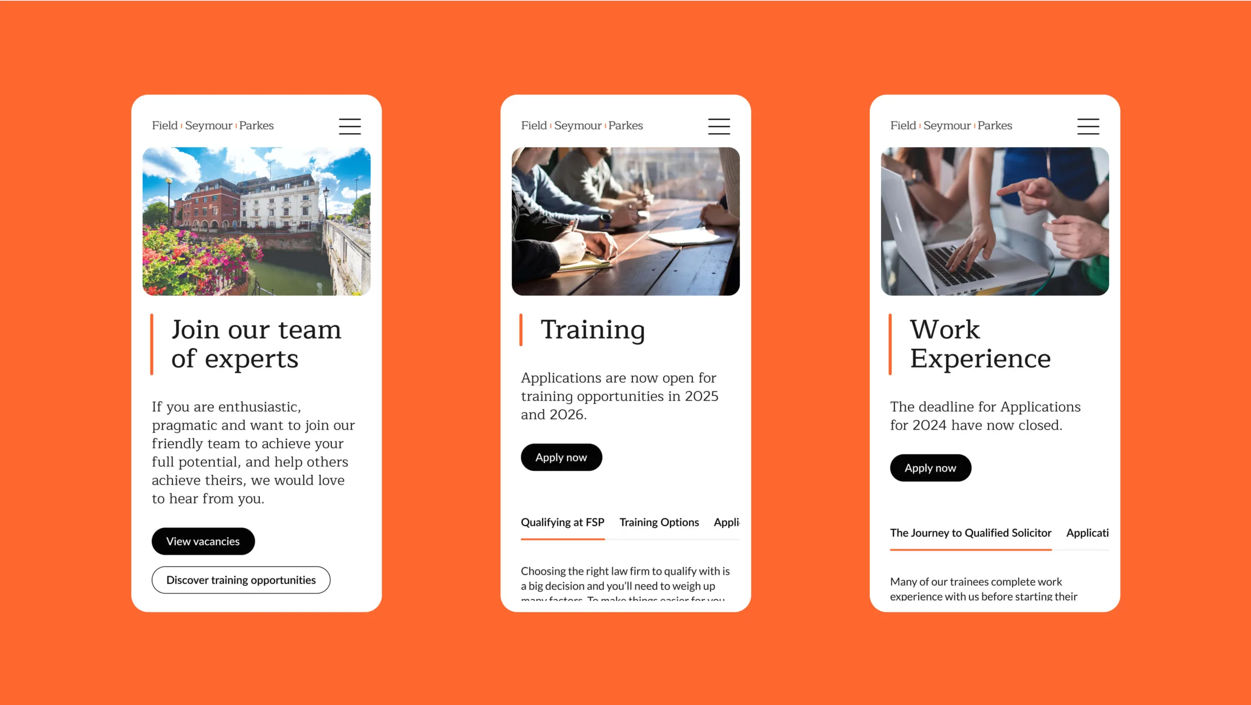
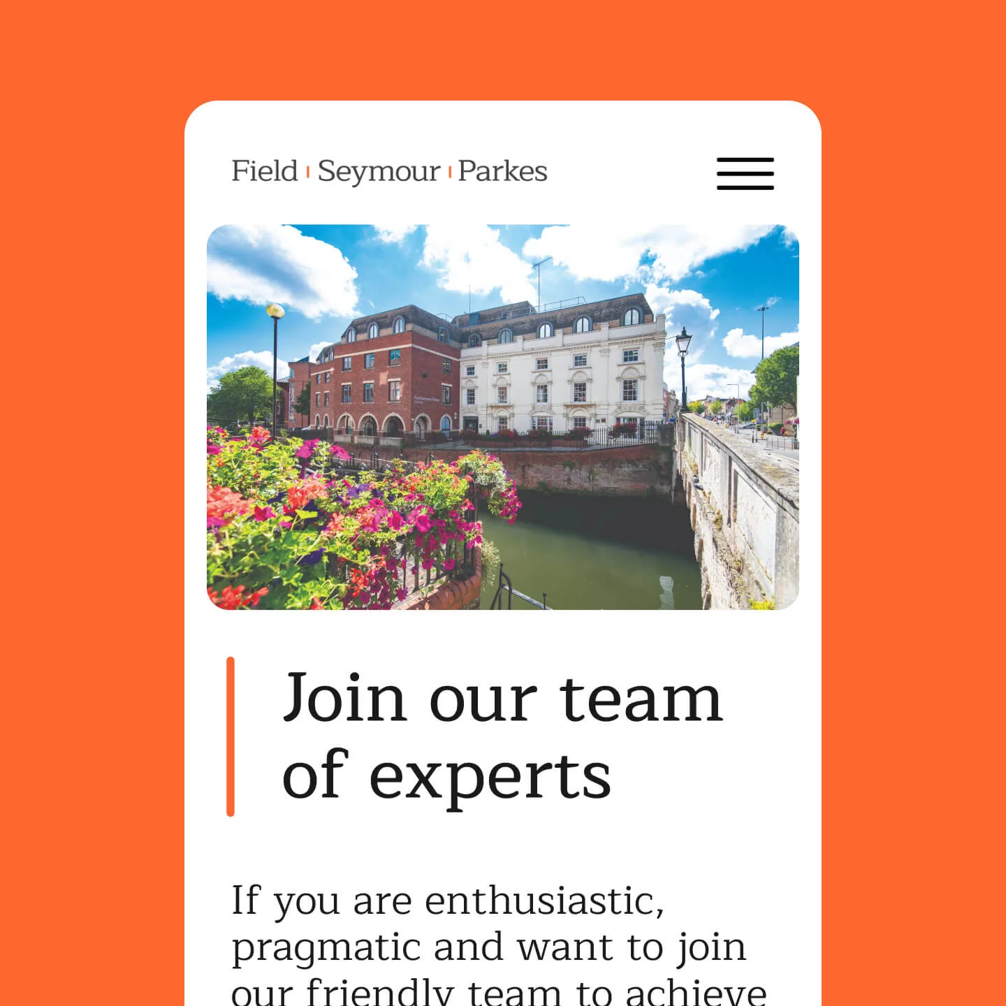
Old site, new problems.
The previous FSP website design had served them well, but the cracks were showing. The design felt dated. The homepage lacked clarity and didn’t guide users effectively. There were accessibility issues, particularly with text layered over images. Style over substance in the places it mattered most.
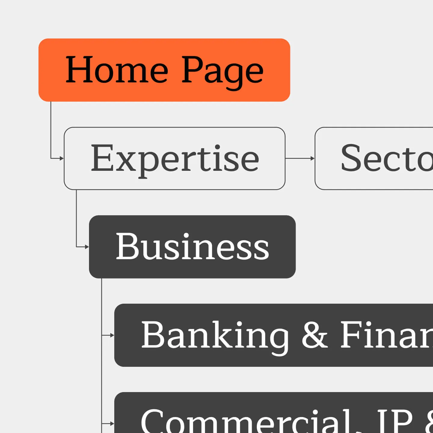
There was also a broader issue of focus. FSP works with both businesses and individuals, but the old site didn’t always make it easy for either group to know where to start. It needed to do more than just inform. It needed to direct.
We ran a full content and UX audit. We found what worked, what didn’t, and where the gaps were. Then we built a content architecture and design system to serve both sides of the business

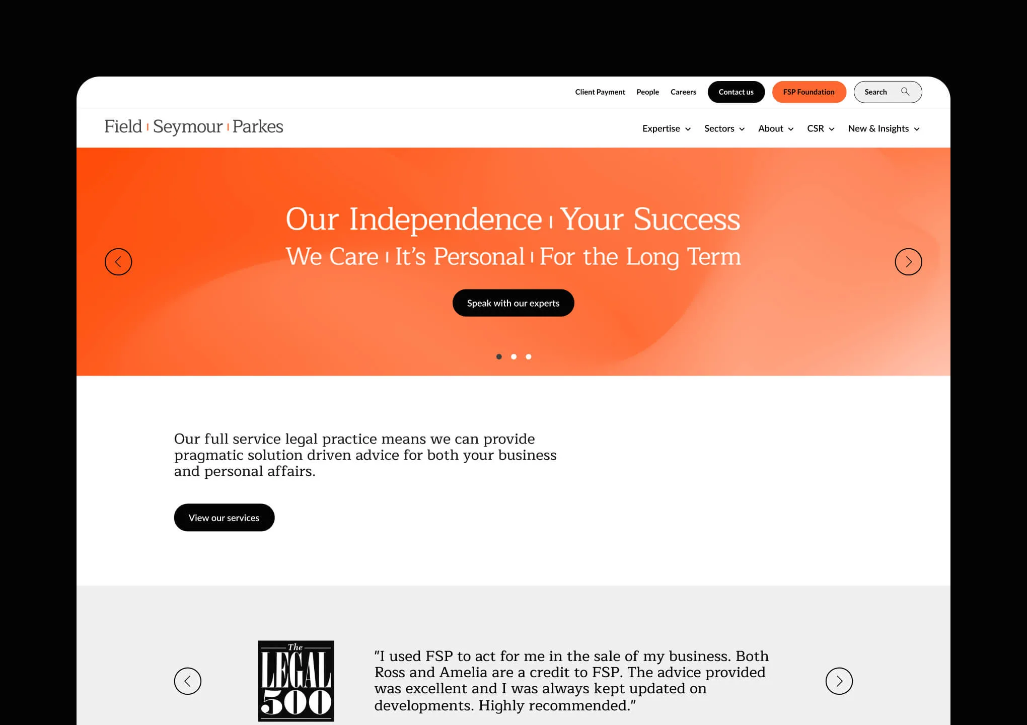
Recognisably FSP, refreshingly clear.
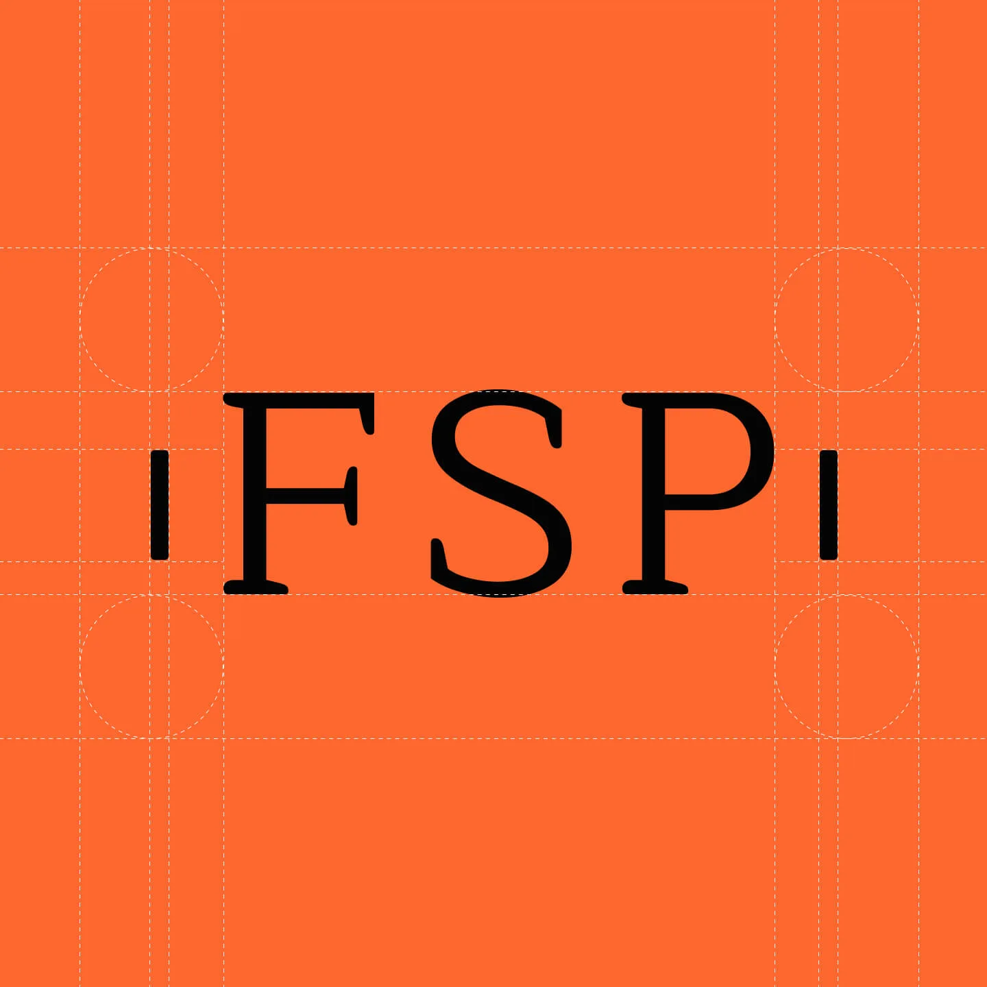
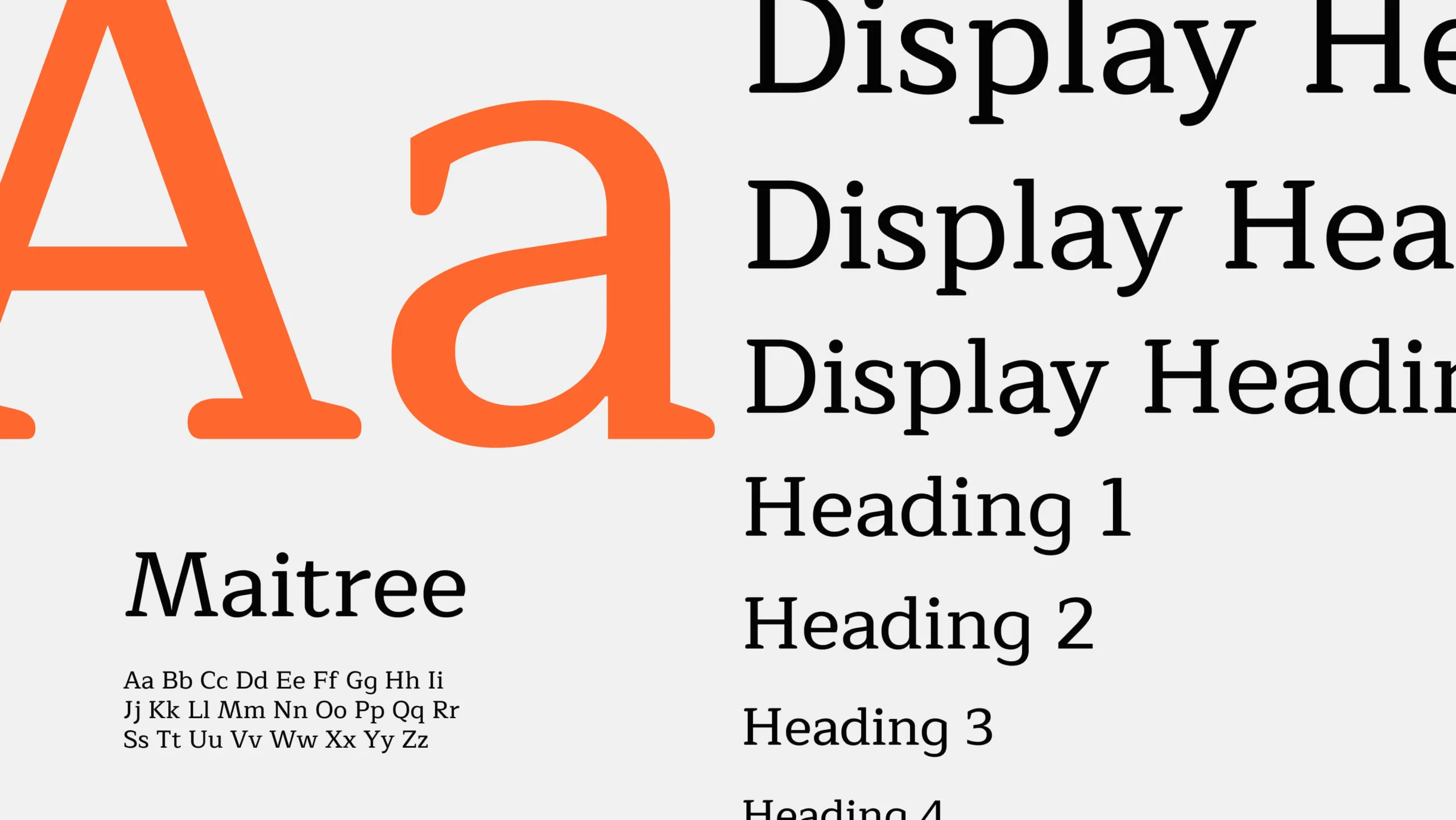
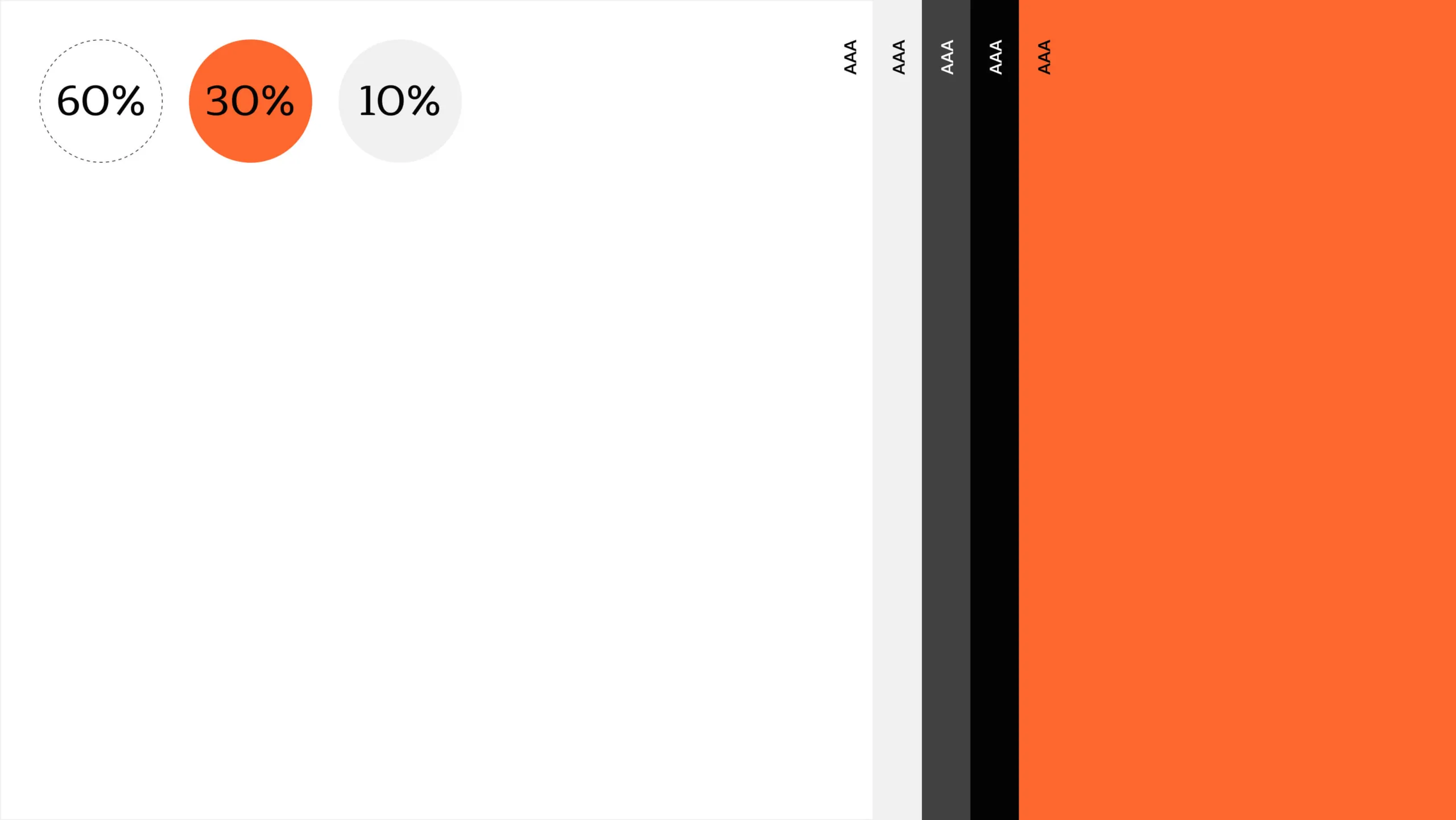
The brand didn’t need a full overhaul, just a more modern, consistent expression. FSP’s core palette of white, orange, and grey was non-negotiable, and rightly so. It’s a key part of their brand recognition. Our role was to take those existing elements and build a more structured design system around them, with clear rules for how they show up across the site and beyond.
We began with the typography. The headline typeface was strong and distinctivly FSP. No need to change it. But it lacked consistency in use, and without a clear hierarchy, users were left guessing what to read first.
We introduced a defined type scale and applied it across the site, bringing structure and clarity to every page. The result? A smoother reading experience and clearer signposting to the content users came for.
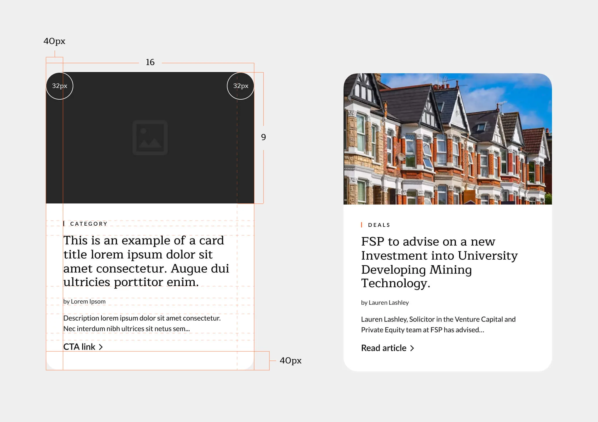
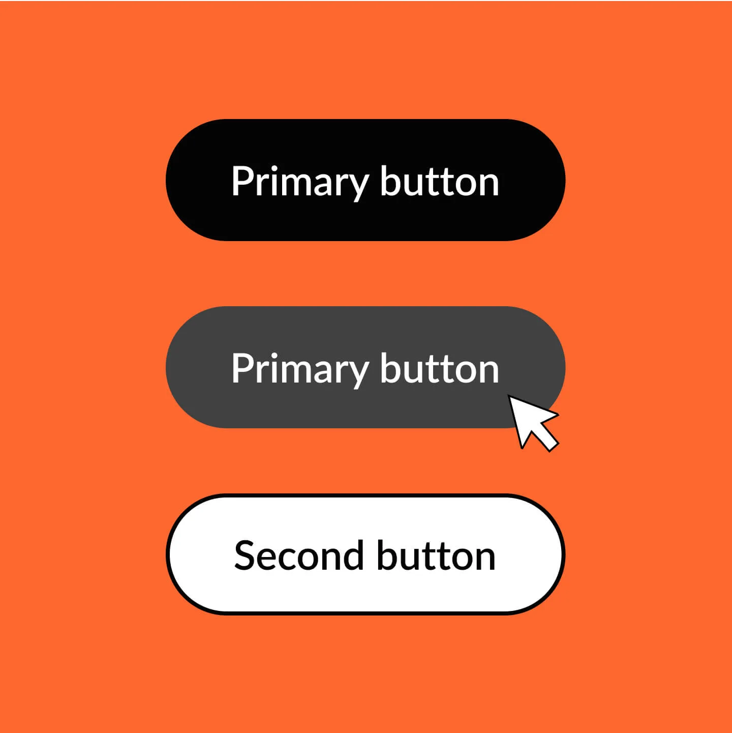
Softer, smarter design choices.
The old website leaned a little too hard into sharp edges and visual noise. Text over images made reading difficult, especially for users with accessibility needs. There was heavy use of orange for headings and links which didn’t meet accessibility standards. It also didn’t reflect the warmth of the FSP team.
We softened the visual language with rounded corners and removed text-over-image combinations entirely, letting content stand clearly on its own. The result is a calmer, more focused design that feels both professional and approachable. Just like FSP.

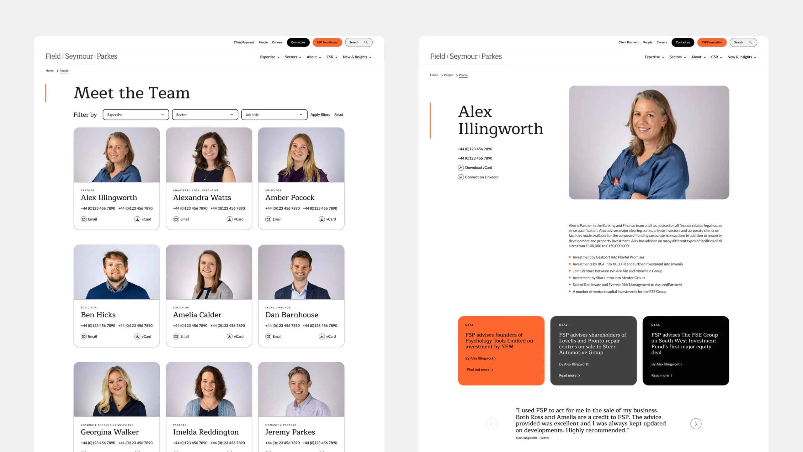
Open, honest, approachable.
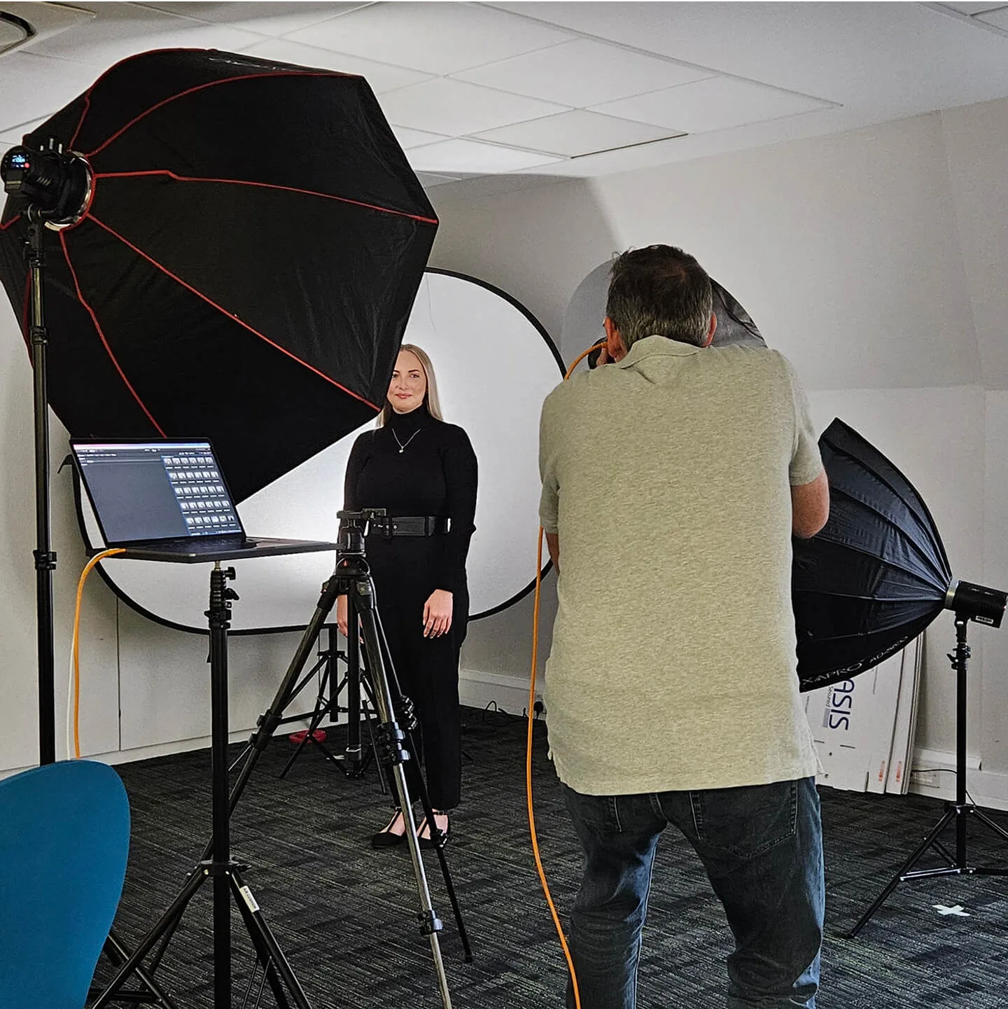
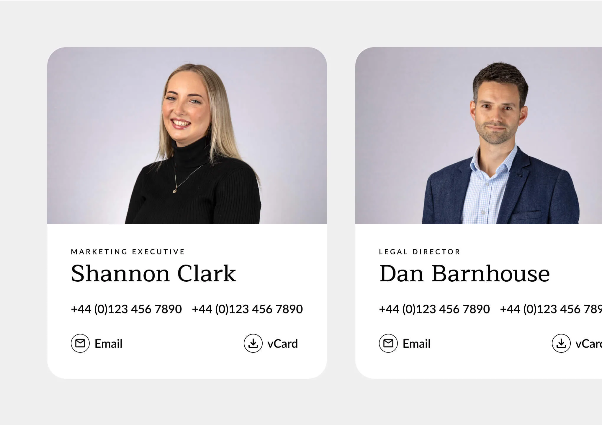
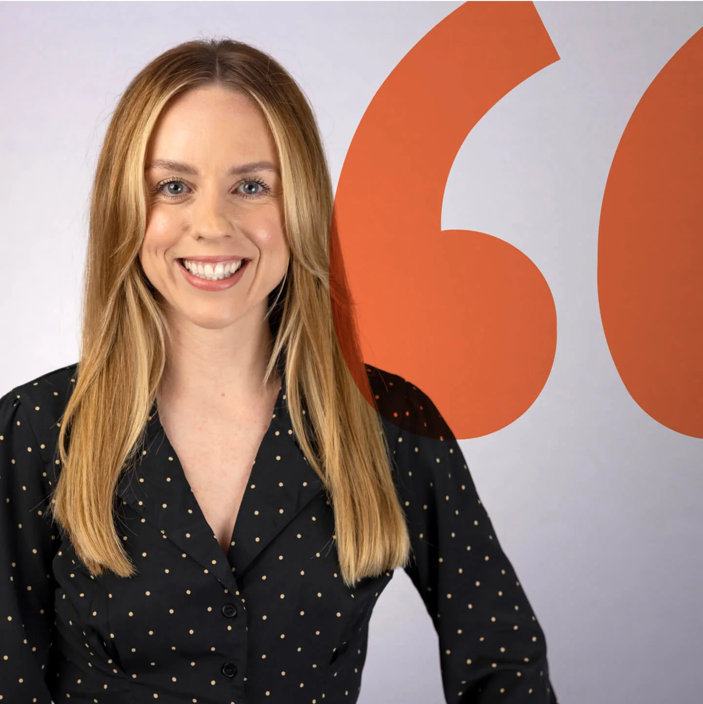
The photography on the old FSP website was largely generic stock images. Distant, staged, and ultimately forgettable. To bring a sense of humanity back into the brand, we organised and art directed a new set of office and team portraits.
Every shot was designed for on-brand visual consistency, with a repeatable style that allows new images to be added seamlessly as the firm grows.
The result is a visual language that puts people first, helping users feel instantly connected. It’s no longer just about the services, it’s about the people you’ll be working with.
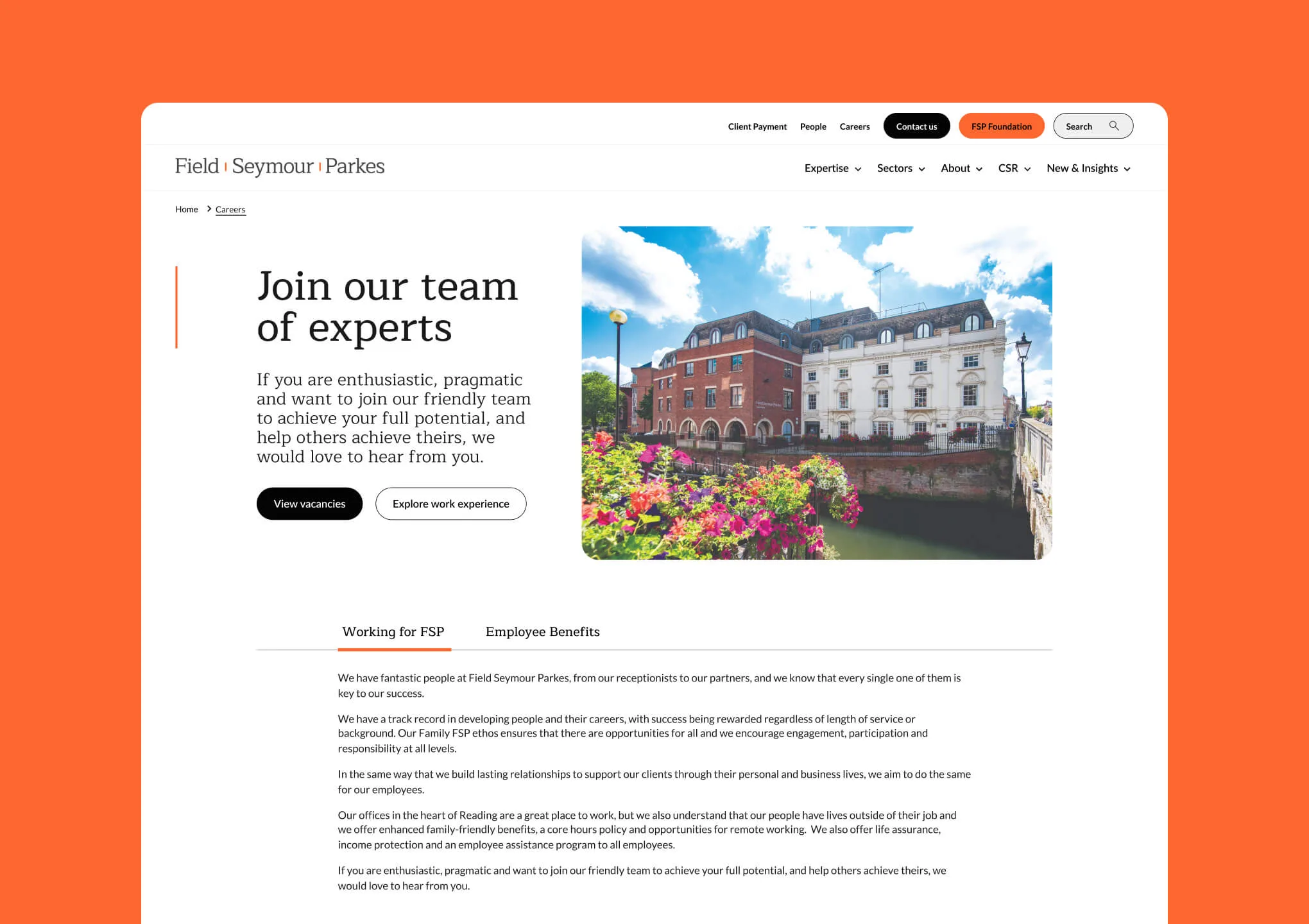
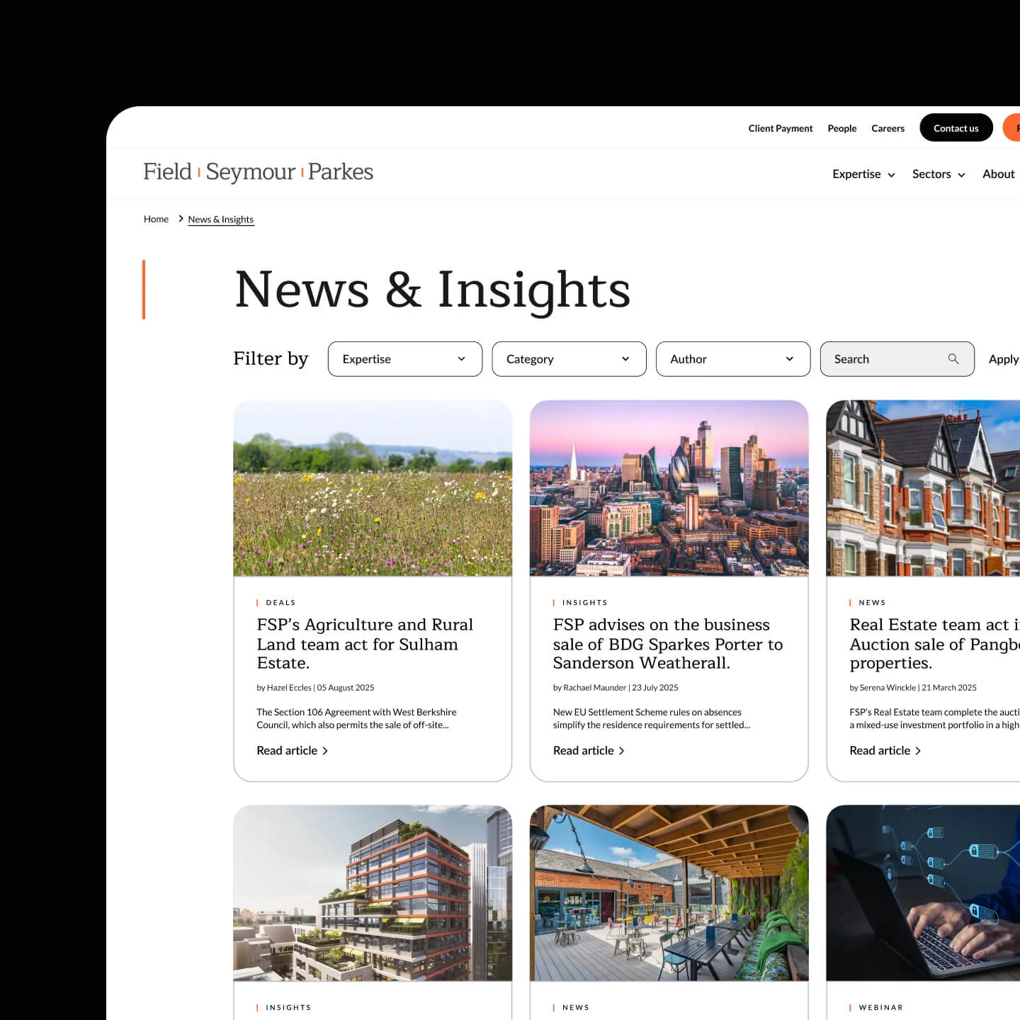
Clear paths through content.
With a solid design system, sharper user focus, and a refreshed visual identity in place, we turned our attention to updating the site’s key pages.
During routine website maintenance, something all our long term clients get, we discovered that bounce rates were a major concern. Some pages were text-heavy and forced users into long scrolls before reaching what mattered. We needed a smarter way to present plenty of content without overwhelming or losing visitors.
Our solution were clean, intuitive tabbed content blocks. Allowing users to navigate dense information quickly and easily with no endless scrolling required.
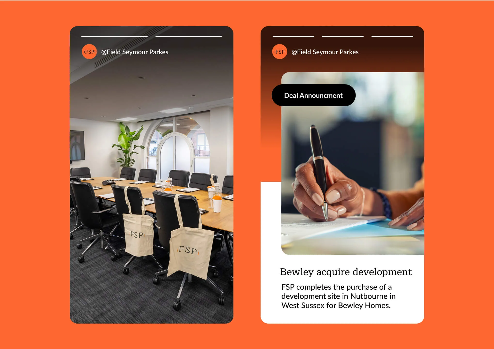
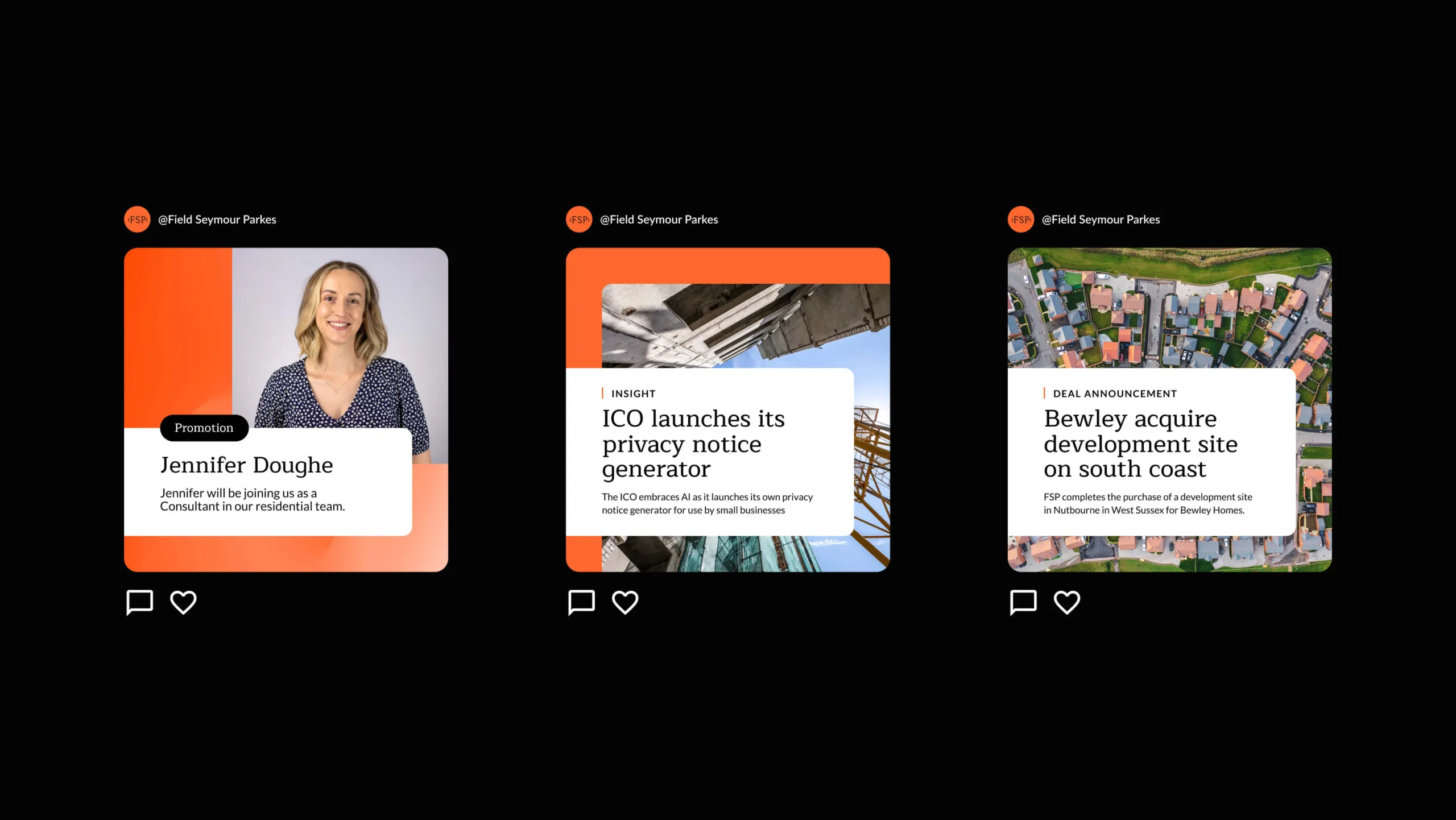
Consistency across channels.
With the new website live, FSP wanted their social media to reflect the fresh, modern identity. Their existing posts felt a bit scattered, so we set out to bring consistency and cohesion.
Building on the visual language from the website refresh, we created a set of social media templates. Now, every post speaks with one clear, confident voice. Showing a unified brand that truly connects with its audience.
“What really stood out about Rouge was their capacity to remain approachable while handling the project professionally”

Clear, confident, click-ready.
The refreshed website launched smoothly and has already shown early improvements in user engagement. Particularly in click-throughs from the homepage to key sections of the site.
FSP now has a site and visual identity that’s fit for the future. One that reflects the professionalism of the team and the clarity of their service.
And while we can’t promise it’ll make legal paperwork more exciting, it certainly makes finding the right legal support a whole lot simpler.