A clearer journey to a cure: An accessibility-focused website for the Friedreich’s Ataxia Research Alliance.

Technically complex, accessibility-focused, user-friendly, visually distinct; Rethinking FARA’s digital presence from the ground up.
Our role
Websites | User-Experience Design | WordPress | Digital Content Strategy
Industry
Not-for-profit
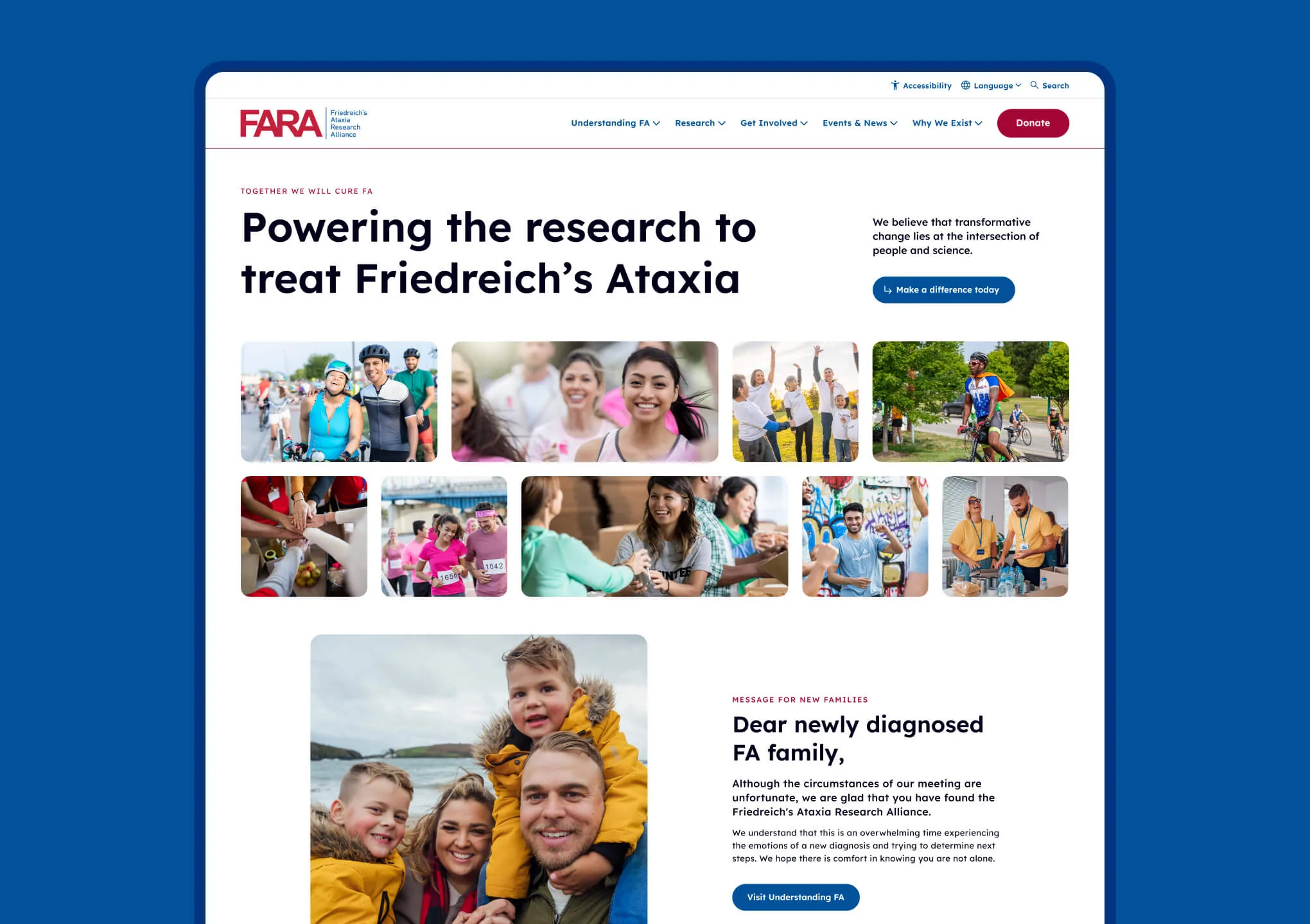
FARA needed a website to reflect their maturity as an organisation - a class-leading gold-standard in inclusive web design - communicating its vision, and telling its story with empathy and clarity.


Rebuilding the heart of the FARA brand.
The FARA team came to us with a website that no longer served the needs of its growing audience. It had become dense, difficult to navigate, and lacked a clear visual hierarchy. Most critically, it wasn’t providing the right user journey for patients, researchers, or donors.
Our challenge was to reimagine the site architecture, help and advise on how to streamline complex content, and design a platform that could meet the demands of an international advocacy organisation, all while still feeling human, personal, and hopeful.


Audience needs to dictate structure.
FARA’s work spans scientific research, patient outreach, fundraising, policy, and education. Organising that into a user-friendly experience meant we had to deeply understand the needs of each audience segment.
We began by mapping key user journeys for groups such as:
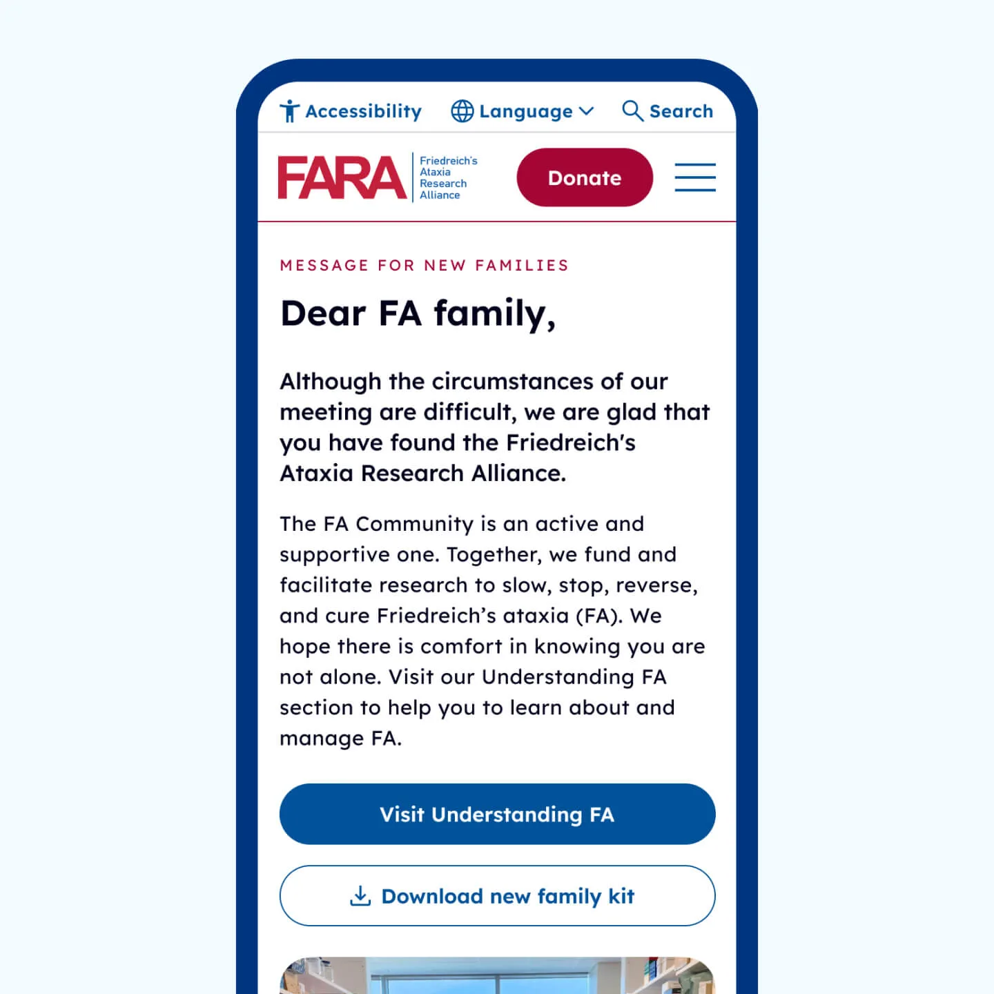
- Newly diagnosed patients
- Clinical researchers
- Families looking for trials
- Fundraisers looking to support a cause.
From here, we developed a new information architecture that brought clarity to each pathway, using plain language and intuitive content groupings to guide visitors to what they were looking for.

Strategic content consolidation.
The old site had grown organically over many years, resulting in overlapping and outdated content, broken links and hidden pages.
Working closely with FARA, we led a content audit and reduction process to:
- Remove duplication
- Help and advise on modernising copy
- Elevate the most impactful stories and resources.
The team at FARA rewrote their core pages to more accurately reflect their voice; accessible, science-led, and full of determination. At the same time, we elevated storytelling elements and content to help bring in lived experience, grounding the science in real human stories.

A fresh digital identity.
The new FARA website needed to be visually distinct and authoritative but at the same time approachable and intuitive.
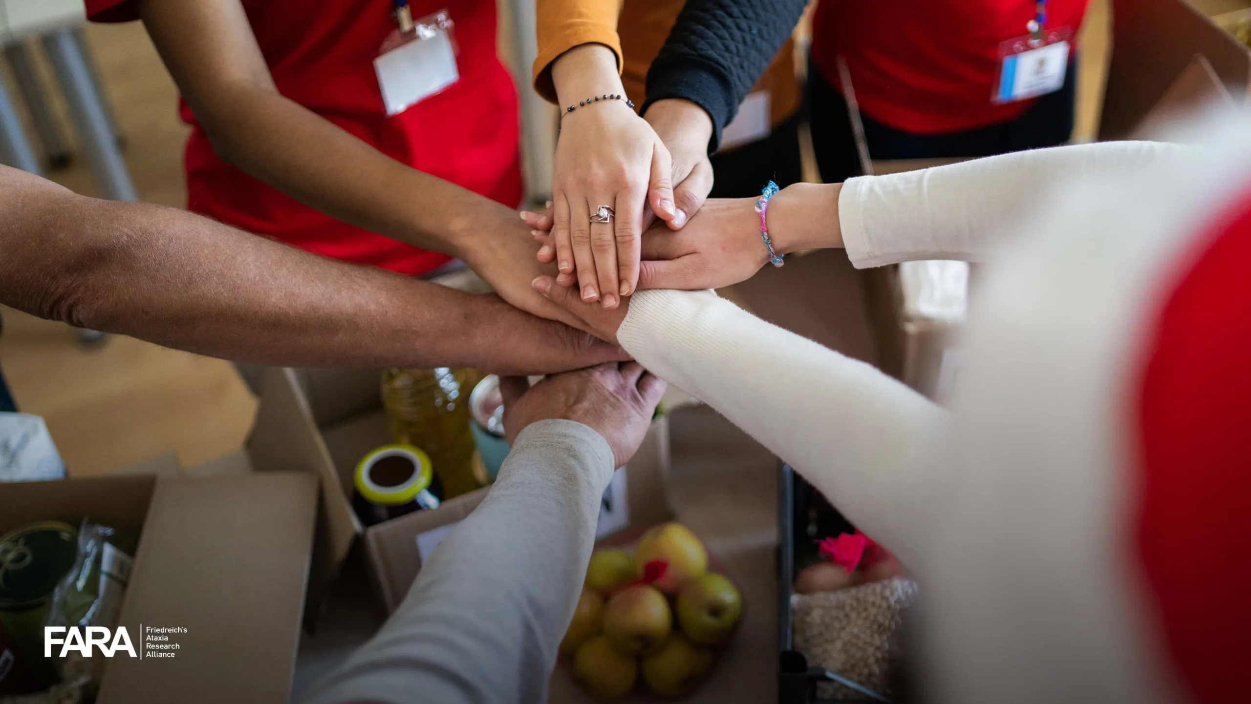
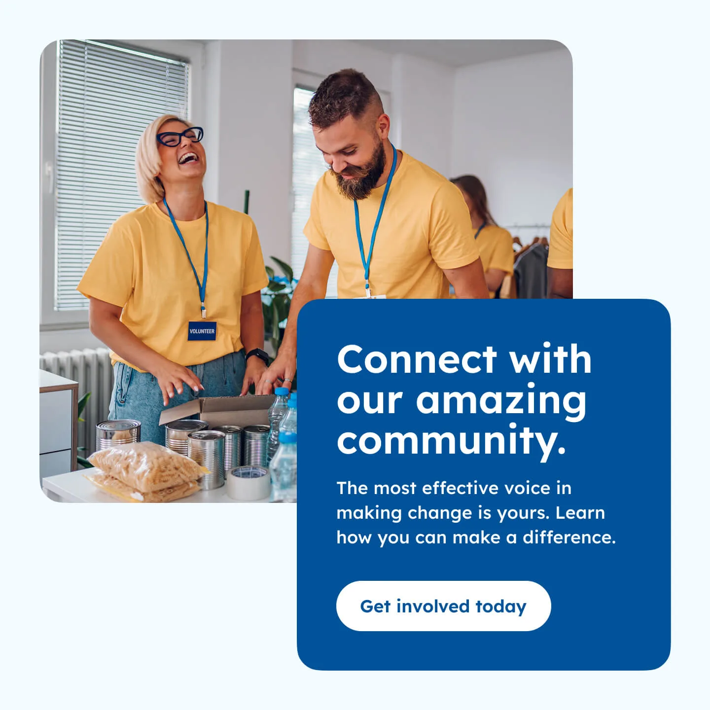
We used photography generously, featuring researchers, families, and events, to put people at the centre. Throughout the site, we attempted to create moments of emotional connection through story and imagery while pursuing a feeling of authority, trust, and clarity.

With accessibility at its core.
Accessibility was a foundational consideration throughout the design and development of the FARA website.
Our design system introduced:
- A cleaned-up, ultra-accessible layout
- A new typeface chosen for it’s specific reading comprehension design
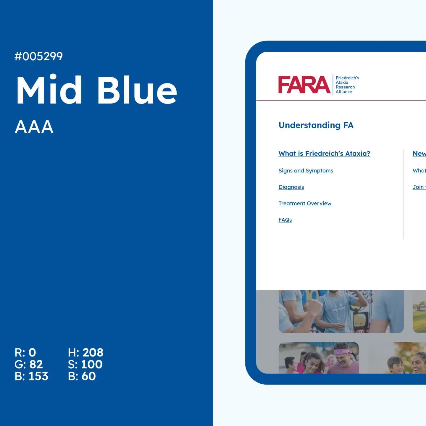
- A restrained colour palette that carried over existing FARA colours, nodding to the medical world without feeling clinical.
We adhered to WCAG 2.1 guidelines to ensure the site could be used by people with a wide range of abilities. This included:
- Strong colour contrast for users with sight conditions
- Consistent semantic heading structures
- Meaningful link labelling
- Keyboard navigability, and
- Screen-reader compatibility.
For an organisation serving people affected by a neuromuscular condition, this wasn’t a technical box to tick, it was an ethical imperative.


Built to scale, built to serve.
We built the new site on a flexible, future-proof WordPress CMS that enables the FARA team to update content and launch campaigns quickly. Custom page templates were created for research updates, clinical trial listings, blog posts, and fundraising initiatives.
We also implemented SEO best practices and performance enhancements to ensure the site works for every visitor, on every device.

Archives, taxonomies and making sense of a complicated data structure.
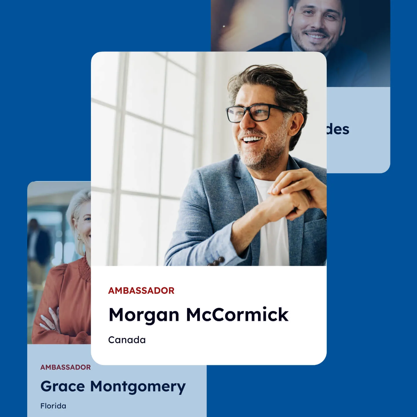
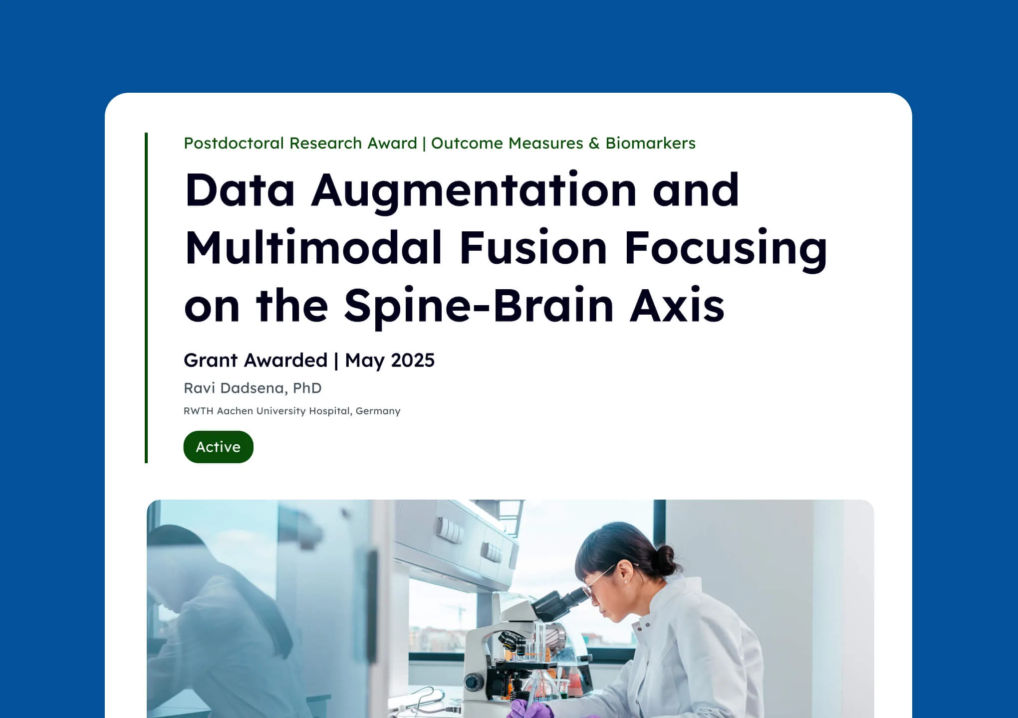
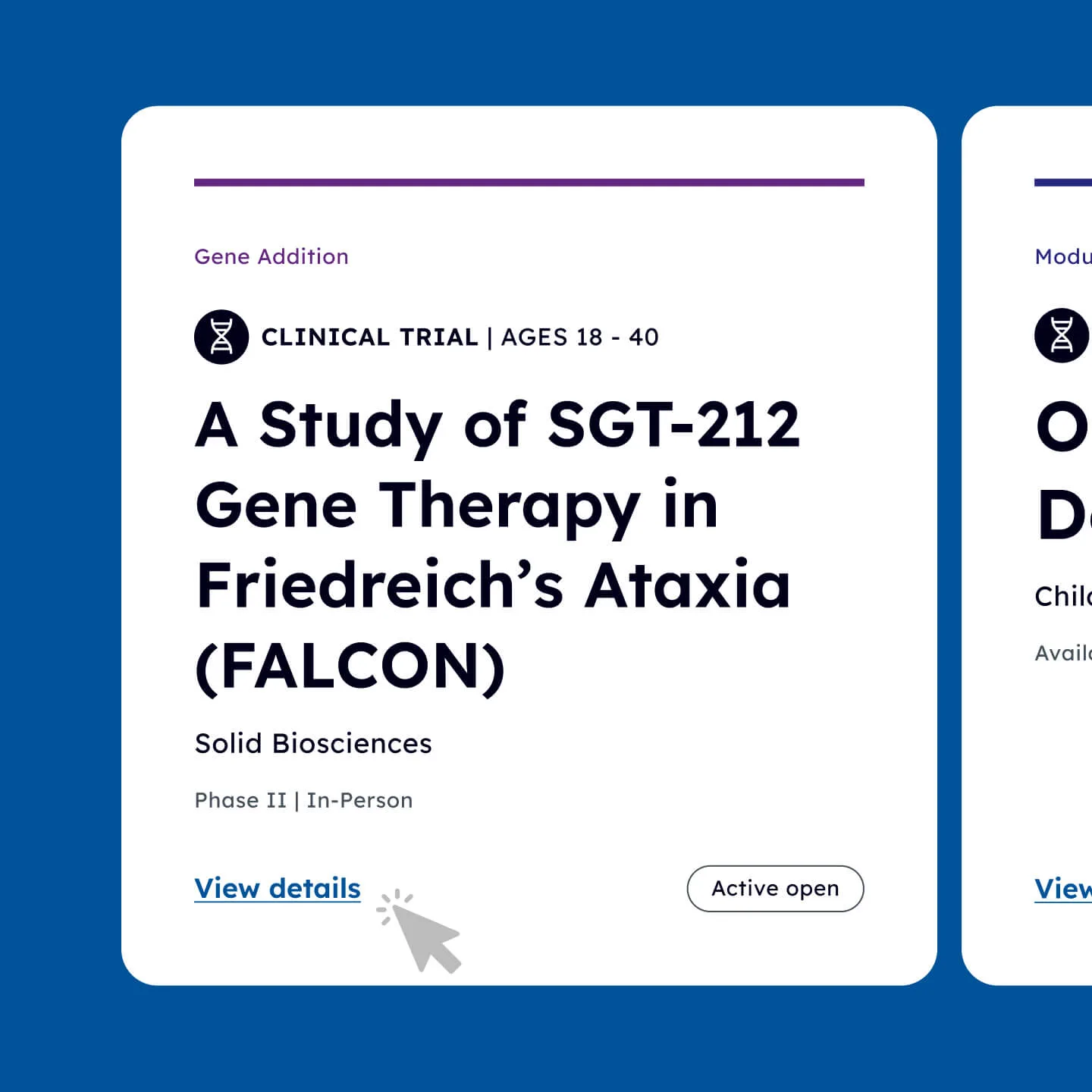
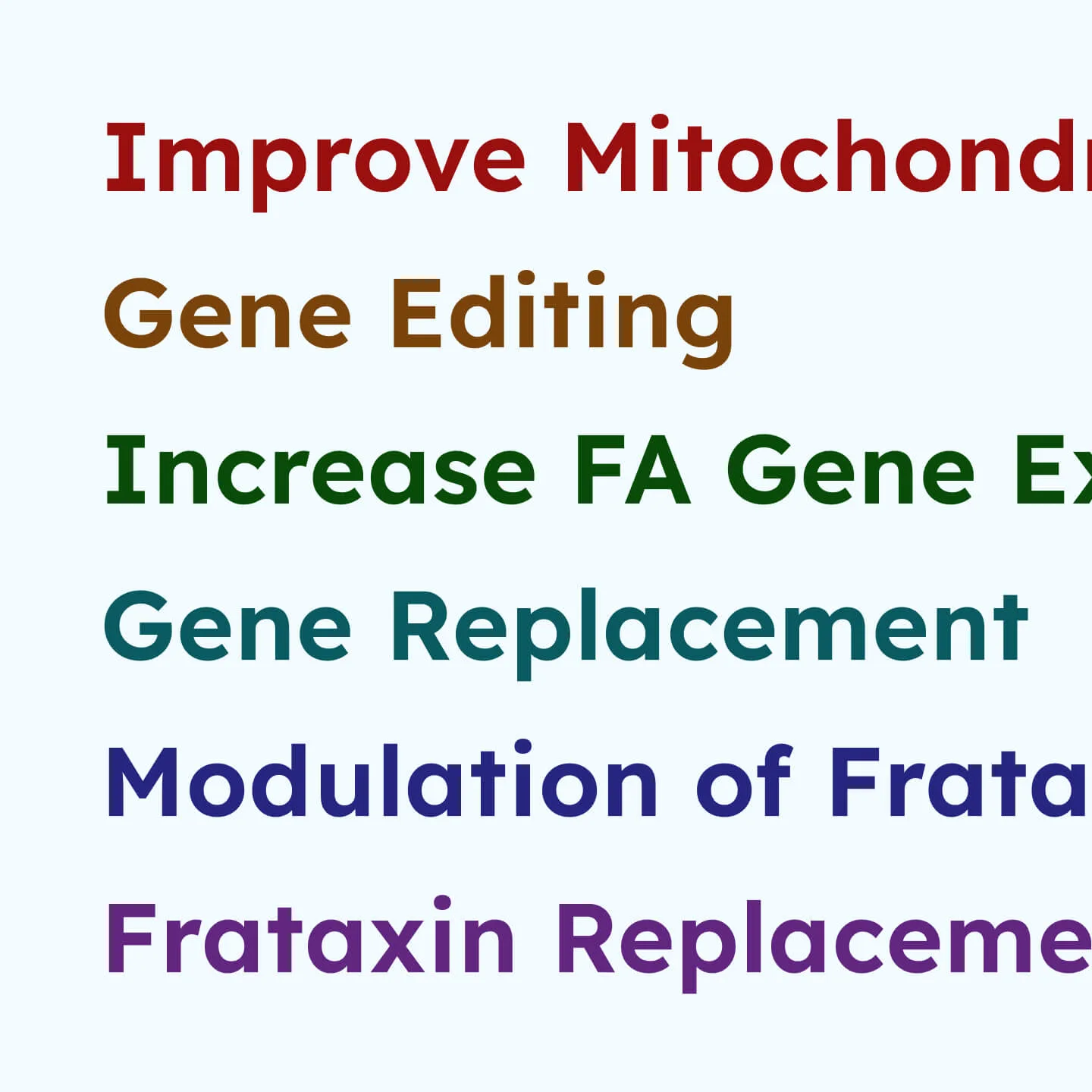
Behind the scenes, the site supports a highly structured system of complex data archives, each with its own filters, relationships, and user needs. This includes five major archive areas: News & Blog, Ambassadors, Funded Grants, Clinical Trials, and the Drug Development Pipeline. Each required its own card-based design system, taxonomies, and tailored filtering logic.
We worked closely with the FARA team to define and map these structures, balancing editorial control with structured data logic. From both a UX and development standpoint, this meant building a robust, extensible information architecture that could scale with their ongoing mission.
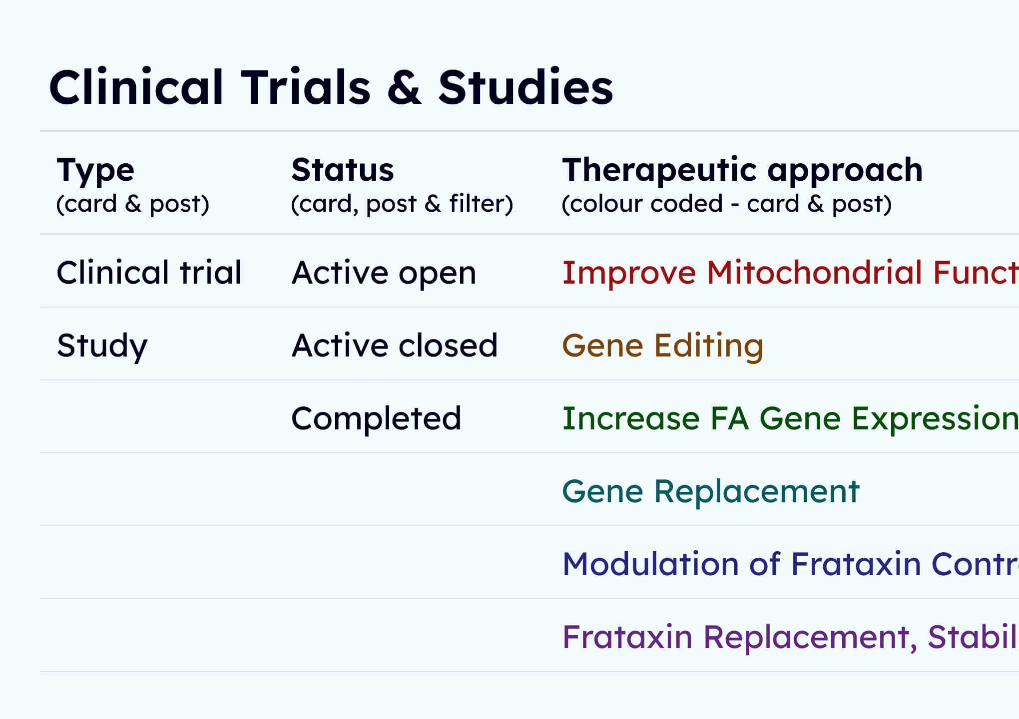

Visualising the drug development pipeline.
One of the more critical and technically complex sections of the site is the Drug Development Pipeline. This feature tracks the progress of drug treatments in development, across stages from discovery to clinical trial.
We deconstructed the content and redesigned it as a custom visual and functional model for the pipeline, enabling users to filter and explore treatments based on their phase, sponsor, or mechanism.
The end solution offers researchers, families, and donors a real-time window into the status of FA treatment innovation. From a backend perspective, it required precise data modelling and a flexible interface to allow easy updates as treatments advance.

For impact and growth.
Since launch, the new website has seen a marked increase in user engagement across key metrics: more time spent on site, lower bounce rates, and an uplift in donations and contact form submissions. Feedback from both the FARA community and their professional partners has been overwhelmingly positive.
The website now feels like a true extension of the FARA mission: focused, inspiring, and resolutely moving forward toward a cure.
Working with Rouge has been a pleasure. Their technical expertise and creativity gave us confidence in the project from the outset.